
Form validation is a cornerstone of interactive web applications, ensuring that the data users input is accurate, complete, and meets predefined criteria before submission. In React, while basic validation can be achieved using built-in HTML attributes or simple JavaScript checks, more complex applications often require advanced and custom validation logic.
This article explores how to implement custom form validation in React using sophisticated patterns and best practices. By the end of this guide, you'll be equipped to create robust, user-friendly, and accessible forms that cater to complex validation requirements.
>> Read more:
- Mastering React Higher-Order Components (HOCs)
- A Comprehensive Guide for React Server Components
Form Validation Concepts
Basic Validation Techniques
Before delving into custom validation logic, it’s important to understand the basics. Common validation techniques include:
- Required Fields: Ensuring that essential fields are not left empty.
- Length Checks: Validating that the input meets specific length requirements (e.g., passwords with a minimum length).
- Pattern Matching: Using regular expressions to enforce formats, such as email addresses or phone numbers.
These basic validations can be implemented using HTML5 attributes (required, minLength, pattern) or through JavaScript logic within your React components.
Custom Validation Logic
For more complex applications, basic validation might not be enough. In such cases, you’ll need to implement custom logic tailored to specific scenarios, such as:
- Conditional Validation: Validating a field only if another field meets specific criteria (e.g., requiring a secondary email if the user selects a "Business" account type).
- Cross-Field Validation: Ensuring that related fields are consistent with each other, such as confirming that two password fields match.
- Asynchronous Validation: Validating data against a server-side API, such as checking if a username is already taken.
Setting Up Custom Validation in React
Integrating Custom Validation in React
Custom validation in React can be easily managed by defining reusable validation functions and integrating them within your form components. For example, we can define the validation functions like below:
// In validationUtils.js

const validateEmail = (email) => {
  const regex = /^[^\\s@]+@[^\\s@]+\\.[^\\s@]+$/;
  return regex.test(email) ? "" : "Invalid email format";
};

const validatePassword = (password) => {
  if (password.length < 8) return "Password must be at least 8 characters";
  if (!/[A-Z]/.test(password)) return "Password must contain an uppercase letter";
  return "";
};
Next, import these validation functions into your form component:
import React, { useState } from 'react';
import { validateEmail, validatePassword } from './validationUtils';

const MyForm = () => {
  const [values, setValues] = useState({ email: '', password: '' });
  const [errors, setErrors] = useState({});

  const handleChange = ({ target: { name, value } }) => {
    setValues({ ...values, [name]: value });
    setErrors({ ...errors, [name]: name === 'email' ? validateEmail(value) : validatePassword(value) });
  };

  const handleSubmit = (event) => {
    event.preventDefault();
    if (!errors.email && !errors.password) {
      console.log('Form submitted:', values);
    }
  };

  return (
    <form onSubmit={handleSubmit}>
      <input name="email" value={values.email} onChange={handleChange} />
      {errors.email && <p>{errors.email}</p>}
      <input name="password" type="password" value={values.password} onChange={handleChange} />
      {errors.password && <p>{errors.password}</p>}
      <button type="submit">Submit</button>
    </form>
  );
};

export default MyForm;
In this example, the handleChange function dynamically applies validation logic to update the errors object, ensuring that form fields are validated as the user types. The handleSubmit function prevents form submission if validation errors are present.
Reusable Functions and Hooks
>> Read more: Mastering React Hooks: Fundamentals for Beginners
To make your validation logic reusable and maintainable, especially across different components, you can encapsulate the validation functions into a custom hook. This approach allows you to manage form state and validation in a clean, modular way. Below is an example of a hook that manages form validation:
// In useForm.ts

import { useState } from 'react';
import { validateEmail, validatePassword } from './validationUtils';

const useForm = (initialValues) => {
  const [values, setValues] = useState(initialValues);
  const [errors, setErrors] = useState({});

  const handleChange = ({ target: { name, value } }) => {
    setValues({ ...values, [name]: value });
    setErrors({ ...errors, [name]: name === 'email' ? validateEmail(value) : validatePassword(value) });
  };

  const handleSubmit = (callback) => (event) => {
    event.preventDefault();
    if (!errors.email && !errors.password) {
      callback();
    }
  };

  return { values, errors, handleChange, handleSubmit };
};
Then, we update the component with the newly created hook.
import React from 'react';
import useForm from './useForm';

const MyForm = () => {
  const { values, errors, handleChange, handleSubmit } = useForm({ email: '', password: '' });

  return (
    <form onSubmit={handleSubmit(() => console.log('Form submitted:', values))}>
      <input name="email" value={values.email} onChange={handleChange} />
      {errors.email && <p>{errors.email}</p>}
      <input name="password" type="password" value={values.password} onChange={handleChange} />
      {errors.password && <p>{errors.password}</p>}
      <button type="submit">Submit</button>
    </form>
  );
};

export default MyForm;
Using reusable functions and custom hooks streamlines form management in React, ensuring consistent and maintainable validation logic. This approach keeps components clean and scalable, making your codebase more efficient and easier to manage as your application grows.
Advanced Validation Patterns
Dynamic Schema Validation
Dynamic schema validation is essential for forms where the structure changes based on user input. This involves defining validation rules that adapt as the form evolves. Imagine a form where users can add multiple sections, each with its own set of fields that require validation. The validation schema must adjust dynamically as new sections are added or removed.
import * as Yup from "yup";

const createSectionSchema = () => Yup.object().shape({
  sectionName: Yup.string().required("Section name is required"),
  items: Yup.array().of(
    Yup.object().shape({
      itemName: Yup.string().required("Item name is required"),
      itemValue: Yup.number().required("Item value is required").positive("Value must be positive"),
    })
  ),
});

const validateForm = (sections) => {
  const schema = Yup.array().of(createSectionSchema());
  return schema.validate(sections, { abortEarly: false });
};
In this example, the validation schema adjusts dynamically based on the number of sections and items, ensuring accuracy regardless of how the form structure evolves.
Form State Management with Validation
Managing form state becomes increasingly complex as the number of fields and validation rules grows. Using a form management library like Formik, along with custom validation logic, can simplify this process. Integrating Formik with Yup for validation provides a powerful way to manage form state while applying complex validation rules.
import React from "react";
import { Formik, Field, Form, ErrorMessage } from "formik";
import * as Yup from "yup";

const validationSchema = Yup.object().shape({
  email: Yup.string().email("Invalid email format").required("Required"),
  password: Yup.string().min(8, "Password must be at least 8 characters").required("Required"),
  age: Yup.number().min(18, "You must be at least 18 years old").required("Required"),
});

const MyForm = () => (
  <Formik
    initialValues={{ email: "", password: "", age: "" }}
    validationSchema={validationSchema}
    onSubmit={(values) => console.log(values)}
  >
    {({ errors, touched }) => (
      <Form>
        <Field name="email" type="email" />
        <ErrorMessage name="email" component="div" />

        <Field name="password" type="password" />
        <ErrorMessage name="password" component="div" />

        <Field name="age" type="number" />
        <ErrorMessage name="age" component="div" />

        <button type="submit">Submit</button>
      </Form>
    )}
  </Formik>
);

export default MyForm;
This setup leverages Formik to manage the form state efficiently while using Yup for schema validation, making it easier to handle large and complex forms.
Multi-Step Form Validation
Multi-step forms require validation at each step to ensure that users can only proceed if all fields in the current step are valid. This pattern is common in checkout processes, surveys, or registration forms. Using a combination of React state and custom hooks, you can manage and validate a multi-step form.
import React, { useState } from "react";

const StepOne = ({ values, handleChange, handleNext }) => (
  <div>
    <label>Name:</label>
    <input name="name" value={values.name} onChange={handleChange} />
    <button

 onClick={handleNext}>Next</button>
  </div>
);

const StepTwo = ({ values, handleChange, handleBack, handleNext }) => (
  <div>
    <label>Email:</label>
    <input name="email" value={values.email} onChange={handleChange} />
    <button onClick={handleBack}>Back</button>
    <button onClick={handleNext}>Next</button>
  </div>
);

const MultiStepForm = () => {
  const [step, setStep] = useState(1);
  const [values, setValues] = useState({ name: "", email: "" });

  const handleChange = (event) => {
    const { name, value } = event.target;
    setValues({ ...values, [name]: value });
  };

  const handleNext = () => {
    // Add validation logic for each step
    setStep(step + 1);
  };

  const handleBack = () => {
    setStep(step - 1);
  };

  return (
    <div>
      {step === 1 && <StepOne values={values} handleChange={handleChange} handleNext={handleNext} />}
      {step === 2 && <StepTwo values={values} handleChange={handleChange} handleBack={handleBack} handleNext={handleNext} />}
    </div>
  );
};

export default MultiStepForm;
This example demonstrates a simple multi-step form with navigation controls. The validation logic can be added to ensure that users cannot proceed to the next step without completing the current step correctly.
flowchart TD
    Start --> Step1[Step 1: Enter Name]
    Step1 --> |Valid Name| Step2[Step 2: Enter Email]
    Step1 --> |Invalid Name| Error1[Error: Name required]
    Step2 --> |Valid Email| Step3[Step 3: Enter Password]
    Step2 --> |Invalid Email| Error2[Error: Invalid Email]
    Step3 --> |Valid Password| Submit[Submit Form]
    Step3 --> |Invalid Password| Error3[Error: Password too weak]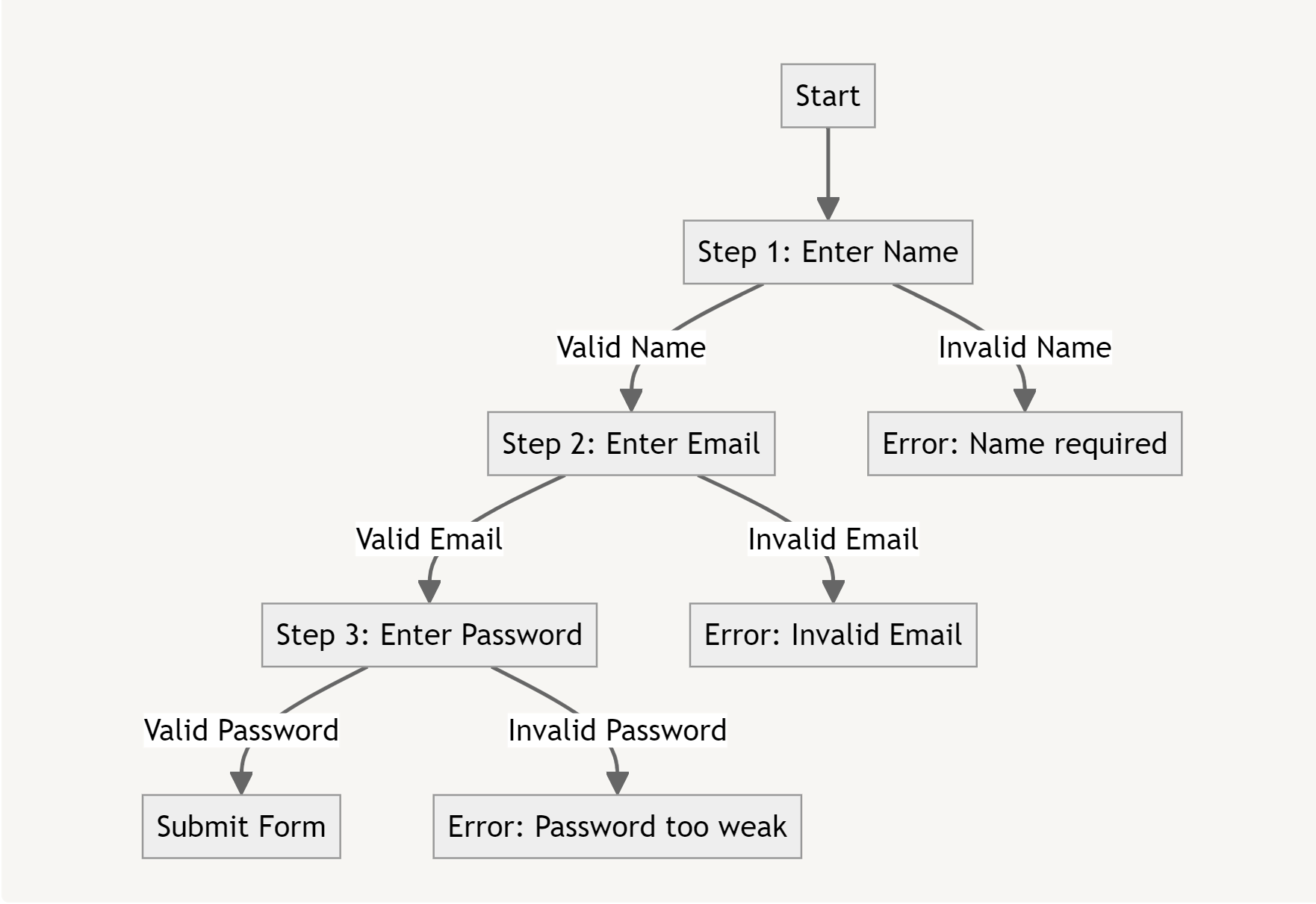
In the above illustration, the flow of a multi-step form is depicted, showing how users move from one step to the next. The validation checks at each step ensure that data is correctly entered before progressing, helping maintain data integrity throughout the process.
Progressive Validation
Progressive validation enhances user experience by displaying validation messages only after the user interacts with a form field or attempts to submit the form. This approach prevents overwhelming users with premature error messages as they type. By combining state management and validation logic, you can implement this user-friendly validation technique.
import React, { useState } from "react";

const validate = (name, value) => {
  switch (name) {
    case "username":
      return value.length >= 4 ? "" : "Username must be at least 4 characters long";
    case "email":
      return /^\\S+@\\S+\\.\\S+$/.test(value) ? "" : "Invalid email format";
    default:
      return "";
  }
};

const ProgressiveValidationForm = () => {
  const [values, setValues] = useState({ username: "", email: "" });
  const [errors, setErrors] = useState({ username: "", email: "" });
  const [touched, setTouched] = useState({ username: false, email: false });

  const handleChange = (event) => {
    const { name, value } = event.target;
    setValues({ ...values, [name]: value });
    if (touched[name]) {
      setErrors({ ...errors, [name]: validate(name, value) });
    }
  };

  const handleBlur = (event) => {
    const { name, value } = event.target;
    setTouched({ ...touched, [name]: true });
    setErrors({ ...errors, [name]: validate(name, value) });
  };

  const handleSubmit = (event) => {
    event.preventDefault();
    const newErrors = Object.keys(values).reduce((acc, field) => {
      acc[field] = validate(field, values[field]);
      return acc;
    }, {});
    setErrors(newErrors);

    if (Object.values(newErrors).every((error) => error === "")) {
      // Submit form
    }
  };

  return (
    <form onSubmit={handleSubmit}>
      <div>
        <label>Username:</label>
        <input name="username" value={values.username} onChange={handleChange} onBlur={handleBlur} />
        {errors.username && <p>{errors.username}</p>}
      </div>
      <div>
        <label>Email:</label>
        <input name="email" value={values.email} onChange={handleChange} onBlur={handleBlur} />
        {errors.email && <p>{errors.email}</p>}
      </div>
      <button type="submit">Submit</button>
    </form>
  );
};

export default ProgressiveValidationForm;
This setup allows for progressive validation, where error messages are only shown after a user has interacted with a field or tried to submit the form. This prevents the form from being cluttered with validation messages as the user types, offering a cleaner and less stressful user experience.
Validation Throttling and Debouncing
Validation throttling and debouncing are techniques used to optimize performance when validating fields that are dependent on user input, particularly in cases where validations trigger expensive operations like API calls. Debouncing the validation of a username field to check availability through an API.
import React, { useState } from "react";
import { debounce } from "lodash";

const validateUsername = async (username) => {
  const response = await fetch(`/api/check-username?username=${username}`);
  const data = await response.json();
  return data.available ? "" : "Username is already taken";
};

const debounceValidation = debounce(async (username, setError) => {
  const error = await validateUsername(username);
  setError(error);
}, 500);

const DebouncedValidationForm = () => {
  const [username, setUsername] = useState("");
  const [error, setError] = useState("");

  const handleChange = (event) => {
    const { value } = event.target;
    setUsername(value);
    debounceValidation(value, setError);
  };

  return (
    <form>
      <div>
        <label>Username:</label>
        <input name="username" value={username} onChange={handleChange} />
        {error && <p>{error}</p>}
      </div>
    </form>
  );
};

export default DebouncedValidationForm;
This example demonstrates how to use debouncing to delay the validation of a username field, preventing excessive API calls and improving form performance.
Enhancing UX
Real-Time Feedback
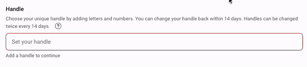
Real-time feedback enhances the user experience by providing instant validation messages as users type. This can be easily implemented by integrating validation logic with input event handlers, as demonstrated in the previous examples. The following illustration shows how YouTube implements this technique.
Dynamic Error Messages
Dynamic error messages provide context-specific feedback, enhancing clarity and guidance for users. Ensure your validation logic generates tailored error messages that accurately reflect specific input issues. For instance, you might incorporate a password strength checker to validate and provide feedback on the user's chosen password.

This example illustrates how dynamic messages adapt to user input. The visualization demonstrates the triggering of various error messages based on different input scenarios, offering clear and relevant guidance. This visual representation is essential for grasping how dynamic error messages improve form usability by providing precise, tailored feedback for specific user mistakes during form completion.
Accessibility Considerations
Ensuring accessibility in form validation is vital for creating inclusive experiences for all users, including those with disabilities. The following best practices help make forms more accessible:
- ARIA Roles: Use ARIA attributes such as
aria-invalidandaria-describedbyto clearly communicate the validation state of form fields to assistive technologies like screen readers. - Screen Reader Support: Error messages should be associated with the corresponding form fields so they can be announced to users relying on screen readers. Ensure that validation messages are clear and descriptive, helping users identify and correct errors efficiently.
- Keyboard Navigation: Ensure that the form is fully navigable using a keyboard, with logical tab order, clear focus indicators, and accessible form controls. This is crucial for users who cannot use a mouse and rely solely on keyboards to interact with forms.
Case Study: Complex Form Example
Consider a complex form that includes fields such as "Username," "Email," "Password," "Confirm Password," and "Account Type." This form illustrates how the validation techniques discussed earlier can be applied in a real-world scenario.
import React, { useState } from "react";
import useFormValidation from "./useFormValidation";

const validate = {
  username: (value) => value.length > 3 ? "" : "Username must be at least 4 characters",
  email: (value) => /^[^\\s@]+@[^\\s@]+\\.[^\\s@]+$/.test(value) ? "" : "Invalid email format",
  password: (value) => value.length >= 8 ? "" : "Password must be at least 8 characters",
  confirmPassword: (value, values) => value === values.password ? "" : "Passwords do not match",
};

const MyForm = () => {
  const { values, errors, handleChange } = useFormValidation(
    { username: "", email: "", password: "", confirmPassword: "" },
    validate
  );

  const handleSubmit = (event) => {
    event.preventDefault();
    // Submit form logic
  };

  return (
    <form onSubmit={handleSubmit}>
      <div>
        <label>Username:</label>
        <input name="username" value={values.username} onChange={handleChange} />
        {errors.username && <p>{errors.username}</p>}
      </div>
      <div>
        <label>Email:</label>
        <input name="email" value={values.email} onChange={handleChange} />
        {errors.email && <p>{errors.email}</p>}
      </div>
      <div>
        <label>Password:</label>
        <input name="password" type="password" value={values.password} onChange={handleChange} />
        {errors.password && <p>{errors.password}</p>}
      </div>
      <div>
        <label>Confirm Password:</label>
        <input name="confirmPassword" type="password" value={values.confirmPassword} onChange={handleChange} />
        {errors.confirmPassword && <p>{errors.confirmPassword}</p>}
      </div>
      <button type="submit">Submit</button>
    </form>
  );
};

export default MyForm;
Explanation:
Validation Logic: The validate object defines rules for each field:
- Username: Must be at least 4 characters.
- Email: Validates against a regular expression to check proper email formatting.
- Password: Must be at least 8 characters long.
- Confirm Password: Ensures it matches the value in the "Password" field.
useFormValidation Hook: This custom hook manages form values and errors, updating as the user types. It ensures validation logic is centralized and reusable, streamlining the form management process.
Form Submission: On submit, the form checks for any validation errors. If there are no errors, the form submission logic is executed; otherwise, it logs validation issues.
Testing and Debugging
Testing Custom Logic
Testing your custom form validation logic is essential to ensure it works as expected and handles edge cases. You can easily write unit tests for validation functions using a testing library like Jest.
import { validateEmail, validatePassword } from './validation';

test('validates email correctly', () => {
  expect(validateEmail('test@example.com')).toBe('');
  expect(validateEmail('invalid-email')).toBe('Invalid email format');
});

test('validates password correctly', () => {
  expect(validatePassword('Passw0rd')).toBe('');
  expect(validatePassword('short')).toBe('Password must be at least 8 characters');
});
Debugging Tips
To troubleshoot validation issues and ensure that your form behaves as expected, consider these debugging strategies:
Console Logs: Strategically place console.log statements in your code to trace the flow of data and see how validation errors are being handled. This can help identify where a validation function might be failing or whether the form state is being updated correctly.
console.log(values);  // Log current form values
console.log(errors);  // Log current validation errors
React DevTools: Use React DevTools to inspect the component's state and props during validation. This is particularly helpful in seeing how form values are updated in real-time and whether the validation logic is applied correctly.
Network Monitoring: For forms that rely on asynchronous validation, such as validating usernames against a server, use the Network tab in your browser's developer tools. This allows you to monitor API requests and responses, ensuring proper interaction between the client and server.
>> Read more:
- In-Depth Tutorial for Mastering React Error Boundaries
- Mastering Asynchronous Testing with React Testing Library
Conclusion
Custom form validation in React enables you to build robust, user-friendly forms that cater to complex requirements. By leveraging advanced patterns like dynamic schema validation, multi-step validation, and progressive validation, you can ensure that your forms not only meet user needs but also enhance the overall user experience. Integrating these techniques with good UX practices and thorough testing will result in forms that are both functional and accessible.
Implement these practices in your next React projects to see the difference in form usability and reliability. Happy coding!
>>> Follow and Contact Relia Software for more information!

- coding
- web development
- Web application Development