
React.js dominates front-end frameworks, allowing developers to easily build compelling and dynamic user experiences. Since React is a popular JavaScript framework, many reusable UI component libraries have been created. These pre-built and customizable component collections speed up development, promote code reuse, and deliver refined user experiences. This article covers 6 React component libraries that every developer should know.
>> Read more: 7 Best React State Management Libraries for Any Project Size
What is A React Component Library?
A React UI component library is a set of pre-built design elements (components) that developers can easily use in their React applications.
These libraries make UI development easier by providing well-designed, accessible components like tables, charts, modals, navigation bars, buttons, and more. They have visually appealing designs right out of the box, so you don’t have to build everything from scratch.
Many libraries also let you customize components to match your app’s style. For instance, you can simply add components like grids without writing any code. Instead, use a React component library to find the perfect grid component, customize it, and integrate it directly.
>> Read more about React.js:
- How to Choose the Best ReactJS Development Company?
- A Complete Guide to Hire Dedicated ReactJS Developers
Benefits and Challenges of Using React UI Component Libraries
Benefits
-
Speed: React UI component libraries boost the development process by implementing design features and functionalities simply than writing code from scratch.
-
Beautiful UI: Faster development doesn't mean sacrificing app aesthetics. UI libraries provide aesthetically-pleasing and ready-to-use components as application building blocks.
-
Easy to Use: CSS is difficult to understand and develop complicated user interfaces. React UI libraries let even beginners import and use elements without extensive CSS knowledge.
-
Consistency: Due to their cohesive style guide, React UI component libraries ensure a consistent look and feel across your application.
-
Performance: By eliminating the need to design components from scratch, React component libraries enhance development speed and let developers focus on implementing more complex features.
-
Customization: These libraries offer ready-to-use components, but they are often highly customizable to cater to your project's specific requirements.
-
Community Support: Popular libraries benefit from large communities that continuously develop them, fix bugs, and provide comprehensive documentation.
-
Support and Accessibility: Building components from scratch that cater to user accessibility needs and render flawlessly across various devices can be challenging. React UI libraries address these concerns and provide backward browser compatibility.
-
Cross-Browser Compatibility: Developing CSS compatible with all browsers can be difficult, especially when utilizing new CSS properties or browser features. This can negatively impact user experience. React UI libraries ensure cross-browser compatibility, guaranteeing your application functions flawlessly on all modern browsers.
Challenges
Misunderstood Philosophy
Each UI component has its own ideology. You must comprehend this to implement it properly. For instance, some allow customisation of theming. Others may ask you to follow their designs and implement features. Choose the correct approach for the use case.
Inconsistent Use
Developers must utilize React UI component libraries consistently to learn how they function and how to use them. Switching component libraries takes time, therefore sticking to one is advised. This is true for new developers who need time to learn these libraries because they have never used them.
Predetermined Choices
React UI library selection for your projects must be flexible. The use case determines which library is best for your project. Projects may not suit all libraries. Some libraries may focus on dashboards. Others may construct static pages. UI component selection cannot be rigid.
When To Use A React Component Library?
You should choose the best component library for React based on the project. Use UI components when functionality is more important than appearance. Below are some common UI component library use cases.
-
Proof of Concept: Since implementation is faster, UI component libraries allow faster prototyping. They help build user interfaces and test functionality with minimal resources.
-
No-Designer Projects: You may have an intuitive design idea but lack design knowledge. You can utilize component libraries to create stunning layouts and rich user experiences.
-
Administrative Panels: Component libraries help create functional and understandable user interfaces. You may implement standard back-office apps with these libraries.
-
Aligned Interest Projects: You must ensure that all project participants are on the same page. After the designer and client agree on the library, discuss its benefits and downsides before proceeding. Start by explaining library functions to handle client expectations.
>> Read more about UI/UX design:
- UI/UX Design: What's The Difference Between UI and UX?
- The UX Design Process: 7 Steps for UX Designers
Top 6 React UI Component Libraries for Your Projects
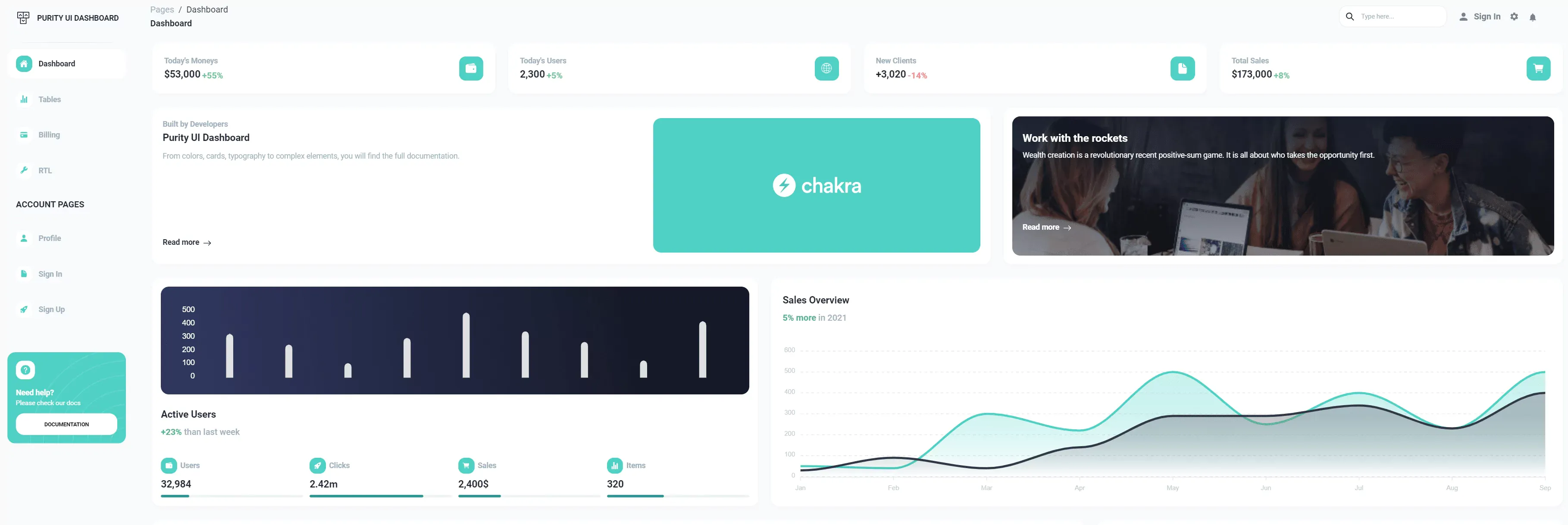
Material UI (MUI)
Link GitHub: https://github.com/mui/material-ui
Material UI is a popular React UI library that uses Google's Material Design visual language. This paves the way for developers to create professional-looking web applications that adhere to modern design standards.
You can utilize this React component library directly or bring your design system to their production-ready components. This platform lets you build faster without losing control or flexibility. It will help you create stunning designs to please customers.
MUI React component library is undeniably one of the most influential and widely used libraries with:
-
3+ million downloads/week on NPM;
-
90,000+ stars on GitHub;
-
17,000+ followers on Twitter;
-
2,4000+ open-source contributors.
Key Features:
-
Typography: MUI uses its typography principles to style all text elements consistently.
-
Icons: MUI offers a selection of icons for your application's visual needs. Import icons from
@mui/icons-materialpackage. -
Form Controls: MUI makes designing user-friendly forms easy with many form components such as text fields, checkboxes, radio buttons, and choose menus.
-
Themes: MUI allows users to customize their theme toggling with support for dark and bright modes. ThemeProvider lets you personalize the theme.
Benefits:
-
Aesthetics: MUI offers trendy, elegant designs. They use their intuitive design rules to ensure top-notch aesthetics.
-
Customization: MUI allows developers to quickly customize components and themes to their liking.
-
Accessibility: MUI prioritizes accessibility. The default library access makes it easy to construct functional apps for everyone.
-
Responsive Design: MUI components are responsive to ensure your apps run on different screen sizes and devices.
-
Production-Ready Gorgeous Components: Use powerful and beautiful MUI components like buttons, typography, menus, alerts, tables, and more to create the greatest design. You may modify them too.
-
Unparalleled Documentation: MUI has comprehensive documentation developed and managed by 3000+ contributors. Thus, learning how to use this tool is simple. If you have questions, this documentation can help.
Installation:
// with npm
npm install @material-ui/core

// with yarn
yarn add @material-ui/core
Usage:
import React from "react";
import ReactDOM from "react-dom";
import Button from "@material-ui/core/Button";

function App() {
  return (
    <Button variant="contained" color="primary">
      Hello World
    </Button>
  );
}

ReactDOM.render(<App />, document.querySelector("#app"));
>> You may consider: Top 10 Best Open Source React & React Native IDEs in 2023
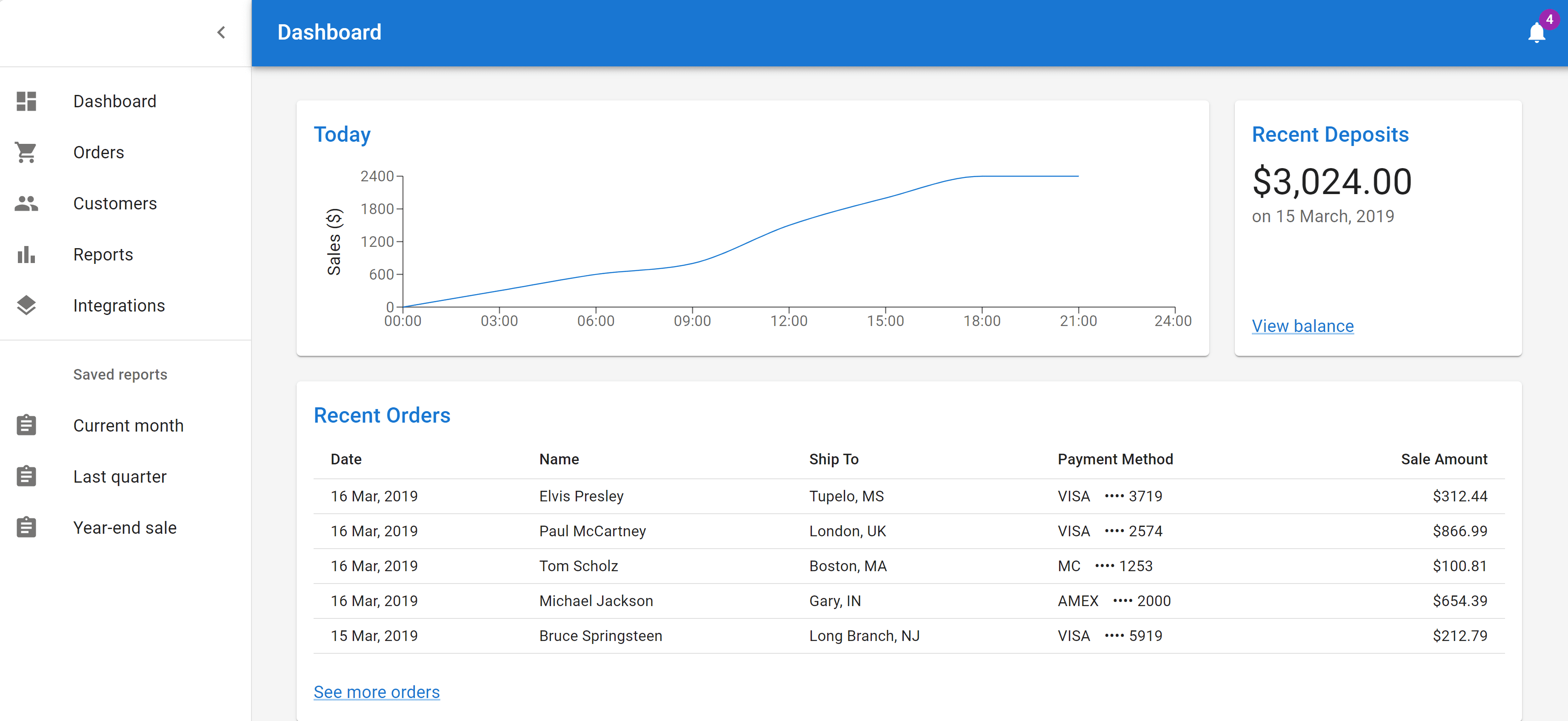
Chakra UI
Link GitHub: https://github.com/chakra-ui/chakra-ui
Chakra UI, created by Segun Adebayo in 2019, emphasizes simplicity, modularity, and accessibility.
The React component library Chakra UI provides developers with extensive hooks and components for constructing accessible, responsive web apps. The large range of custom hooks that abstract away typical UI logic like animation, disclosure, and more makes Chakra UI powerful. These hooks simplify complex interfaces.
Excellent offerings and performance are making Chakra UI popular with:
-
1.3 million monthly downloads;
-
19,700 GitHub stars;
-
7,400 Discord members;
-
10,000 core contributors.
Key Features:
-
Style Props: Chakra UI styles components with style props.
-
Icons: Use icons from
@chakra-ui/iconspackage in your app with Chakra UI. -
Form Controls: Chakra UI provides Textarea, Input, and Checkbox components with built-in validations and form controls like isDisabled, isInvalid, etc.
-
Notification: Toast and Alert notify users of state changes in Chakra UI.
-
Default Theme: Chakra UI supports dark mode. The theme color can be adjusted to your liking.
Benefits:
-
Simplicity: The Chakra UI is easy to use and comprehend, enabling developers to reduce learning curve and focus on development.
-
Accessibility: Chakra UI components meet WAI-ARIA standards, making apps easily accessible.
-
Customization: Style props can modify all component styles. The component's colors and spacing are freely customizable.
-
Important UI Components: Chakra UI provides customisable React components for web projects including buttons, menus, modals, and forms. Variations serve different purposes.
-
Seamless Form Integrations: Chakra UI's form components work well with React Hook Form, Formik, and Final Form. This makes forms adaptable and accessible.
-
Coding Collaboration Tools: Chakra UI Figma design kits ensure design-to-code fidelity between designers and developers.
-
Lightweight and Reusable Logic: Built-in performance measures, such as automated code splitting, reduce bundle sizes. Composable component architecture maximizes logic reuse across an application.
-
Documentation: Comprehensive, well-written documentation includes usage recommendations and examples.
-
Developer Community: Active and growing developer community. Beyond the core team, approximately 100 developers are contributing to the project, so this React component library will have extensive resources and upgrades.
Installation:
// with npm
npm i @chakra-ui/react @emotion/react@^11 @emotion/styled@^11 framer-motion@^4

// with yarn
yarn add @chakra-ui/react @emotion/react@^11 @emotion/styled@^11 framer-motion@^4
Usage:
import * as React from "react";

//import ChakraProvider component
import { ChakraProvider } from "@chakra-ui/react";

function App({ Component }) {
  // 2. Use at the root of your app
  return (
    <ChakraProvider>
      <Component />
    </ChakraProvider>
  );
}
Ant Design (AntD)
Link GitHub: https://github.com/ant-design/ant-design
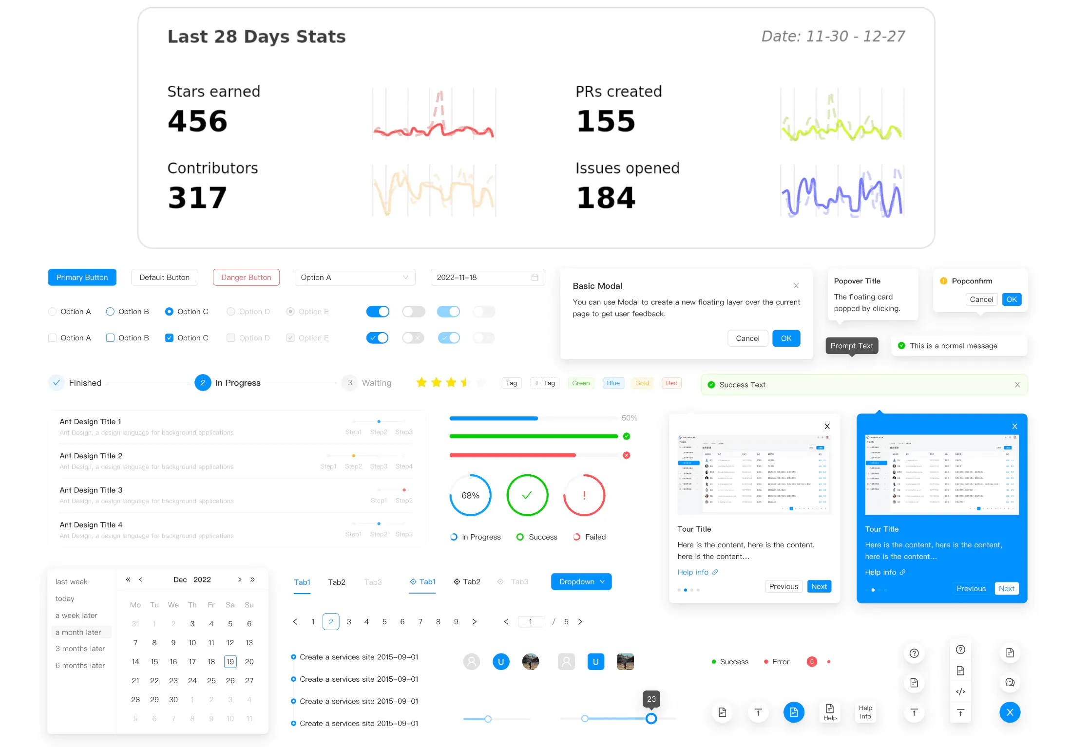
Ant Design is a React UI component library for building enterprise-level web application interfaces. Its proprietary design language is heavily utilized in Ant Financial's product line.
Ant Design has 50+ common and unique components across categories to meet most UI demands. TypeScript-built components are updated frequently with weekly-added new features and enhancements. Ant Design provides customized, simple React components for scalable enterprise apps.
>> Read more about TypeScript:
- Mastering Utility Types in TypeScript For Better Code
-
A Complete TypeScript Decorators Tutorial With Real Example
Teams designing complicated business tools and data-heavy experiences will love its wide component selection, robust theming, and active maintenance. Alibaba, Baidu, Tencent, and others use this tool.
As an enterprise solution, Ant Design provides rich documentation, best practices, and professional support. In January 2023, it has over:
-
83,000 stars on GitHub;
-
1 million weekly downloads on NPM.
Key Features:
-
Internationalization Support: Ant Design offers built-in internationalization for global users and supports dozens of languages.
-
Theme Customization: Ant Design lets you integrate your bright and dark themes and choose your theme mode.
-
Icons: Ant Design's
@ant-design/iconspackage has a variety of icons. -
Navigation Menus: Menus, sidebars, etc. are in the library.
-
Data Visualization: Ant Design offers data visualization components such as charts and graphs. They are provided in the
@ant-design/chartspackage. -
Date Pickers and Calendar: Customizable date, time, and calendar pickers are also available.
-
Popovers and Tooltips: display context-sensitive information.
Benefits:
-
Customization: You can personalize it to meet your desired design by theming it and using the customization controls to alter the font, style, and color scheme.
-
Accessibility: It adheres to accessibility best practices means, so you can create for any kind of user.
-
Form Controls: Its powerful form validation feature makes it easy to streamline your form validation logic.
-
Aesthetic Minimalism: Components offer a clean, lightweight, simple visual design for uncomplicated interfaces out of the box.
-
Community Support: The library is supported by a big and vibrant community of developers that work hard to keep it running well and make new and better additions. Articles are also available to assist you with your construction.
-
Enterprise-Grade: It's built for enterprise apps and gives them a well-designed and professional look.
-
Complete Documentation and Access: Comprehensive documentation, best practices, API references, and enterprise support. Uses inclusive design and accessibility standards for interfaces usable by all.
Installation:
// with npm
npm install antd

// with yarn
yarn add antd
Usage:
//import style sheets manually using the below import statement.
import 'antd/dist/antd.css'; // or 'antd/dist/antd.less'

import { DatePicker } from 'antd';

ReactDOM.render(<DatePicker />, mountNode);
React–Bootstrap
Link GitHub: https://github.com/react-bootstrap/react-bootstrap
Mark Otto and Jacob Thornton at Twitter created Bootstrap, originally called Twitter Blueprint. Bootstrap is two years older than React. Bootstrap, an open-source CSS framework for building responsive, mobile-first front-end websites and apps, is growing in popularity.
React-Bootstrap differs a bit from Bootstrap yet is similar. React-Bootstrap replaces Bootstrap JavaScript and builds each component from scratch as a React component without unneeded dependencies like jQuery.
There are 27 consistent, core bootstrap-compatible components that can be simply produced. React-Bootstrap has:
-
Around 21, GitHub stars on GitHub.
-
1.3+ million weekly downloads on NPM.
Key Features:
-
Bootstrap Components: React-Bootstrap features a wide variety of Bootstrap components, including buttons, forms, navigation, modals, and more.
-
Theme: Bootstrap SASS variables offer theme support.
-
Accessibility: All components are accessible and follow accessibility guidelines.
-
Forms: React-Bootstrap forms allow form validation.
-
React Hooks Support: React-Bootstrap components support React hooks. The state can be passed as props within the React-Bootstrap component, simplifying state and effect management.
Benefits:
-
Responsive Design: Web apps that use React-Bootstrap grid framework are responsive and operate well on many screen sizes and devices. It is responsive and Flexbox-built.
-
Lightweight: Importing only the components you need instead of the whole library reduces the volume of application code. It will also save time.
-
Customization: React-Bootstrap lets developers tweak and expand components to meet app designs.
-
Community Support: React-Bootstrap offers extensive library documentation. Online tutorials and resources due to the vast active community will help you use the library.
Installation:
// with npm
npm install react-bootstrap bootstrap

// with yarn
yarn add react-bootstrap bootstrap
Usage:
import React, { useState } from "react";

import Jumbotron from "react-bootstrap/Jumbotron";
import Toast from "react-bootstrap/Toast";
import Container from "react-bootstrap/Container";
import Button from "react-bootstrap/Button";

import "./App.css";

const ExampleToast = ({ children }) => {
  const [show, toggleShow] = useState(true);

  return (
    <>
      {!show && <Button onclick={() => toggleShow(true)}>Show Toast</Button>}
      <Toast show={show} onclose={() => toggleShow(false)}>
        <Toast.Header>
          <strong className="mr-auto">React-Bootstrap</strong>
        </Toast.Header>
        <Toast.Body>{children}</Toast.Body>
      </Toast>
    </>
  );
};

const App = () => (
  <Container className="p-3">
    <Jumbotron>
      <h1 className="header">Welcome To React-Bootstrap</h1>
      <ExampleToast>
        We now have Toasts
        <span role="img" aria-label="tada"></span>
      </ExampleToast>
    </Jumbotron>
  </Container>
);

export default App;
Blueprint UI
Link GitHub: https://github.com/palantir/blueprint
Blueprint UI, an open-source project by Palantir Technologies, provides high-quality UI components. Blueprint is a React-based UI toolkit for designing complicated, data-dense desktop interfaces. If you want to build desktop apps, this React component library is ideal.
The core Blueprint NPM package includes 30+ familiar and unique React components such as Button, Card, Menu, Form Group, File Input, etc.
Datetime and Datetime2 for dates, Icons with over 300 vector UI icons, Select and Table for items selection in a list, and interactive spreadsheet interfaces building are among Blueprint's other NPM packages.
Blueprint UI is quite popular with:
-
20,000+ stars on GitHub;
-
190,000+ weekly downloads on NPM.
Key Features:
-
Icons: Blueprint UI's
@blueprintjs/iconspackage offers over 500 vector icons in 2 sizes (16px and 20px) and 2 formats (SVG and font). These icons are easy to utilize in React apps. -
Accessibility: Blueprint includes accessible components and ARIA attributes and roles.
-
Form Controls: Form items are controlled and validated.
-
Overlays: Blueprint overlays like Toast, Tooltip, Alert, Popovers, and others let developers display context-sensitive information and error messages.
-
DateTime: Blueprint enables developers to design time and date interactivity with date picker, range picker, and time picker.
-
Internationalization: Blueprint UI simplifies internationalization, designing apps for different languages and areas. Hebrew and Arabic are written right-to-left using .bp5-rtl.
Pixel streaming, capturing mixed realities, creating magic leaps, multi-user editing, panoramic capture, chaos destruction, and more are other valuable features.
Benefits:
-
Developer-friendly: Blueprint's sophisticated UI lets developers design complicated, feature-rich web interfaces with many components and modules. The manual documentation is straightforward. Example-based explanations of concepts and tutorials.
-
Performance: Blueprint is performance-focused.
-
Customization: CSS lets developers easily customize each component for their projects. Library typography, color schemes, and styles can be changed.
-
Accessibility: Blueprint is one of the most accessible libraries. Installing it with npm on the command prompt is simple. Blueprint follows accessibility standards and principles to prioritize accessibility.
-
Theme: Although it lacks a wide selection of themes, you do receive two distinct themes – dark and light mode – along with other design components like color schemes, classes, typography, etc.
-
Real-time compositing: The Composer tool lets you do real-time compositing and improve your app's user interface.
Installation:
// with npm
npm install @blueprintjs/core

// with yarn
yarn add @blueprintjs/core
Usage:
import { Button } from "@blueprintjs/core";

<Button intent="success" text="button content" onClick={incrementCounter} />
PrimeReact
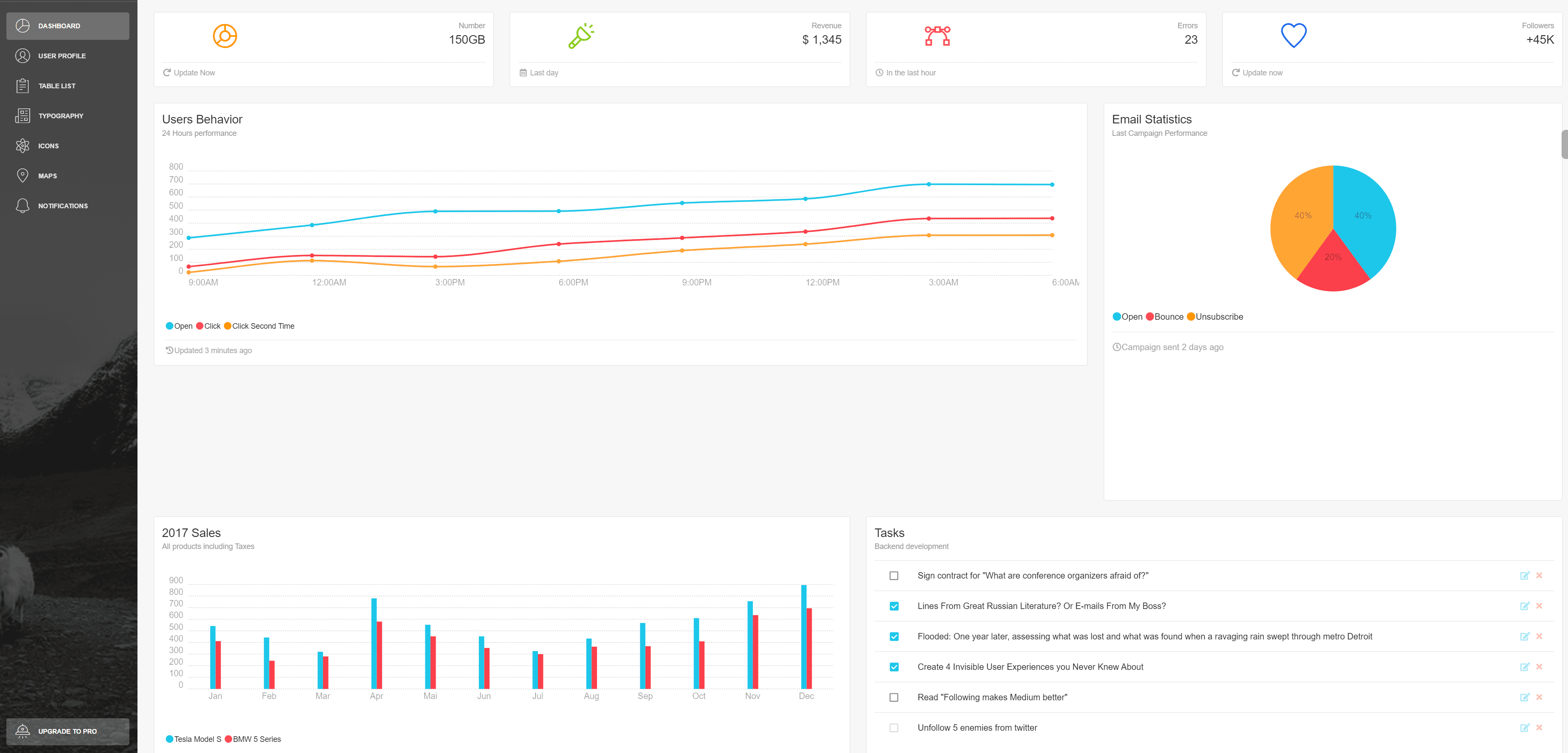
Link GitHub: https://github.com/primefaces/primereact
PrimeReact is an extensive React component library utilized by global corporations such as Mercedes, ebay, Nvidia, Intel, American Express, and Lufthansa, etc. The app gained popularity between 2022 and 2023 (from 39.5k to 78.7k weekly downloads).
Over 90 React components are ready to use in your app. TreeSelect, Organisation chart, Terminal, and Captcha are unique components it offers. PrimeReact provides customisable templates and 280+ copy-and-paste UI elements to swiftly build any interface.
Its design-agnostic infrastructure lets you use the look-and-feel of popular libraries like Material and Bootstrap or construct your own. The GUI-based Theme Designer includes 500+ variables to customize.
They offer help and reply to feature or enhancement requests within one business day.
Key Features:
-
Data Tables: Sorting, filtering, and pagination are available in PrimeReact data tables.
-
Form Inputs: Pre-validated checkboxes, radio buttons, and date pickers are PrimeReact form inputs.
-
Charts: Customisable bar, line, and pie charts are available in PrimeReact.
-
Navigation Menus: PrimeReact supports breadcrumbs and tab menus.
-
Rich Text Editor: PrimeReact's rich text editor integrates into content and text formatting apps.
-
Lazy Loading: PrimeReact components can be lazy-loaded to boost performance.
-
Widgets: The PrimeReact library has sliders, progress bars, and badges.
-
Icons: PrimeReact packs its icons in PrimeIcons.
-
Hooks: Hooks can be imported and used from the primereact/hooks package by PrimeReact support.
-
Overlay: To display context-sensitive information and modal messages, PrimeReact offers overlay tooltips and popup components.
Benefits:
-
Components: PrimeReact offers from basic to complex components like input fields, buttons, charts, and media carousels.
-
Templates: PrimeReact provides customisable project templates. Your app can also use dozens of intuitive icons from them.
-
Theme: Primreact's theme lets developers customise component appearance and behaviour. It comes with a variety of themes from which you can select.
-
Responsive: PrimeReact is responsive out-of-the-box, helping your app seem good on all screen sizes.
-
Accessibility: PrimeReact respects accessibility standards to give you components you can use to build apps for everyone.
Installation:
// with npm
npm install primereact

// with yarn
yarn add primereact
Usage:
//import style sheets manually using the below import statement.
import "primereact/resources/themes/lara-light-cyan/theme.css";

import { Button } from "primereact/button";

function MyButton() {
  return (
    <>
      <Button icon="pi pi-check" />

      <Button label="Submit" icon="pi pi-check" />

      <Button label="Submit" icon="pi pi-check" iconPos="right" />
    </>
  );
}
Factors To Consider When Choosing A React Component Library
Consider several criteria while picking a React component library, including:
-
Project Requirements: Can the library deliver the components and functionality your project needs? Take into account your project's size, type, and requirements. For instance, a large enterprise app requires a high complexity-supporting library.
-
Longevity: Is the library updated often? Will it be supported later? Choosing a well-maintained library will help you avoid library migration.
-
Customizability: Can you customize the library to match your brand's design? Some libraries offer more customization. Choose a customizable library if you have design requirements.
-
Accessibility: The library should follow accessibility best practices and guidelines like WAI-ARIA. This ensures components function well with screen readers.
-
Community: Does the library have a large, engaged community? A broad community can assist you solve challenges.
-
Documentation: Does the library have good documentation? Learning how to utilize the library and solve difficulties is easier with good documentation.
-
Performance: How well does the library function? When compared to one another, some libraries perform better. Pick a React component library with a reputation for speed and responsiveness if you're looking for a highly performant one.
Conclusion
Before settling on a React component library, give some thought to how well it fits your project's needs, design objectives, and technical limitations. Development time, maintenance ease, and the user experience as a whole are all affected by your choice.
Here we took a look at a number of well-known React UI design kits and outlined their key features and advantages. With this newfound understanding, you may confidently choose a suitable React component library for your next React project! You should always consider the project's specific requirements while making a decision.
>>> Follow and Contact Relia Software for more information!

- coding
- Mobile App Development
- Web application Development