In web design, the responsive design method uses one fluid and flexible layout, while adaptive design uses several static layouts for selected screen conditions. When people compare adaptive vs responsive design, they are usually trying to answer one practical question: which approach will help a website work better across different screens without creating extra problems later?
In this article, we will explain the difference between adaptive and responsive web design in a simple way, compare their key characteristics, and show when each method works best. You will also find a practical checklist to help you decide which one fits your website, your users, and your team more clearly.
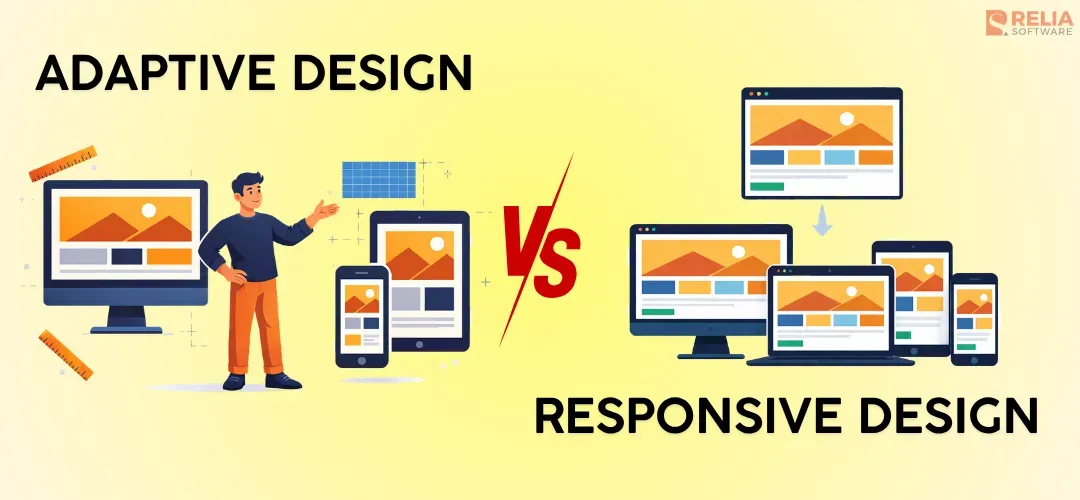
Adaptive vs Responsive Web Design: Simple Definition
What is Adaptive Design?
Adaptive design is an approach that developers use to build a website with several preset layouts for selected screen sizes or device types. Imagine a team builds one layout for desktop, one for tablet, and one for mobile. When a user opens the site, the system tries to match that user to one of those versions. The layout does not keep shifting little by little at every screen width, but between planned versions.
Core Principles:
- Uses several preset layouts
- Each layout is made for a specific screen width or device group
- The site chooses the closest matching version
- Gives more control over how each version looks
- Often needs more design, testing, and maintenance work
What is Responsive Design?
Responsive web design is an approach where the site uses one flexible layout system that adjusts across different screen sizes. Instead of switching between separate versions, the layout stretches, shrinks, and rearranges itself to fit different screens.
Core Principles:
- Uses one flexible layout system
- Adjusts continuously across different screen sizes
- Often relies on fluid grids, flexible images, and media queries
- Keeps the same core content and structure across devices
- Usually easier to maintain over time than multiple fixed layouts
In short, adaptive design uses a few fixed layouts prepared to serve the devices or screens that fit best, while responsive design uses one flexible layout that changes across screen sizes.
Key Differences Between Adaptive and Responsive Web Design
|
Aspects |
Adaptive design |
Responsive design |
|
Layout Behavior |
A few statistic layouts for selected screen sizes |
One fluid layout across screen sizes |
|
Design Control |
More control over each screen layout |
More flexible across screen sizes |
|
Development & Maintenance Effort |
More separate layout planning, build and maintenance works |
More careful, flexible layout setup, and easier to manage |
|
Performance |
Load faster on selected screens |
Load a little longer, depending on implementation quality |
|
Testing Complexity |
More version-based testing |
More screen-width testing |
|
Scalability |
Less flexible for new devices |
More flexible |
|
Content Consistency |
Vary more by layout |
Usually stays more consistent across devices |
|
Best fit |
Redesigns or strict layout needs |
New builds and long-term flexibility |
After the quick overview, it is now necessary to look at each difference more closely, making it easier to see which approach fits your project better.
Layout Behavior
Adaptive design uses a few static layouts prepared in advance for selected screen sizes. The team builds a separate layout for each important screen range, and the website loads the version that best fits the user’s screen. Because of that, the layout changes by switching between preset versions at set breakpoints, rather than adjusting smoothly across every screen width.
Responsive design uses one fluid layout that adjusts across screen widths. Instead of loading separate versions, the same layout stretches, shrinks, and rearranges itself as the available space changes, so columns may stack, images may scale, and menus may shift into a different form. Responsive design usually feels smoother across different screen sizes rather than jumping between fixed layouts.
Design Control
Adaptive design gives stronger control over each target layout. Since the team prepares each version separately, they can decide exactly how the mobile layout should look, how the tablet layout should look, and how the desktop layout should look. This makes it easier to create bigger visual differences between screen sizes.
Responsive design gives more flexible control instead of fixed control. The team still decides breakpoints and layout rules, but they are building one system that needs to work across many widths. That means it can handle more variation, though with less fixed control over each screen range.
Breakpoints
Adaptive design uses breakpoints as decision points for loading a different layout. Once the screen falls into a certain range, the website shows the preset version made for that range. Because of that, the change is more noticeable. The structure, spacing, or navigation can shift from one fixed setup to another rather than adjusting little by little.
Responsive design also uses breakpoints, but the purpose is to determine when to switch layouts and their styles. The process usually happens through CSS media queries, which respond to conditions such as screen width, height, or orientation. So rather than switching to a new version, the same layout keeps adjusting its spacing, column structure, image size, or navigation style as the screen changes.
Development & Maintenance Effort
Adaptive design often needs more work both during development and after launch because the team is building and managing several layout versions. Even when some code is shared, each layout still needs its own design attention, front-end work, and later updates. Every change may need to be checked across multiple versions, which increases effort and makes inconsistency more likely.
Responsive design often needs more careful planning at the start because the team has to build one flexible system that can work well across different screen sizes. They need to think through grids, spacing, media behavior, and how elements should move as the screen changes. However, once that system is in place, it is usually easier to maintain because most updates happen inside the same layout structure instead of across several separate versions.
>> Read more: How To Choose The Best Responsive Website Builder Tool?
Performance
Adaptive design can load faster on selected screens when each layout is optimized well. Since each version is planned for a specific screen range, the team may be able to simplify certain layouts, reduce some visual load, or shape the experience more directly for that screen range. In some cases, adaptive design can help the site feel lighter and more focused.
Responsive design usually needs more upfront planning for breakpoints, media queries, and layout behavior across different screen widths, so it can take a little bit longer to load. However, when the team manages the assets and priorities well, responsive design can still load quickly and provide a smooth experience across devices.
Testing Complexity
Adaptive design usually needs more version-based testing. Because the site may serve different layouts for different conditions, the team has to check whether the right layout appears at the right time and that each version works well on the screens it was built for. If the layouts differ a lot, the test workload can become heavier.
Responsive design usually needs broader layout testing with screen-width testing inside one system. The team is now checking how the flexible layout behaves as space changes, rather than checking several separate layout versions.
In short, adaptive design often increases testing for each version, while responsive design often increases behavior-based testing. Both need careful QA, but the type of testing is a little different.
Scalability to New Devices
Adaptive design is less flexible when new screen sizes become important later. Since it depends on prepared layouts, the team may need to add new versions or adjust old ones when device patterns change. If the site was planned around a limited set of screens, it may not handle newer sizes as smoothly without extra work.
Responsive design usually scales better to new devices because the layout was built to flex across a wider range of widths from the start. New screen sizes are still tested and refined when needed, but the system is generally better prepared for variation, making responsive design a safer long-term choice for many modern websites.
Content Consistency
Adaptive design can create more variation in content presentation because each layout is prepared separately. A team chooses to move sections, simplify navigation, hide certain elements, or change the order of content between layouts, which is useful in some cases, especially when mobile priorities are very different, but this design method can also lead to a less consistent experience if not handled carefully.
Responsive design usually keeps content more consistent when the page structure often stays closer to the same core experience, even though the layout changes shape. Content blocks may stack differently or appear in a tighter form, but the overall structure usually stays more aligned from one screen to another. Therefore, responsive design usually supports stronger consistency across devices.
When To Use Adaptive Design?
You should use adaptive design when the project needs control first, such as:
Legacy website redesigns
Adaptive design is often useful when a business is updating an older website that was built around fixed desktop layouts. In this case, rebuilding the whole site into a fully flexible system may take too much time, cost, or technical effort. Therefore, designing extra layouts for added devices can be a more practical way to improve the experience on key screens without rebuilding everything from the ground up.
Strict layout control sites
Some websites need tighter control over how each version looks. These kinds of sites can happen with branded campaign pages, landing pages, or special product pages where spacing, content order, and visual structure matter a lot. Adaptive design works well here because the team can shape each layout more directly instead of depending on one flexible layout to handle every case.
Projects with a limited set of target devices
Adaptive design also makes sense when the audience uses a narrower range of screen sizes. If the business already knows that most users come from a few common devices or screen groups, building around those conditions can be more practical than trying to support every possible width in the same flexible system.
For example, adaptive design can be a strong option for dashboards or internal tools when desktop use is still the main focus and mobile access is more limited. The team may choose to create a full desktop layout and a simplified mobile version for only the most important tasks, which is often easier than forcing a dense interface to behave smoothly across every screen width.
Apps with controlled mobile flow
Some websites depend heavily on a controlled mobile journey, which often happens in booking flows, lead forms, checkout steps, or pages where the business wants users to follow a clear sequence. Adaptive design works well in these cases because the mobile layout can be planned more carefully, with stronger control over buttons, spacing, navigation, and content order.

When To Use Responsive Web Design?
New websites
Responsive web design is usually the best starting point for a new website. New projects often need to support many devices from day one, and it takes time and costs more to design for the screen sizes users will have. A responsive layout gives the team one flexible foundation that can adjust across phones, tablets, laptops, and larger screens without needing a separate version for each one.
Content-heavy websites
Websites with a lot of content, such as blogs, service pages, media sites, resource hubs, and company websites, often need repeated updates, new sections, and layout consistency across many pages. A responsive system makes that easier because content can flow inside one layout structure instead of being managed across several preset versions.
Projects that have many screen sizes
If a website serves many types of users on many types of screens, responsive design is usually the safer choice because it handles variation better and gives the site more room to stay usable as device patterns change. It is important for public-facing websites where traffic can come from many phone sizes, tablets, office monitors, personal laptops, and everything in between.
Easier long-term maintenance
Since the site runs on one flexible layout system when using responsive design, updates are usually easier to manage than in a setup with several fixed versions, which also reduces maintenance work later for developers. Therefore, responsive web design matters in this situation, especially when new features, new content blocks, or design refreshes are likely to happen over time.
Stronger consistency across devices
Responsive design is also a better fit when the business wants users to get the same core experience on desktop, tablet, and mobile. The layout may shift to fit the screen, but the overall structure usually stays more aligned, helping when consistency matters for branding, content clarity, and easier user movement between devices.

A Simple Checklist To Decide Which One To Use
Still struggling with your decision? Here, we give you the checklist below to help you make your choice in a practical way. By answering all the questions in the map below, you can have an overview and the right direction for your web project.
Questions About Users
Start with the people who will use the website. The target users’ screen habits matter a lot because the right design method depends on whether you are building for a narrow device range or a wide mix of devices.
Ask yourself:
- Do most users come from a small set of screen sizes, or from many different devices?
- Is mobile traffic very different from desktop traffic?
- Do mobile users need a very specific path, such as booking, buying, or submitting a form?
- Will users switch between phone, tablet, and desktop often?
- Does the website need to feel similar across devices, or can the experience change more from one screen to another?
If most users come from a few known screen types and the mobile experience needs tighter control, adaptive design may work well. If users come from many devices and need a smoother experience across all of them, responsive web design is usually the better fit.
Questions About Content
Next, think about the content itself. Some websites have simple pages with a few fixed goals. Others grow over time and need many sections, many updates, and a more flexible layout.
Consider:
- Is the website small and focused, or large and growing?
- Will pages follow a similar structure, or do some layouts need to be very different?
- Does the content need to stay mostly the same across devices?
- Do you want to change the order or presentation of content more heavily on mobile?
- Will the site include blogs, landing pages, service pages, product pages, or other content types that may expand later?
If the content is more controlled and some screen versions need clearly different layouts, adaptive design may make more sense. If the content needs to flow across many screens and grow more easily over time, responsive web design is usually the stronger choice.
Questions About Budget and Team
The right design method also depends on what your team can realistically build and maintain. A method may sound good in theory, but it still has to match your budget, workflow, and technical support.
Ask your team about:
- Can your team design, build, and test several layout versions well?
- Do you have enough time to manage more screen-specific layout work?
- Is the team more comfortable building one flexible layout system?
- Will future updates be handled by a strong internal team or a smaller team with limited time?
- Is the project a full rebuild, or a more limited redesign?
Then, if your answer is more about building and managing several planned layouts, adaptive design can work well. When your team wants a simpler long-term workflow with one flexible system, responsive web design is often the safer choice.
Questions About Future Maintenance
A website is rarely finished after launch. Pages change, features get added, content grows, and user needs shift. That is why long-term maintenance should be part of the decision from the start.
Ask yourself:
- How often will the website be updated?
- Will new sections or page types be added later?
- Do you want to reduce layout management over time?
- Is long-term flexibility more important than strict short-term control?
- Will the website need to handle new screen sizes more smoothly in the future?
Then:
- When the project can support more layout management later and still benefits from tighter screen-by-screen control, let’s choose adaptive design.
- When the site needs easier updates and broader long-term flexibility, choose responsive web design instead.
FAQs
1. Is responsive web design better for SEO?
It is often the safer choice because it usually keeps one consistent experience across devices. Still, SEO depends more on overall site quality, mobile usability, and performance than on the design type alone.
2. Is adaptive design outdated?
No. It is still useful for some projects, especially older websites or cases that need stricter layout control.
3. Can a website use both adaptive and responsive ideas?
Yes. You can use responsive for almost all pages on the site, but use adaptive ideas in specific parts where the team wants more control.
For example, a website can use responsive design for the main page layout, so the header, text, images, and content sections resize smoothly on different screens. At the same time, it can use adaptive design for the navigation menu by showing one menu layout on desktop and a different preset menu layout on mobile.
4. Is adaptive design better than responsive design?
Not always. Adaptive design is better when a project needs tighter control over selected screen sizes, while responsive design is usually better for broader flexibility and easier maintenance.
Conclusion
In simple terms, adaptive design uses a few fixed layouts for selected screen sizes, while responsive design uses one flexible layout across different screens. The right method choice depends on your project requirements. If you need more control over each device version, adaptive design may work well. If you want a more flexible and easier-to-manage solution for the long term, choose a responsive one.
>>> Follow and Contact Relia Software for more information!

- Designing an application
- Web application Development
- development
- web development