Ensuring compatibility across all screen sizes is essential in today's digital age. With the vast array of devices and resolutions, creating individual versions for each is impractical. Therefore, it is time for responsive web design to become popular. This approach allows websites to adapt seamlessly to any device, offering a consistent user experience.
This post will explain the details of responsive web design (RWD) including its definition, guidelines for implementation, best practices, benefits, and challenges, helping web designers and developers stay ahead in an ever-evolving landscape.
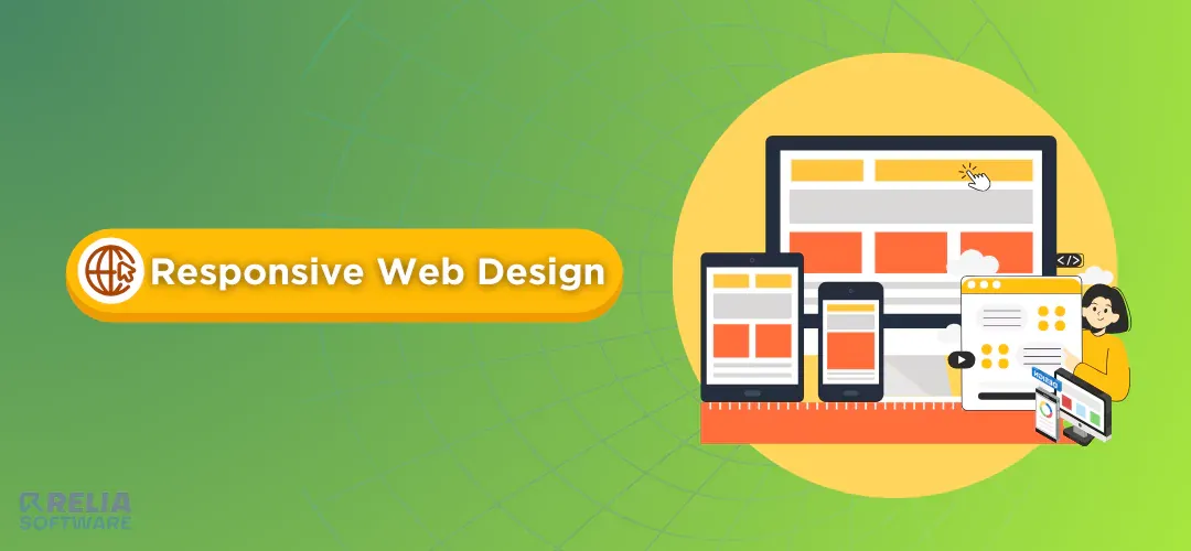
What is Responsive Web Design (RWD)?
Responsive web design (RWD) is an approach to web development where websites automatically adjust to any screen size. This ensures a great user experience on desktops, laptops, tablets, and smartphones.
Consider a website that automatically modifies its layout, content, and graphics to fit precisely any device, from widescreen monitors to small smartphone screens. RWD eliminates the need for users to zoom in and out, struggle with clumsy navigation, or view distorted content. They'll have a seamless and frustration-free browsing experience on any device.

Why is Responsive Web Design (RWD) Important For Businesses?
In today's digital environment, having a mobile-friendly website is not a luxury but a requirement. With a major percentage of web traffic coming from smartphones and tablets, RWD offers several main benefits:
Enhanced User Experience (UX): RWD ensures a seamless browsing experience across all devices, eliminating the need for users to pinch and zoom. This results in pleasant visitors who are more likely to stay engaged and become potential clients.
Improved Search Engine Optimisation (SEO): Google favors responsive websites in search results. A responsive site is easier for search engines to scan and index, resulting in higher search rankings and increased organic traffic.
Increased Conversion Rates: A consistent user experience across all devices is critical for conversions, whether it's a purchase, sign-up, or download. RWD lowers barriers to conversion by ensuring that your website works flawlessly on any screen.
Reduced Maintenance Costs: Having various websites for different devices might be expensive. RWD eliminates this requirement, saving time and money in the long run.
Future-Oriented Your Website: The way we access the internet is constantly changing, with an increasing number of users browsing on several devices from desktops to tablets and smartphones. With RWD, your website can adapt to new devices and screen sizes, ensuring it remains current and user-friendly for years to come.
By prioritizing RWD, you're not just creating a website, you're making a positive user experience that drives better SEO, higher conversions, and a future-proof online presence.
Core Principles of Responsive Web Design
Media Queries
Responsive Web Design is not fixed and rigid, but more like comfy clothes that adjust to your body. CSS techniques apply different styles based on the device's characteristics, such as screen width. They tell the website how to change its format including font size, picture size, and overall layout, at different breakpoints (screen sizes). For instance, the website might switch to a single column for easier navigation on phones.
Flexible Media
Cool pictures and videos make websites more interesting, but they can cause problems on small screens. RWD uses special responsive images so they resize automatically or come in different sizes depending on the device. This way, videos will not overflow the screen and images won't look blurry.
Focus on Content
Responsive web design makes sure that content is delivered clearly and simply, so users can find what they need easily. This might involve thinking about mobile-first design and making sure the most important information is easy to find on even the tiniest phone screen. Also, the text size needs to be adjusted so it's easy to read on all devices.
Prioritize User Experience
No more zooming in and out or getting frustrated with confusing menus. A responsive website should be easy and intuitive to use on any device, keeping visitors engaged and enjoying their browsing experience.
Accessibility for All
Making the website accessible to people with all abilities, including those with vision problems, trouble using a mouse, or who learn differently. The ability to navigate using only the keyboard, clear color contrast, and text descriptions for images all contribute to the user experience on the website. Following the WCAG guidelines can ensure a website is accessible to a wider audience.
How To Implement Responsive Web Design?
Step 1: Get started with Wireframes
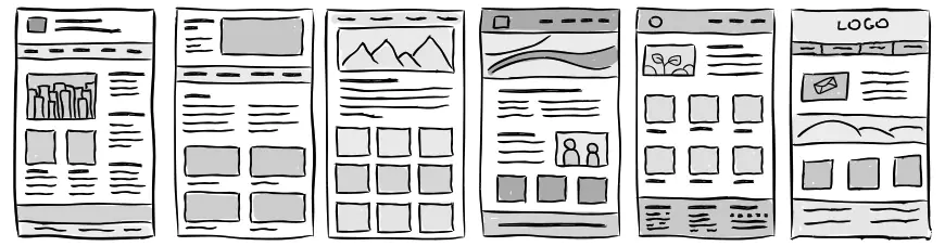
First, you need to build Wireframes. These are layout sketches of website or app interfaces in the form of Box Holders, to represent main components such as button positions, text, images, etc.
When creating Wireframes, you need to keep the design simple. At this stage, you need to test different solutions to choose the design that best suits your target audience. Therefore, instead of wasting time optimizing each Wireframe pixel, focus on the functionality and information structure of the design.
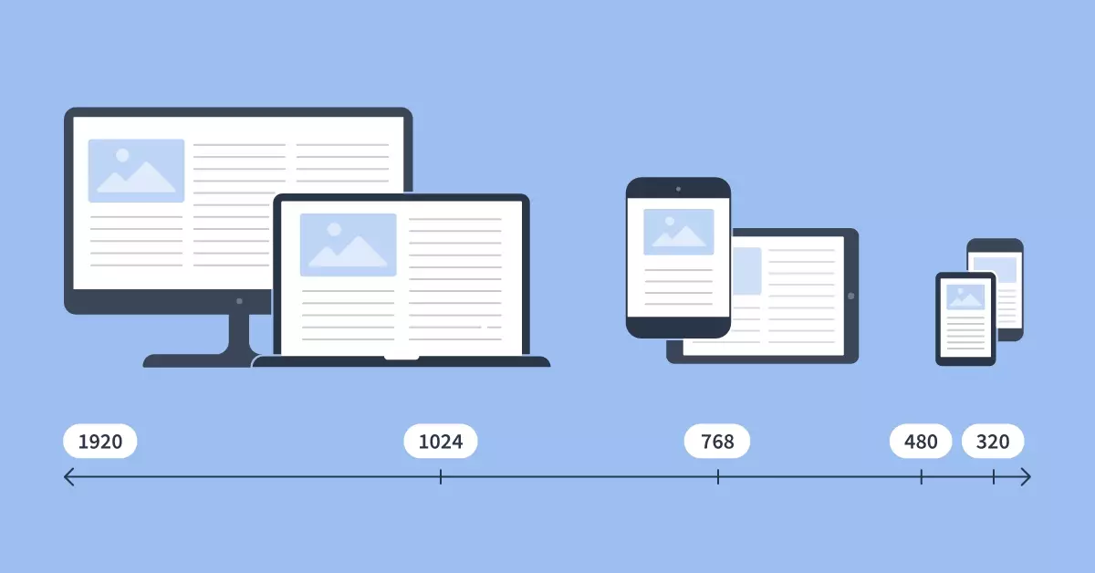
Step 2: Identify Breakpoints
Breakpoints are screen width limits. The website interface is adjusted to the version most suitable for the user's device within that breakpoint.
Breakpoints are determined by the min- and max-width of CSS media queries. Generally, media queries are a feature of CSS used to define and apply CSS rules based on certain device or display environment conditions. These media queries will contain breakpoint conditions to determine which specific CSS rules will be applied.
Normally, developers will rely on wireframe designs from UX designers to determine appropriate breakpoints. There are no standards for determining limit points. However, there are 3 most popular breakpoints:
- 320 – 768px are used for smartphones
- 768 – 1024px are breakpoints for tablets
- Over 1024px are breakpoint for laptops, PCs, TVs, etc.
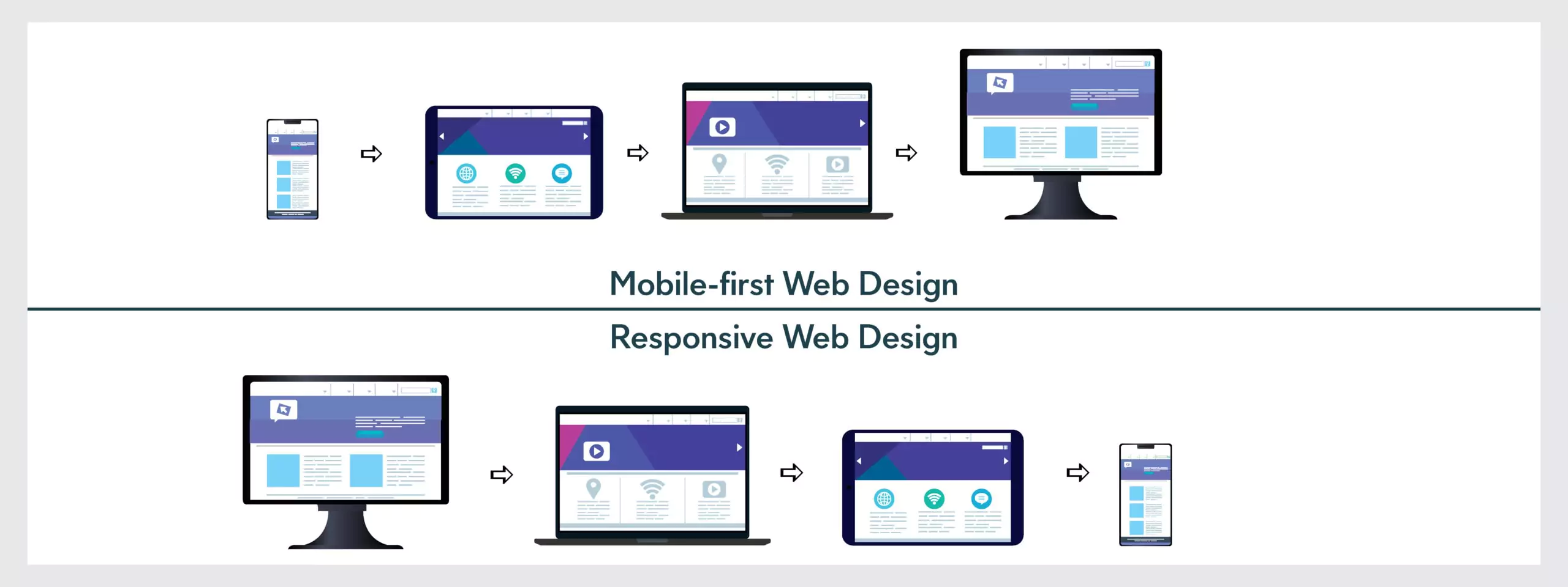
Step 3: Prioritize Mobile-First Design
When designing a responsive web interface, UX designers should prioritize designing content for the mobile version before refining the content for larger viewports. This helps designers focus on important content for user needs, instead of getting caught up in unnecessary elements.
You should also consider hiding some content to optimize space in responsive web design. The hamburger menu web design techniques are usually used for mobile design to hide the content on the navigation menu bar.
In addition, you need to focus on optimizing interactive elements for touch screens, ensuring users can interact comfortably with their fingers. To do this, you can use media queries like orientation and aspect ratio to determine conditions and adjust the design based on the user's device.
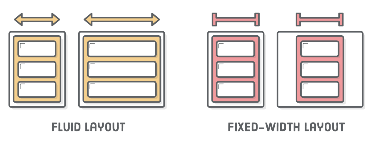
Step 4: Use Fluid Grid
Fluid Grid is a flexible grid that divides the width of a page into smaller, equally sized columns to display content. Basically, it will determine the maximum layout size of the interface and divide the grid into a certain number of columns with corresponding width and height. This makes it easy for elements to adjust whenever the screen size changes.
Currently, two main types of website sizes are fixed and fluid layouts. Fixed layout is designed in standard sizes (960px or 1024px) and cannot be changed according to the width of the frame. This causes the interface to become unbalanced when the screen size changes. On the contrary, the fluid layout can automatically adjust accordingly according to the % parameter, making the website interface look more beautiful.
Step 5: Improve Image Size
Image quality greatly affects user experience (UX). A website with sharp images and appropriate sizes will create a good impression on visitors. However, when the device screen size changes, some images may become blurred or distorted, causing unhappy user experience.
To improve this, you need to resize the image in 2 ways:
Using Width and Max-width in CSS: The width property helps set a fixed width for an image, so the image always stays the same size on all dimensions. At the same time, max-width limits the maximum width and maintains the original aspect ratio. This means that when the image is scaled, the ratio between width and height is maintained, avoiding distortion.
Using SVG image files: Unlike Raster images - usually in JPEG/PNG format and fixed resolution, the resolution of Scalar Vector Graphic (SVG) is infinite. This means SVG images can be resized without losing quality.

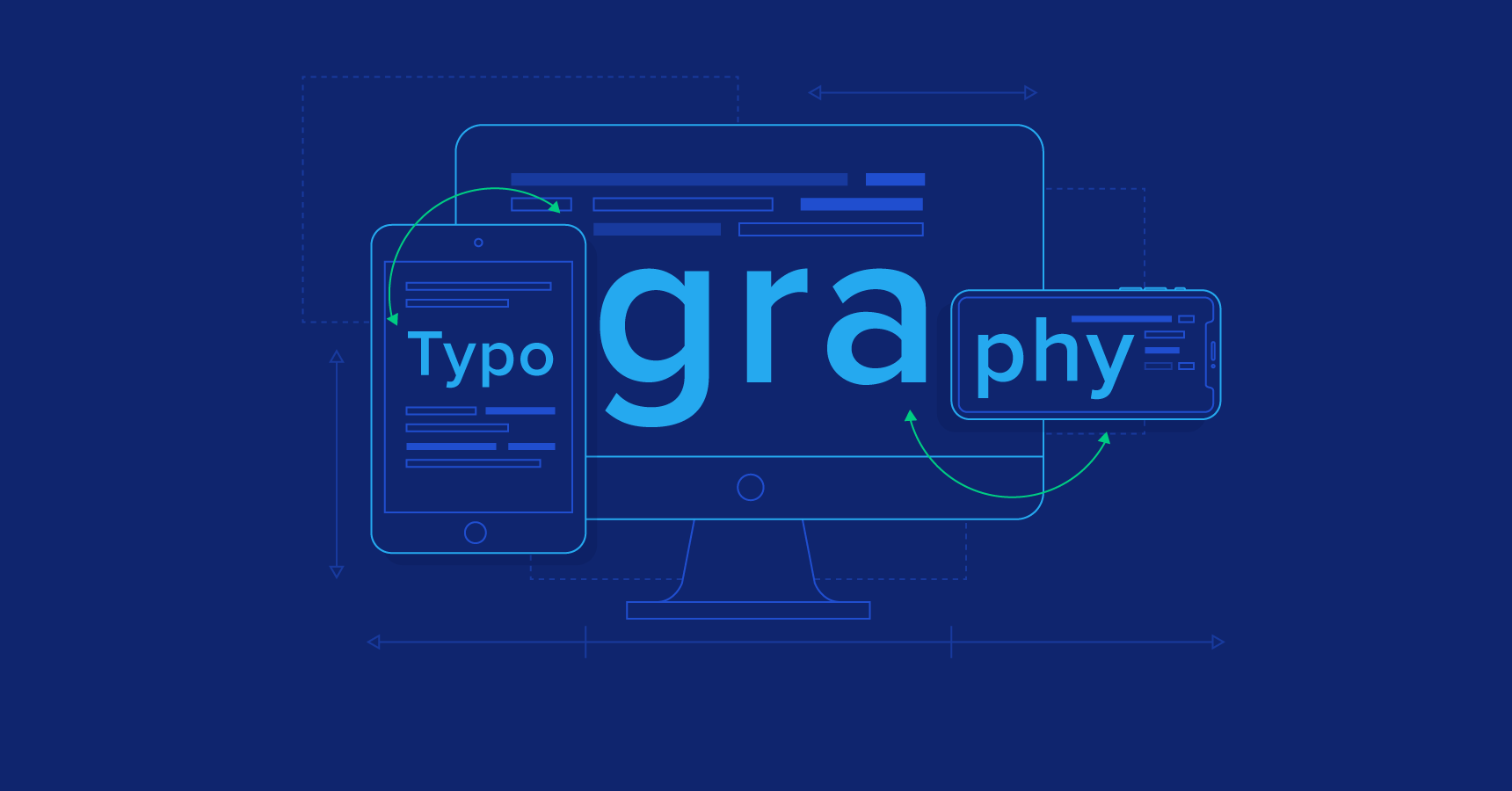
Step 6: Optimize Typography
Like images, text quality will also significantly affect the user's impression when visiting the website. Websites with inappropriate typography (typeface) not only affect users' reading experience and the quality of content on the website but also make the reputation of the business incredibility.
To optimize Typography for your Website, you need:
Choose the Appropriate Font: The font must be balanced on different screen sizes and resolutions. You should prioritize using popular and safe website fonts, like Helvetica and Roboto. These fonts are optimized to display beautifully on many resolutions.
Setting Font Size with Fluid Units: Using Fluid Units (e.g. em or rem in CSS) helps ensure text can scale dynamically to the screen size, providing a more user-friendly experience across different devices.
>> Read more: Web Development Skills To Become A Good Web Developer
Best Practices for Responsive Web Design
Prioritizing Mobile Development
People mostly search on their phones, so put mobile users first right away. This means making sure that the most important parts of your website, like the functions and information, can be easily found and used on even the smallest smartphone screens. Consider major buttons that you can tap and text that can be easy to read.
Accessibility Considerations for RWD
Great responsive websites work for all abilities and RWD is not only about screen size. People who have trouble seeing, using a mouse, or learning in a certain way can also enjoy your website. Consider using clear color differences, let people use only a keyboard to move around, and give text to your pictures to explain what they are.
Performance Optimization for Responsive Websites
A responsive website should be attractive while also responding quickly. Large images, a lot of code, and complex layouts may all slow things down, especially on phones with slower internet connections. Use techniques such as image optimization, code shortening, and caches to keep your website loading quickly for everyone.
>> Read more: Best Practices for Successful E-commerce Website Design
Responsive Web Design Tools and Frameworks
Pure CSS
Pure CSS is an open-source CSS framework that consists of many responsive CSS modules that are easy to use for any web design project. It can make responsive websites with flexible screen sizes by following mobile-first standards and using grids, menus, and other tools.
Additionally, Pure CSS makes it easier to add new CSS rules without having to delete the previous ones. By using this method, it is possible to make custom designs with their visual appeal and atmosphere.

Foundation
Foundation is a versatile website design framework providing a strong grid system, responsive design elements, and extensive customization options. The tool has adaptable typography, mobile-friendly forms, and accessibility standards. The versatility of this tool makes it useful for modern web development.
Foundation is well-suited for intricate, extensive projects that require bespoke design. Enterprise applications and websites that require extensive customization can use this framework to design their web. Adobe and National Geographic also use the Foundation's responsive design capabilities.

Tailwind CSS
Tailwind CSS is a utility-focused responsive website framework. It allows developers to create custom designs right within their markup. Tailwind lets you combine low-level utility classes to create your designs. This tool gives you the most control over the final product's appearance.
Tailwind is ideal for custom design projects. It's frequently utilized in contemporary SaaS and web apps that need to establish their brand. Examples include the websites for startups such as Superhuman and Tailwind itself, which showcases its impressive design skills.

>> Read more: Guide for SaaS Application Development
Bootstrap
Bootstrap is a popular responsive website design framework with lots of documentation and ease of use. It simplifies responsive web design with a grid system, pre-made elements, and JavaScript plugins. Bootstrap lets developers build gorgeous, functional websites without starting from scratch.
Bootstrap speeds up prototyping and standardizes web apps. It is used on many business websites, blogs, and administrative dashboards, such as Twitter and LinkedIn.

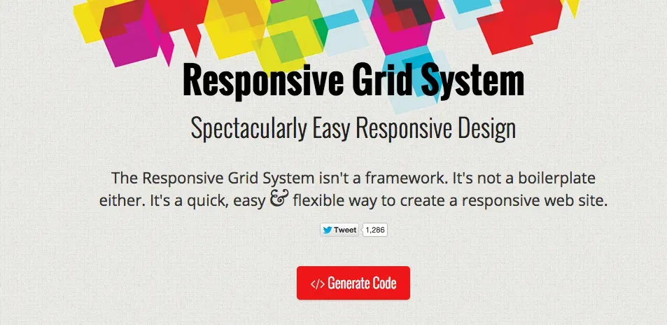
Responsive Grid System
The framework is great at making responsive website design quickly and easily. It lets you put as many columns as you want on a page and makes changing the width easy by using percentages. By putting content first, developers can change the grid to make it work well with the content. The first step of designing will be easier when the mobile versions of the grid are part of the package.
A responsive grid system works well with HTML or CSS, which makes designing responsive websites easier. With fluid columns, developers can use fewer lines of code to make a mobile-friendly website with a clean, simple design.
Benefits of Responsive Web Design
Responsive web design (RWD) makes sure that websites automatically change so that they look great on all kinds of screens, from computers to tablets to phones. It helps in these ways:
Smooth Browsing: You won't have to zoom in and out, deal with annoying menus, or see information that is skewed. Any device your users use will have a smooth and enjoyable viewing experience with RWD.
Faster Loading Times: Because responsive websites are frequently performance-optimized, they load more quickly. This means less waiting and more time to explore the information they're interested in.
Accessibility for Everyone: RWD extends beyond screen size. Clear color contrast and keyboard navigation make responsive websites more accessible to visually and motorically impaired users.
Mobile-Friendly for Mobile Access: With the growing popularity of mobile devices, RWD ensures that your users can access their favorite websites and information at any time, from any location, using any device they have available.
In general, RWD makes the user experience better. It is easier for users to find information, making the site feel natural.
Common Challenges of Responsive Web Design
Complex Layouts
Think about a website that has a lot of complicated parts and features. Sometimes it's hard to get everything to fit on a tiny phone screen.
Solution: Use a modular design technique as a solution. Split complicated plans into smaller, modular parts that are easier to move around and change sizes on different devices.
Maintaining Over Time
There are a lot of new devices coming out all the time. To keep your website up to date, this can feel like a job that never ends.
Solution: Set up a design system that is open and scalable. In the future, you won't have to start from scratch to make changes to your website to fit new screen sizes and features.
Not All Browsers Work Well
Most new browsers are good at handling RWD, but older browsers may not work well with it.
Solution: Make sure your website works well on several browsers and devices by using developer tools and programs, for example. This helps you find issues and fix them before the website goes live.
Balancing Image Quality and Performance
Large picture files can make it take longer for pages to load, especially on mobile devices, but high-quality images make the experience better for users.
Solution: To minimize and improve the quality of your pictures without losing any of their detail, use special tools. You might also want to use responsive image formats, which change the size instantly based on the device.
Maintaining Consistent User Experience
Even though responsive web design ensures your website works on all devices, it is still important to make sure that users have the same experience no matter what device they're using.
Solution: Create a solid information architecture with clear content organization and labeling during planning, which allows users to easily find what they need. Moreover, making navigation simple and consistent across devices while maintaining website-wide UI with similar design and interaction patterns. You can use a responsive design framework to simplify development and ensure consistency.
The Future of Responsive Web Design
Beyond Phones and Computers
With connected devices and the global web, imagine a world where your fridge or watch could access the internet and search websites. As more people use smartwatches and other portable tech, RWD will have to change to fit these bigger screens and how we use them.
Websites that Know You
RWD is already great at adapting to different devices, but what if websites could also adapt to you? Artificial intelligence (AI) could be the key to making website layouts and material more relevant to you based on how you browse the web and what you like to see.
Websites that Read Your Mind
The future of RWD is context-aware, using AI or machine learning to deliver an exceptional user experience on any device. Websites can not only adjust the screen size but also adapt to your needs. For example, restaurant websites can suggest personalized lunch menus based on AI-powered.
Websites that Feel and Sound Amazing
RWD has always been focused on how things look, but how they feel and sound might become more important in the future. This could include writing about things you can't see on the screen, giving you extra information when you touch the website, or even linking websites to augmented reality (AR) events.
>> Read more:
Conclusion
For websites to work in today's digital world, responsive web design (RWD) is more than just a trend. Making sure your website works well on all devices gives users a good experience, which improves SEO, boosts sales, and protects your online presence for the future.
Remember that it's all about putting the user experience first on every screen, whether you're starting from scratch or thinking about RWD makeover. You can make a responsive website that makes your users happy and stays ahead of the curve by using the tips and best practices we've talked about in this article.
>>> Follow and Contact Relia Software for more information!

- Web application Development
- development
- web development