
Let's jump right in and get Tailwind CSS working with your React projects! This powerful combo will supercharge your ability to build custom website interfaces quickly and efficiently. We'll walk you through the installation process, step-by-step, and explain what each tool brings to the table. By the end, you'll have Tailwind seamlessly integrated, ready to add style to your React components.
Read more about React coding:
- Mastering React Higher-Order Components
- Top 6 Best React Component Libraries for Your Projects
- The Best React Design Patterns with Code Examples
- Top 9 Best React Animation Libraries for Web Developers
What is Tailwind CSS?
Tailwind CSS is a utility-first CSS framework for building custom website interfaces quickly. Unlike traditional frameworks with pre-designed components, it offers low-level utility classes. These act like Lego blocks for website design. Instead of writing tons of CSS code, you simply use these pre-built classes to style your website. This makes creating unique designs faster and easier.
Tailwind CSS integrates seamlessly with React, a popular tool for building interactive website interfaces. This lets you style your website directly within your JavaScript code. Tailwind offers more efficiency and flexibility compared to regular CSS. Imagine having a pre-made Lego set instead of building each block from scratch! Plus, making design changes is easier – just swap out one class for another.
Installation and Setup
Installing Tailwind CSS and Dependencies
Let's get Tailwind CSS up and running in your React project! We'll need a few additional tools to make it work smoothly.
Firstly, open your terminal in the project directory and run the following command:
npm install tailwindcss postcss autoprefixerThis installs Tailwind CSS itself, along with PostCSS and Autoprefixer.
- PostCSS is a tool for transforming styles with JavaScript plugins. These plugins can do a lot of things like linting your CSS, supporting variables and mixins, transpiling future CSS syntax, inlining images, and more.
- Autoprefixer is a PostCSS plugin. It uses data based on current browser popularity and property support to automatically add any necessary vendor prefixes to your CSS. This ensures that your CSS works as expected in different browsers, even those that require specific prefixes for certain CSS features.
Configuration Files
- Create
tailwind.config.jsin your project root. This file tells Tailwind where to find the parts of your React application that contain styles (usually inside thesrcfolder).
module.exports = {
    content: ['./src/**/*.{js,jsx,ts,tsx}'], theme: {
        extend: {},
    }, plugins: [],
};- Create
postcss.config.jsin your project root. This file tells PostCSS which plugins to use.
module.exports = {
  plugins: {
    tailwindcss: {},
    autoprefixer: {},
  },
};
Importing Tailwind CSS
Finally, open your src/index.css file and add the following lines at the top:
@tailwind base;
@tailwind components;
@tailwind utilities;
That's it! Now you have Tailwind CSS set up and ready to use in your React components. We'll explore how to style your React elements with Tailwind CSS classes in the next section.
Using Tailwind CSS in React Components
Let's see Tailwind CSS in action! We'll explore a sample project that uses Tailwind to build components. I will mention practical examples included in a project deployed.
Getting Started
Clone this example project:
git clone https://github.com/nvkhuy/examples.gitNavigate to react-tailwind-css example:
cd react-tailwind-cssTo install package:
yarn installTo run:
yarn startGo to http://localhost:3000 in your browser, result looks like this:

Look through the project structure:
.
├── README.md
├── package-lock.json
├── package.json
├── postcss.config.js
├── public
│   ├── favicon.ico
│   ├── index.html
│   ├── logo192.png
│   ├── logo512.png
│   ├── manifest.json
│   └── robots.txt
├── src
│   ├── App.js
│   ├── assets
│   │   ├── double.png
│   │   ├── laptop.jpg
│   │   ├── single.png
│   │   └── triple.png
│   ├── components
│   │   ├── Analytics.jsx
│   │   ├── Cards.jsx
│   │   ├── Footer.jsx
│   │   ├── Hero.jsx
│   │   ├── Navbar.jsx
│   │   └── Newsletter.jsx
│   ├── index.css
│   └── index.js
├── tailwind.config.js
└── yarn.lock
In App.js, return the UI structure:
import React from 'react';
import Analytics from './components/Analytics';
import Cards from './components/Cards';
import Footer from './components/Footer';
import Hero from './components/Hero';
import Navbar from './components/Navbar';
import Newsletter from './components/Newsletter';

function App() {
  return (
    <div>
      <Navbar />
      <Hero />
      <Analytics />
      <Newsletter />
      <Cards />
      <Footer />
    </div>
  );
}

export default App;
Build A Navigation Bar
In the Navbar.jsx component, check the code in src/components/Navbar.jsx:
import React, { useState } from 'react';
import { AiOutlineClose, AiOutlineMenu } from 'react-icons/ai';

const Navbar = () => {
  const [nav, setNav] = useState(false);

  const handleNav = () => {
    setNav(!nav);
  };

  return (
    <div className='flex justify-between items-center h-24 max-w-[1240px] mx-auto px-4 text-white'>
      <h1 className='w-full text-3xl font-bold text-[#00df9a]'>REACT.</h1>
      <ul className='hidden md:flex'>
        <li className='p-4'>Home</li>
        <li className='p-4'>Company</li>
        <li className='p-4'>Resources</li>
        <li className='p-4'>About</li>
        <li className='p-4'>Contact</li>
      </ul>
      <div onClick={handleNav} className='block md:hidden'>
          {nav ? <AiOutlineClose size={20}/> : <AiOutlineMenu size={20} />}
      </div>
      <ul className={nav ? 'fixed left-0 top-0 w-[60%] h-full border-r border-r-gray-900 bg-[#000300] ease-in-out duration-500' : 'ease-in-out duration-500 fixed left-[-100%]'}>
        <h1 className='w-full text-3xl font-bold text-[#00df9a] m-4'>REACT.</h1>
          <li className='p-4 border-b border-gray-600'>Home</li>
          <li className='p-4 border-b border-gray-600'>Company</li>
          <li className='p-4 border-b border-gray-600'>Resources</li>
          <li className='p-4 border-b border-gray-600'>About</li>
          <li className='p-4'>Contact</li>
      </ul>
    </div>
  );
};

export default Navbar;
Here’s how Tailwind is used:
- Responsive Design: Tailwind is used to control how the navigation menu appears on different screen sizes. For example, the
md:hiddenclass hides the navigation menu on medium and larger screens, while themd:flexclass displays it as a flex container. The navigation bar displays as a horizontal menu on medium and large screens, and as a collapsible vertical menu on smaller screens. - Styling: Tailwind provides a wide range of utility classes for styling. Our Navbar uses classes like
h-24(height),max-w-[1240px](maximum width), andmx-auto(margin left and right auto) to define the container's size and position. We also usetext-whitefor clear text on a dark background. - State Management: The
useStatehook from React is used to manage the state of the navigation menu on small screens. When the menu icon is clicked, thehandleNavfunction toggles thenavstate betweentrueandfalse. This state is used to control the display of the navigation menu on small screens. - Conditional Rendering: Tailwind classes are dynamically applied based on the
navstate to show or hide the navigation menu on small screens. Ifnavistrue, the menu is displayed as a fixed, full-height panel on the left side of the screen. Ifnavisfalse, the menu is hidden off the left edge of the screen. - Icons: The
AiOutlineCloseandAiOutlineMenuicons from thereact-icons/ailibrary are used for the close and menu buttons, respectively. These buttons are displayed or hidden based on thenavstate.
Build A Hero Section
The hero section is a crucial part of your website, grabbing user attention and conveying your message. In Hero.jsx ,this code creates a hero section with a typing animation and a button:
import React from 'react';
import Typed from 'react-typed';

const Hero = () => {
  return (
    <div className='text-white'>
      <div className='max-w-[800px] mt-[-96px] w-full h-screen mx-auto text-center flex flex-col justify-center'>
        <p className='text-[#00df9a] font-bold p-2'>
          GROWING WITH DATA ANALYTICS
        </p>
        <h1 className='md:text-7xl sm:text-6xl text-4xl font-bold md:py-6'>
          Grow with data.
        </h1>
        <div className='flex justify-center items-center'>
          <p className='md:text-5xl sm:text-4xl text-xl font-bold py-4'>
            Fast, flexible financing for
          </p>
          <Typed
          className='md:text-5xl sm:text-4xl text-xl font-bold md:pl-4 pl-2'
            strings={['BTB', 'BTC', 'SASS']}
            typeSpeed={100}
            backSpeed={140}
            loop
          />
        </div>
        <p className='md:text-2xl text-xl font-bold text-gray-500'>Monitor your data analytics to increase revenue for BTB, BTC, & SASS platforms.</p>
        <button className='bg-[#00df9a] w-[200px] rounded-md font-medium my-6 mx-auto py-3 text-black'>Get Started</button>
      </div>
    </div>
  );
};

export default Hero;
Here's how we apply Tailwind CSS:
- Layout and Responsiveness: The
max-w-[800px]class ensures the hero section adapts well to different screen sizes. Thew-fullclass utilizes the full available width within its container, andh-screensets the height to match the user's screen.mx-autohelps center the content horizontally for a balanced look. - Text Styling: The text-white class makes the text stand out against the background. Headings utilize responsive classes (
md:text-7xl,sm:text-6xl,text-4xl) to adjust their size based on the device viewport. Thefont-boldclass adds boldness to the headings for emphasis. - Flexbox for Alignment: The
flexclass creates a flex container, whileflex-colstacks elements vertically.justify-centercenters the content vertically within the flex container. - Typing Animation: The
Typedcomponent is a wrapper around thetyped.jslibrary which creates a typing animation for the strings provided in thestringsprop. - Call to Action Button:
bg-[#00df9a]class sets a custom background color for the button, andtext-blackensures the button text is clearly visible. Other classes likew-[200px](width),rounded-md(rounded corners),my-6(margin), andpy-3(padding) define the button's appearance and spacing.
When rendering Hero component, it looks like this:

Build An Analytics Section
Analytics.jsx represents a section of a webpage. It includes a div container with two main sections arranged in a grid layout on medium and larger screens:
import React from 'react';
import Laptop from '../assets/laptop.jpg';

const Analytics = () => {
  return (
    <div className='w-full bg-white py-16 px-4'>
      <div className='max-w-[1240px] mx-auto grid md:grid-cols-2'>
        <img className='w-[500px] mx-auto my-4' src={Laptop} alt='/' />
        <div className='flex flex-col justify-center'>
          <p className='text-[#00df9a] font-bold '>DATA ANALYTICS DASHBOARD</p>
          <h1 className='md:text-4xl sm:text-3xl text-2xl font-bold py-2'>Manage Data Analytics Centrally</h1>
          <p>
            Streamline your data analytics process by managing all your data, metrics,
            and reports from one centralized dashboard. Easily monitor performance,
            generate insights, and make informed decisions with real-time visualizations
            and customizable reports.
          </p>
          <button className='bg-black text-[#00df9a] w-[200px] rounded-md font-medium my-6 mx-auto md:mx-0 py-3'>Get Started</button>
        </div>
      </div>
    </div>
  );
};

export default Analytics;
Analytic component UI rendering will look like this:
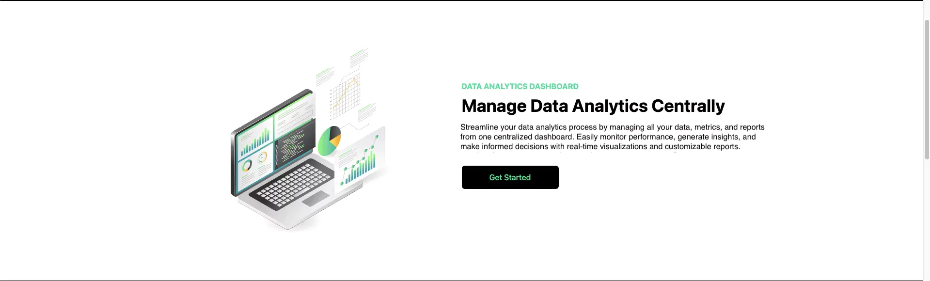
Here’s a simple explanation of what the Tailwind CSS classes do in this code:
- Layout and Responsiveness: The
w-full,bg-white,py-16,px-4classes set the overall container with full width, white background, and padding.max-w-[1240px]ensures a maximum width for larger screens. On medium and larger screens (md:grid-cols-2), the content is arranged in a two-column grid layout withgrid. - Image and Text Arrangement: The image is styled with
w-[500px]for a fixed width. The text content utilizesflex flex-col justify-centerfor a vertical column with centered elements. - Button Styling: The button receives a black background with
bg-black, green text withtext-[#00df9a], and common styling classes likew-[200px](width),rounded-md(rounded corners), and padding (py-3). Responsive margins (mx-auto md:mx-0) center the button on smaller screens but remove margins on medium and larger ones.
Build A Newsletter Section
Newsletter.jsx defines the structure and appearance of the newsletter section.
import React from 'react';

const Newsletter = () => {
  return (
    <div className='w-full py-16 text-white px-4'>
      <div className='max-w-[1240px] mx-auto grid lg:grid-cols-3'>
        <div className='lg:col-span-2 my-4'>
          <h1 className='md:text-4xl sm:text-3xl text-2xl font-bold py-2'>
            Want tips & tricks to optimize your flow?
          </h1>
          <p>Sign up to our newsletter and stay up to date.</p>
        </div>
        <div className='my-4'>
          <div className='flex flex-col sm:flex-row items-center justify-between w-full'>
            <input
              className='p-3 flex w-full rounded-md text-black'
              type='email'
              placeholder='Enter Email'
            />
            <button className='bg-[#00df9a] text-black rounded-md font-medium w-[200px] ml-4 my-6 px-6 py-3'>
              Notify Me
            </button>
          </div>
          <p>
            We care bout the protection of your data. Read our{' '}
            <span className='text-[#00df9a]'>Privacy Policy.</span>
          </p>
        </div>
      </div>
    </div>
  );
};

export default Newsletter;
Newsletter component UI will look like this:

Here’s how Tailwind is used:
w-full py-16 text-white px-4establishes a full-width container with white text and padding. Responsive layouts are achieved withmax-w-[1240px]for a maximum width andgrid lg:grid-cols-3for a two-column layout that adapts to three columns on larger screens.- The form integrates seamlessly with
flex flex-col sm:flex-row, switching between a vertical stack on smaller screens and a horizontal layout on larger ones. - Common styling classes like
rounded-mdandtext-blackare applied to the input field and button. The privacy policy link is styled withtext-[#00df9a]to match the green theme without being visually overwhelming.
Build A Grid of Three Cards
This is a React component named Cards that renders a grid of three cards. Each card represents a different user plan: Single User, Double User, and Triple User. Each card displays an image, a title, a price, and a list of features. There’s also a “Start Trial” button on each card.
import React from 'react';
import Single from '../assets/single.png'
import Double from '../assets/double.png'
import Triple from '../assets/triple.png'

const Cards = () => {
  return (
    <div className='w-full py-[10rem] px-4 bg-white'>
      <div className='max-w-[1240px] mx-auto grid md:grid-cols-3 gap-8'>
          <div className='w-full shadow-xl flex flex-col p-4 my-4 rounded-lg hover:scale-105 duration-300'>
              <img className='w-20 mx-auto mt-[-3rem] bg-white' src={Single} alt="/" />
              <h2 className='text-2xl font-bold text-center py-8'>Single User</h2>
              <p className='text-center text-4xl font-bold'>$149</p>
              <div className='text-center font-medium'>
                  <p className='py-2 border-b mx-8 mt-8'>500 GB Storage</p>
                  <p className='py-2 border-b mx-8'>1 Granted User</p>
                  <p className='py-2 border-b mx-8'>Send up to 2 GB</p>
              </div>
              <button className='bg-[#00df9a] w-[200px] rounded-md font-medium my-6 mx-auto px-6 py-3'>Start Trial</button>
          </div>
          <div className='w-full shadow-xl bg-gray-100 flex flex-col p-4 md:my-0 my-8 rounded-lg hover:scale-105 duration-300'>
              <img className='w-20 mx-auto mt-[-3rem] bg-transparent' src={Double} alt="/" />
              <h2 className='text-2xl font-bold text-center py-8'>Single User</h2>
              <p className='text-center text-4xl font-bold'>$149</p>
              <div className='text-center font-medium'>
                  <p className='py-2 border-b mx-8 mt-8'>500 GB Storage</p>
                  <p className='py-2 border-b mx-8'>1 Granted User</p>
                  <p className='py-2 border-b mx-8'>Send up to 2 GB</p>
              </div>
              <button className='bg-black text-[#00df9a] w-[200px] rounded-md font-medium my-6 mx-auto px-6 py-3'>Start Trial</button>
          </div>
          <div className='w-full shadow-xl flex flex-col p-4 my-4 rounded-lg hover:scale-105 duration-300'>
              <img className='w-20 mx-auto mt-[-3rem] bg-white' src={Triple} alt="/" />
              <h2 className='text-2xl font-bold text-center py-8'>Single User</h2>
              <p className='text-center text-4xl font-bold'>$149</p>
              <div className='text-center font-medium'>
                  <p className='py-2 border-b mx-8 mt-8'>500 GB Storage</p>
                  <p className='py-2 border-b mx-8'>1 Granted User</p>
                  <p className='py-2 border-b mx-8'>Send up to 2 GB</p>
              </div>
              <button className='bg-[#00df9a] w-[200px] rounded-md font-medium my-6 mx-auto px-6 py-3'>Start Trial</button>
          </div>
      </div>
    </div>
  );
};

export default Cards;
UI rendering would be like this:
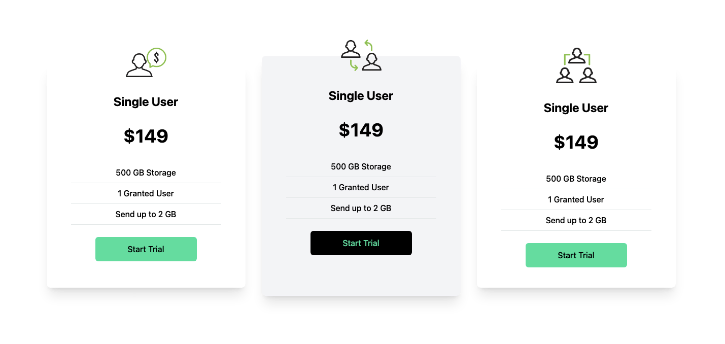
Let's analyze how Tailwind is used:
- The outer container (
w-full py-[10rem] px-4 bg-white) establishes a full-width section with white background and padding. - The inner content utilizes
max-w-[1240px]for a maximum width andgrid md:grid-cols-3 gap-8to create a one-column layout on small screens, transitioning to three columns on medium and larger ones with spacing (gap-8). - Individual cards are styled with
shadow-xlfor depth,flex flex-colfor vertical arrangement, androunded-lgfor gentle corners. The hover effect (hover:scale-105 duration-300) slightly enlarges the card on hover for better interactivity. - Image placement and styling are handled within each card's
imgtag. Card titles (text-2xl font-bold text-center py-8) and prices (text-center text-4xl font-bold) utilize clear styles. Features are listed withtext-center font-medium, and borders are added withborder-b mx-8for separation. - Start trial buttons (
bg-[#00df9a] w-[200px] rounded-md font-medium my-6 mx-auto px-6 py-3for green ones andbg-black text-[#00df9a]for the black one) receive consistent styling with variations in background color and text color.
Build A Footer Section
Finally, the Footer component creates a responsive footer section with social media icons and navigation links. The footer is divided into four main sections: a logo and description, solutions, support, and company information.
import React from 'react';
import {
  FaDribbbleSquare,
  FaFacebookSquare,
  FaGithubSquare,
  FaInstagram,
  FaTwitterSquare,
} from 'react-icons/fa';

const Footer = () => {
  return (
    <div className='max-w-[1240px] mx-auto py-16 px-4 grid lg:grid-cols-3 gap-8 text-gray-300'>
      <div>
        <h1 className='w-full text-3xl font-bold text-[#00df9a]'>REACT.</h1>
        <p className='py-4'>Lorem, ipsum dolor sit amet consectetur adipisicing elit. Id odit ullam iste repellat consequatur libero reiciendis, blanditiis accusantium.</p>
        <div className='flex justify-between md:w-[75%] my-6'>
            <FaFacebookSquare size={30} />
            <FaInstagram size={30} />
            <FaTwitterSquare size={30} />
            <FaGithubSquare size={30} />
            <FaDribbbleSquare size={30} />
        </div>
      </div>
      <div className='lg:col-span-2 flex justify-between mt-6'>
    <div>
        <h6 className='font-medium text-gray-400'>Solutions</h6>
        <ul>
            <li className='py-2 text-sm'>Analytics</li>
            <li className='py-2 text-sm'>Marketing</li>
            <li className='py-2 text-sm'>Commerce</li>
            <li className='py-2 text-sm'>Insights</li>
        </ul>
    </div>
    <div>
        <h6 className='font-medium text-gray-400'>Support</h6>
        <ul>
            <li className='py-2 text-sm'>Pricing</li>
            <li className='py-2 text-sm'>Documentation</li>
            <li className='py-2 text-sm'>Guides</li>
            <li className='py-2 text-sm'>API Status</li>
        </ul>
    </div>
    <div>
        <h6 className='font-medium text-gray-400'>Company</h6>
        <ul>
            <li className='py-2 text-sm'>About</li>
            <li className='py-2 text-sm'>Blog</li>
            <li className='py-2 text-sm'>Jobs</li>
            <li className='py-2 text-sm'>Press</li>
            <li className='py-2 text-sm'>Careers</li>
        </ul>
    </div>
    <div>
        <h6 className='font-medium text-gray-400'>Legal</h6>
        <ul>
            <li className='py-2 text-sm'>Claim</li>
            <li className='py-2 text-sm'>Policy</li>
            <li className='py-2 text-sm'>Terms</li>
        </ul>
    </div>
      </div>
    </div>
  );
};

export default Footer;
UI would be like this:
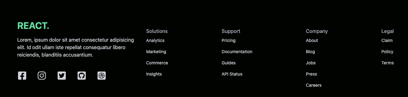
Here’s a breakdown of how Tailwind CSS is used:
- The
max-w-[1240px] mx-auto py-16 px-4class sets a maximum width, horizontal centering, padding, and a light gray text color (text-gray-300). - The
grid lg:grid-cols-3 gap-8class creates a responsive grid layout: a single column on smaller screens and transitioning to three columns on larger ones, with spacing (gap-8). - The logo (
w-full text-3xl font-bold text-[#00df9a]) utilizes full width, large font size, bold weight, and a green color. - Social media icons (
flex justify-between md:w-[75%] my-6), from thereact-icons/falibrary, are displayed horizontally with spacing, adjusting width on medium screens (md:w-[75%]). - Sections like
Solutions(font-medium text-gray-400) utilize clear headings with a slightly darker gray. - List items (
py-2 text-sm) receive consistent padding and small font size.
You can check code result in http://localhost:3000. Best way to learn React UI is practicing on this example code, maybe tweak a bit to understand how things work.
Key Features of Tailwind CSS
- Utility-First: Tailwind is a utility-first CSS framework packed with classes like
flex,pt-4,text-center, androtate-90that can be composed to build any design, directly in your markup. - Rapid Development: Tailwind allows you to rapidly build modern websites without ever leaving your HTML.
- Customizable: Tailwind is easy to customize and adapts to any design.
- Small Build Size: Despite its extensive utility classes, Tailwind has a tiny build size.
- Responsive Modifiers: Tailwind provides responsive modifiers, making it easy to create responsive designs.
- Components: Tailwind offers a variety of components like form layouts, tables, dialogs, application shells, stacked layouts, sidebar layouts, and multi-column layouts.
- Installation Process: Tailwind works by scanning all of your HTML files, JavaScript components, and any other templates for class names, generating the corresponding styles, and then writing them to a static CSS file.
>> You may be interested in:
- Mastering React Test Renderer for Streamlined Testing
- Demystifying React Redux for Centralized State Management
- Mastering React Context API for Streamlined Data Sharing
Conclusion
The integration of Tailwind CSS with React improves the development experience. Tailwind’s utility-first approach promotes rapid prototyping and component-driven design, which aligns perfectly with React’s philosophy. The detailed examples provided in this article demonstrate how Tailwind empowers developers to create complex, responsive designs with ease.
Moreover, Tailwind’s customization capabilities allow developers to maintain a consistent design system across projects, making it an indispensable tool in modern web development. Whether you’re a seasoned developer or just starting out, mastering Tailwind will undoubtedly boost your React projects to a new level of sophistication and efficiency. Therefore, it’s not just beneficial, but essential to familiarize yourself with Tailwind when working with React. Happy coding!
>>> Follow and Contact Relia Software for more information!

- coding
- development