You may enhance your sales and connect with a wider audience by setting up an online store. So, what exactly is ecommerce web design, and how can you create a cutting-edge ecommerce website that will increase sales? Learn the ins and outs of ecommerce websites, as well as some helpful pointers for designing your own, right here.
>> Read more:
What Is Ecommerce Website Design?
Ecommerce web design refers to the practice of developing an interface for an online store. If you want to sell products online, you need a website that looks professional. A well-designed website will:
- Determine the initial impression: Making a good impression on potential clients is essential, and your website is where you can do that. It's a symbol of your identity and your profession. Quality ecommerce website design is essential for success in the online retail industry.
- Define customer experience: The web design of your ecommerce store determines how customers feel as they purchase on your site. You may learn a lot about your e-commerce customers' wants and needs by modeling their experience as a series of distinct stages.
- Boost sales: An efficient ecommerce website design can increase sales and revenue since it allows customers to quickly and easily buy the things they want.
Some elements of e-commerce web design are:
- Creating an e-commerce site's color scheme and theme;
- Picking the right font and size for your website;
- Designing the look of your website's pages;
- Adding logos and other branded images to your website.
When compared to sites whose primary purpose is to teach or educate readers, e-commerce platforms must be meticulously vetted and intended to attract buyers. That's why ecommerce sites need their own set of design guidelines for enticing customers to actually buy something.
Essential Design Elements for Your Ecommerce Website
According to the experts, there are around 8 crucial pages that affect the conversion rate of any eCommerce website:
- Homepage
- About page
- Category page
- Product page
- View Cart page
- Checkout page
- Subscription form
- Search Result page
Remember that there is no one best technique to create a successful online store. Those are some suggestions on what should be included. Feel free to get creative with how you incorporate these aspects. Use your imagination to come up with a one-of-a-kind experience that complements your brand.
Nonetheless, here are a few ideas that can be used by internet retailers of any scale.The basic setup of an internet shop looks like this:
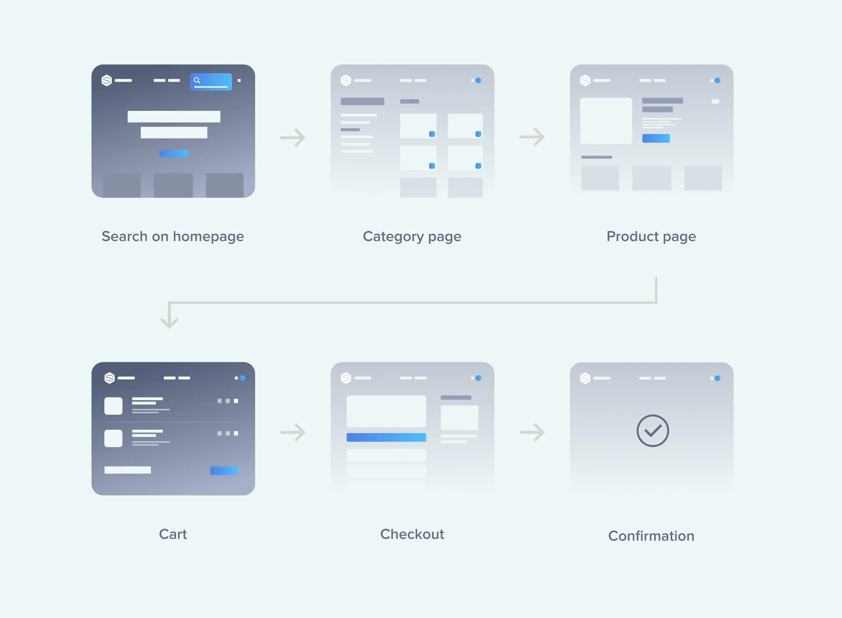
We’ll explore mobile-specific design with detailed ingredients of the aforementioned pages throughout the rest of this guide.
Site-Wide Design
Navigation
The first step toward a satisfying buying experience is a site's easy navigation. Keep in mind that success depends on quick access to information and simple navigation to desired products.
-
Menus
Depending on the variety of products you offer, you may wish to employ a drop-down menu with sub-items. Use broad categories for describing product types.
-
A search bar
A search bar is prominently displayed on every page. However, here's an example of something that's useful just if your site sells a lot of items. If not, it's just background noise. When it does work, though, it speeds up the process of finding the information the user needs. Customers need to be able to search for specific products or browse by category.
-
Cart icon
In addition to being accessible from every page, the symbol should also display the current number of additions. Customers can easily access their shopping carts and complete their purchases by clicking the icon. If you really want to push the envelope, you could even have a preview of the cart appear when the user hovers over the icon. If your website only features one product, you should probably have your call to action appear on each and every page.
Increasing Self-Assurance
-
Reputable and trusted logos
Again, this is not always the case, but if you're selling well-known brands on your website, that fact should be made clear. Your company's reputation will be enhanced by displaying these logos from respected organizations. It also activates trust, another crucial measure of user engagement.
-
Feedback from real customers
We naturally gravitate toward confirmation from others. In the realm of online commerce, this idea is extremely potent. Customer testimonials can be shown anywhere on your site, not just on product pages. On most pages, you'll find customer testimonials, which are placed at the bottom so as to not distract from the main material.
-
Business details including contact information
The footer of each page contains links to other resources that may help visitors with their most pressing questions or problems. Your contact information should be prominently displayed as a first priority. It's crucial that clients believe joining is simple and that they can trust your communication methods.
You may also want to include these links in your footer: "About Us" section; privacy policy; return policy; delivery information.
Homepage Design
Don't blow the opportunity to make a strong first impression on your website's homepage, which is analogous to the first few seconds of a blind date. It's the best venue to introduce new customers to your product. So, what exactly does a home page need to have?
Attractive Title
An effective slogan that describes your product in a few words can do wonders for brand recognition. It's also where you may promote any deals you're running.
Call to action
Your call to action (CTA) should follow your title and be specific to the product(s) you offer. Look for a formula that comes near to representing your brand's essence. Avoid using any CTAs that seem dull or generic.
Images of your items in use
Customers will have more faith in your business and products if you use high-quality images. Since internet buyers rarely have the time for a thousand words, providing ample visuals is essential.
Highlighted products' top sellers should be included
While your site shouldn't function as a catalog, you can nonetheless highlight your top products there. Consider what you would put on display in the front window of your store if you actually had one. They might be perennial favorites or seasonal must-haves, depending on the context.
Listing Page Design
Listing (or catalogue) pages are typically reached by the user via the search box or by clicking through to a certain category. That they are getting interested is another meaning. There, consumers can see a complete catalog of everything sold under the heading that most closely fits their current need.
However, if you're only selling a small number of items, maybe you don't need to organize them in this way. In that instance, the product catalogue will feature everything you provide.
You can improve the look of these pages by following these guidelines for layout:
Category introduction
A brief summary of the page's contents can let customers know right away if they've landed on the proper catalogue page. You can't afford to have people waste time searching in vain, therefore introduce categories clearly and openly.
Make it possible to sort and filter data
The end goal is, once again, to make it easier for people to find what they need. You should allow users to filter and sort results even within a single category. The greater the variety of items, the more vital this becomes. Feel free to use a wide variety of criteria for sorting, including but not limited to color, price, size, brand, etc.
In user experience design, there is a proverb that goes, "more options, more problems." Finding the optimal number of filters is important. It's important to remember that filters are a helpful tool, but they aren't essential to the operation of the page. Also, if the user's filters provide no results, don't just show them a blank page with the words "Sorry".
Take advantage of this situation by trying something new so as to keep the customer on the site.
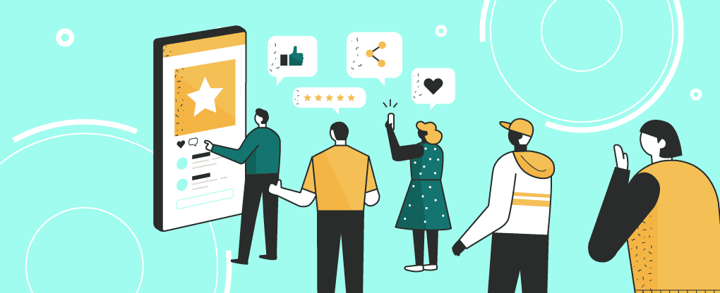
Emphasize top sellers and customer ratings
Here is another chance to show off your wares, so make the most of it! Feature or move to a higher position in the list of the products that you have found to be particularly popular with your consumers. Also, it would be helpful if the catalogue page included star ratings for the products. Take use of the persuasive power of social proof when making purchases online.
(Source: Internet)
Display available inventory
This one is meant to be taken before any problems arise. You don't want customers to discover at the last minute or at checkout that an item is out of stock. Putting them front and center on the product page will save you time and potential customer backlash. Furthermore, this might be a great incentive to buy quickly when there are only a few available.
Product Page Design
You've successfully guided a potential consumer to the detail page for a specific product, and things couldn't be better. The "Buy" button is staring them in the face; a purchase is almost complete. The potential for failure is high. Having to commit to the purchase of an intangible good presents the greatest psychological hurdle.
This website should mimic a real-world shopping experience as closely as feasible so that the transition is as smooth as possible. A consumer needs to be able to put his money where his mouth is, which means the product's photographs, descriptions, and specifications need to be as thorough as possible.
The following is a rundown of what makes a good product page and how it should be laid out:
The "Add to cart" button
This should be front and center on your sales page. You could say it's your cash cow, an integral part of an impending deal. A first-rate buy button ought to:
-
Be in a prominent placement:
It needs to be displayed in a highly visible area. Depending on the specifics of the design, it should be placed somewhere within easy reach of the clients at all times. This can be accomplished by displaying the content above the fold.
Allow it to be the focal point by not surrounding it with too much clutter. The use of white space is encouraged. It's also a smart move to replicate your buy button and put it at the page's footer. Therefore, a consumer who scrolls all the way to the bottom of the page will still be prompted to take action.
-
Be contrasted:
Again, individuality is of paramount importance. Use a color that isn't present anyplace else on the page; it seems paradoxical, but it's better. However, you should exercise caution and pick a hue that complements your existing color scheme while standing out.
-
Be big:
There's not much else to say about this one. You want your button to jump off the page at the reader. It's a major red flag if your "buy now" button has to be searched for on the page.
Images
Pictures are the best way to give them an idea of what they're getting. Customers want to know (and see) exactly what they're getting. Let them see. Several methods exist for accomplishing this:
- Make use of carefully staged, multi-shot photographs. There should be as many visual representations of your product's key features as necessary.
- Make picture displays more engaging. When it comes to pictures, a user-friendly interface can include a slideshow with a zoom function.
- Video explanations are rising in popularity. If it's more challenging to market your goods with just pictures, you might want to think about adding text.
Descriptions of Goods
You can go into greater depth about what you're selling in the product description. It needs to address as many concerns as possible.
The description should be thorough, but not necessarily at first look. It is recommended to either provide a brief overview of the product next to the buy button and a more thorough explanation below, or to provide a "read more" link that activates a modal window with additional information.
Specific details and information are required for some products. Use tabs to organize the data in this kind of situation.
Shopping Cart & Checkout Design
Shopping Cart
What's most crucial is that accessing your shopping cart doesn't feel like a pause in the action. You should be able to quickly review your cart's contents and continue shopping if necessary.
If the shopping cart is empty, it would be a waste of time to simply note that no items were added. Include a call to action or shopping instructions to encourage consumers to add things. Product recommendations can also be included.
If they have items in their shopping carts, the following features should be prominently displayed to shoppers:
- Product inventory (with pictures & short descriptions)
- Product quantity
- Product options (with custom fields)
- Individual price
- Total price
Checkout Design
The typical order of events at the register is as follows:
- Shopping cart
- Payment details (optional, depending on the retailer)
- Details for shipping (which may be the same as billing).
- Transport technique
- Method of Payment
- Confirmation
Best Tips For Outstanding Ecommerce Website Design
1. Simplify
When designing for online stores, "KISS" (Keep It Simple, Silly) is one of the most important rules to follow.
The simpler the design of an online store, the better. The more distractions (text, images, and ads) there are on a page, the more it distracts from the site's primary purpose, which is to make a transaction.
2. Invest heavily in your brand
People prefer to buy from well-known businesses on the internet, rather than from anonymous e-commerce sites that might just be trying to steal their personal information.
Think long and hard about your brand's identity if you want to attract customers and generate substantial revenue for your online store. Branding is essential to the success of any online store because it communicates to customers who you are, what you stand for, and what sets you apart from your competitors.
3. Put yourself in the shoes of a website visitor
You need to put yourself in the shoes of your target market while designing your ecommerce website's layout and interface. Your potential customers only care about a few things when it comes to purchasing on your e-commerce site: that it is simple to use, attractively designed, and quick and simple to complete.
Think like a user when you're designing your site, for example:
- How can you best design a layout that caters to their needs?
- How can you present your offerings in a way that is intuitive to the customer?
- Is there a way to streamline the purchasing procedure?
By putting yourself in the shoes of your target audience, you can better tailor your e-commerce website to their specific demands.
4. Color can be used effectively
People's thoughts, feelings, and behaviors are all influenced by color. If you want your e-commerce site to be successful, you need to take advantage of the psychological effects of color.
If you want them to buy something, for instance, you should use a bold color like red on the buy button. According to studies in color theory, consumers are more likely to make a purchase when they are feeling enthusiastic about the product.
Alternatively, blue can help to increase your site's reliability. More than half of all design logos include some variation of the color blue, and this widespread acclaim is likely due to blue's proven ability to inspire confidence.
The point is that color is one of the most potent elements in your design arsenal, and can have a significant effect on your ecommerce design if used correctly.
5. Only use top-notch photos
It's general knowledge among web designers that including relevant photos in a website's design boosts conversions. No one is going to buy anything they haven't seen first. High-quality photographs of your products are essential if you want to convince customers to make a purchase.
Investing in professional product photography (and providing photos of the goods from a variety of perspectives) can do wonders for gaining your customers' trust. Customers are more inclined to buy when they have complete faith in the information provided to them. But if there aren't any pictures of the goods they want to buy (or if there's only one picture, and it's of poor quality), they'll be more hesitant to buy it, and your conversion rate will suffer.
6. Create scannable content
Don't waste your time or theirs writing novel-length product descriptions for your e-commerce site; nobody reads them.
According to studies, most people only read roughly 20% of the material on a webpage. Instead, they skim for relevant nuggets of information. If you want to boost sales, you need to make your content scannable.
Product descriptions, blog pieces, and "about us" pages all benefit from being broken up into digestible chunks. Keep your phrases and paragraphs brief, emphasize necessary details by bolding them, and break up lengthy passages of text with bulleted lists.
Making your material scannable increases the likelihood that your audience will take in your important messages, which in turn increases the likelihood that you will make a sale.
7. Make sure it has a professional appearance
The premise of any online store is, of course, the sale of goods or services. Because of this, you're requesting potentially dangerous information from them, including their credit card number. Which they won't be willing to do if your website seems unprofessional.
Building client trust is crucial to the success of any online store, and investing in a quality website is essential to doing so.
When we say "professional," what do we mean?
- No errors or misspellings should be found on your website.
- The layout of your typeface, color scheme, and footer should remain constant throughout the entire document.
- Shouldn't have any broken buttons or links to your products.
- Shouldn't use photographs that appear like they were taken on an old iPhone 5.
- Shouldn't use an old-fashioned layout that was stolen from somewhere.
The point is, a professional web design is the only way to show them you take yourself seriously, which is essential if you want them to consider you seriously.
8. Consider the support of social proofs
Look for opportunities to highlight the good responses you've had from current consumers when creating your e-commerce site. Put in a place for customers to rate your products (and aim for as many 5-star ratings as possible). Include a section highlighting customer images and quotes praising their experience working with you. Encourage happy customers to share their experiences by publishing their testimonials on your website.
Customers will gain trust in your business and be more likely to make a purchase if they read favorable feedback from previous buyers on your website in the form of reviews or testimonials.
9. Make it simple to browse different sections
Poorly designed product pages are one of the quickest ways to lose buyers. Your customers will quickly leave your website for a competitor's if they have to navigate through ten different menus before they discover the product they're looking for.
Make it simple to browse different product types and individual product pages. Make it simple for clients to find what they're looking for by providing filters for things like color, size, and category. Customers are more likely to make a purchase if they can quickly and easily find the products they want to buy within your site's categories and pages.
10. Simplify the purchasing process
Do you remember how we warned you that unwieldy product pages would kill your sales? The inefficiency of the checkout process comes in at a close second.
Customers will leave if the purchasing process is a headache in the you-know-what. Making a purchase from you should be as easy, quick, and stress-free as possible if you want to attract customers.
Maintain a streamlined, uncluttered, and user-friendly layout for your shopping cart page. Customers should be able to choose whether they want to sign up for an account or pay as guests.
Clarify everything from the information needed to complete the purchase (and where to submit it) to the various shipping alternatives (and their associated costs) to the procedures to follow if something goes wrong with the order or they need to return it. Send buyers to a confirmation page after they've made a purchase to reassure them their payment was successful.
To sum up, facilitate the buying process as much as possible for your customers.
11. Make it interactive
Mobile internet usage has overtaken that of desktop. And that includes shopping.
Make sure your website is entirely responsive if you want to attract customers who like to shop from their mobile devices. If you don't, you risk losing out on potential sales from your site's mobile users.
>> You may consider:
- Top 5 Vietnam Ecommerce App Development Company 2023
- How Much Does It Cost To Design an App?
- Guide to Responsive Web Design
Conclusion
It's not simple to create an online storefront. However, remember the fundamentals of eCommerce website design, such as accessibility, brand recognition, security, ease of use, searchability, and minimalism.
>>> Follow and Contact Relia Software for more information!

- E-commerce