
Telehealth apps serve as indispensable tools to keep users connected to healthcare services. However, their success goes beyond just offering extensive functionality. A crucial factor is an intuitive and convenient healthcare UI design. Let's explore tips for enhancing healthcare UI design in mobile apps via this article.
>> Read more:
- UI/UX Design: What's The Difference Between UI and UX?
- The Importance Of Brand Web Design For Businesses
- The UX Design Process: 7 steps for UX designers
- Guide to Medicine Delivery App Development For Pharmacy Businesses
The Significance of Medical UI Design
Mobile healthcare solutions have revolutionized digital health services, facilitating faster and more convenient connections between patients and doctors, irrespective of location. These solutions personalize services and give patients easier access to medical data, leading to a better understanding of their health.
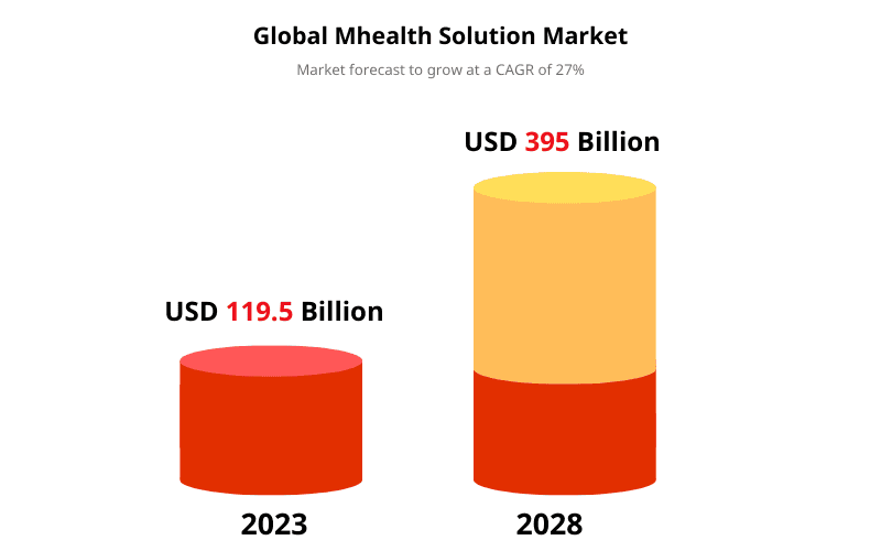
The mHealth app market has grown substantially, reaching a valuation of $119.5 billion in 2023 and is projected to reach $395 billion by 2028.
Given the soaring demand for healthcare apps, delivering a well-designed solution is paramount to stand out in this rapidly expanding market. Therefore, understanding the best UI practices in healthcare is essential to develop a successful healthcare application. Let's explore the key considerations for creating an effective UI design for healthcare apps.
>> Read more: Web Design Tips: Elevating Your Website's User Experience
18 Tips for Enhancing Healthcare UI Design
1. Defining the App's Core Value
The initial and essential step in developing a telemedicine app is clearly defining the primary value it aims to deliver to its users. Will it facilitate appointment scheduling and online patient-doctor communication to reduce offline visits? Alternatively, is it intended to be a comprehensive app with many features, including those mentioned?
Attempting to address numerous objectives and incorporate extensive functionalities all at once may result in an inefficient and impractical application. Such an approach could lead to various issues when implementing UI practices in healthcare and crafting a seamless patient experience.
Therefore, the first crucial tip in mHealth app development is for all stakeholders to identify the key user pain points and prioritize the most critical ones to address. By adopting this approach, you can create a design and subsequently develop a mobile application that encourages continuous user engagement, allowing them to transform challenges into tangible benefits.
2. Adhere to Privacy Regulations
Given that medical applications involve the transmission of electronic patient health information (ePHI), strict compliance with HIPAA regulations is imperative. While many of these regulations can be integrated into the app's code, such as data encryption, information access control, and overall security measures, they must also be considered during the user interface and patient experience design phases.
For instance, it is essential to strategize how to incorporate current mHealth UI design trends to ensure the secure handling of ePHI during video conferencing or screen sharing. Additionally, careful consideration should be given to how and when users will be informed about the privacy rules followed by the application.
Moreover, minor details, such as refraining from displaying patient names or medical data on the home screen, are equally important to safeguard their privacy, especially when using the app in public settings.
Naturally, it is prudent to address mandatory healthcare app regulations from the outset of the design process, thereby avoiding the need to make substantial changes to the user interface design at later stages of healthcare application development.
>> Read more:
- Data Security in Healthcare Software: Why Is It Important?
- DevSecOps: Integrating Security into DevOps for Enhanced Software Development
- 5 Best Practices for Enhancing CI/CD Pipeline Security
3. Build Healthcare UI Product Design through Wireframing
Once you have identified the pain points your app aims to address, a beneficial starting point for the design phase is creating wireframes – simple illustrations of your app's future screens. These wireframes should depict the app's functionality in basic layouts, enabling test users to easily comprehend the app's flow.
The primary advantage of wireframing lies in its ability to test the healthcare UI design for intuitiveness. By allowing patients or doctors (depending on your target users) to interact with the wireframes, you can gather valuable feedback on how effectively the app addresses their pain points.
This user feedback becomes invaluable in enhancing the design without requiring substantial changes to finalized screens, a situation that could arise if you forego wireframe-based design.
4. Make the Design Intuitive with Familiar Interfaces
Irrespective of its specific solution, a telemedicine app serves as a valuable healthcare services assistant for its users, whether they are seeking medical attention or providing it. The app aims to support users throughout their journey, whether it involves booking appointments, engaging in specialist consultations, or accomplishing any other healthcare-related goal with its mHealth functionality.
To effectively translate this vision into UI practices in healthcare, the app's design must prioritize intuitiveness and ease of navigation. Users should feel guided and supported throughout their interactions. Therefore, incorporating familiar interfaces that have proven successful among users is highly recommended.
Conversely, one must avoid overcomplicating interfaces and adding unnecessary steps for users to complete simple processes, such as scheduling a visit. A non-intuitive UI and patient experience design will only lead to user confusion, frustration, and isolation, ultimately preventing them from effectively utilizing or benefiting from the app's healthcare services.
5. Emphasizing Clear and Direct Design of Key Telehealth Features
The functionality of telemedicine applications may vary, but certain standard features are prevalent in current mHealth UI design trends. These features include visit scheduling, video conferencing, and medicine intake reminders.
The app should offer a simple and convenient solution to enhance visit scheduling, eliminating users needing to contact the clinic separately. Design considerations should focus on boosting convenience, such as incorporating a clickable calendar that allows users to easily select a suitable date with just one glance.
Chat and videoconferencing, these features play a crucial role in bridging the gap between patients and doctors, offering the immense value of healthcare services delivered irrespective of location. Additionally, video calls can significantly increase patient trust in the application as their healthcare assistant. Thus, thoughtful design should benefit both parties and ensure seamless communication during consultations.
Medication intake reminder scheduling is another essential feature in telehealth apps, and it can be designed interactively. Users can easily track their medication adherence consistency by incorporating progress charts and a general overview. Furthermore, encouraging reminders can help patients stay on track with their medication schedules.
6. Effective Use of White Space
Achieving a balance between screen content and white space is crucial to guide users effectively towards the solutions they seek. Well-utilized white space can contribute to a clear and organized layout. However, excessive space can be as distracting as overcrowding the page with too many elements. So, how can white space be effectively used in a telemedicine app?
The key is to draw attention to critical elements on the screen, such as buttons, by surrounding them with white space to create contrast and highlight their significance. Additionally, use white space to separate different themes or functionalities on the screen.
However, avoid placing objects too far from one another, as it might hinder intuitive comprehension of the screen's content. Also, refrain from overloading the interface with unnecessary objects or content to fill empty spaces, confusing users and diverting their attention from essential elements.
7. Choosing Readable Fonts
Contrast is a vital aspect that influences the user-friendliness of applications, and it can be achieved through white space and appropriate fonts. Selecting simple and easily readable fonts is crucial, ensuring the text size is suitable, especially for users with poor eyesight. However, certain common font selection mistakes should be avoided in healthcare UI design.
It is best to limit using more than two similar fonts in healthcare applications. Vivid font colors, light-coloured fonts, and excessively large font sizes should also be avoided, as they can make the app visually overwhelming and distract users from its functionality, ultimately hindering its ability to meet users' needs effectively.
8. Integrating Healthcare-Related Visuals into the UI Design
Visuals are valuable assets in healthcare UI design but must be relevant to the screen's content. Consider incorporating images of doctors, medical equipment, and healthcare services for a telemedicine app.
This will enhance users' perception of the app's content and facilitate faster comprehension. Visual elements such as photos, images, illustrations, and graphs can also help guide users' attention throughout the page, reducing the reliance on excessive text.
However, it is essential to ensure that visuals are of high quality and appropriate file sizes to avoid compromising user experience and page loading time. Properly preparing images in terms of quality and size before featuring them in the app is essential.
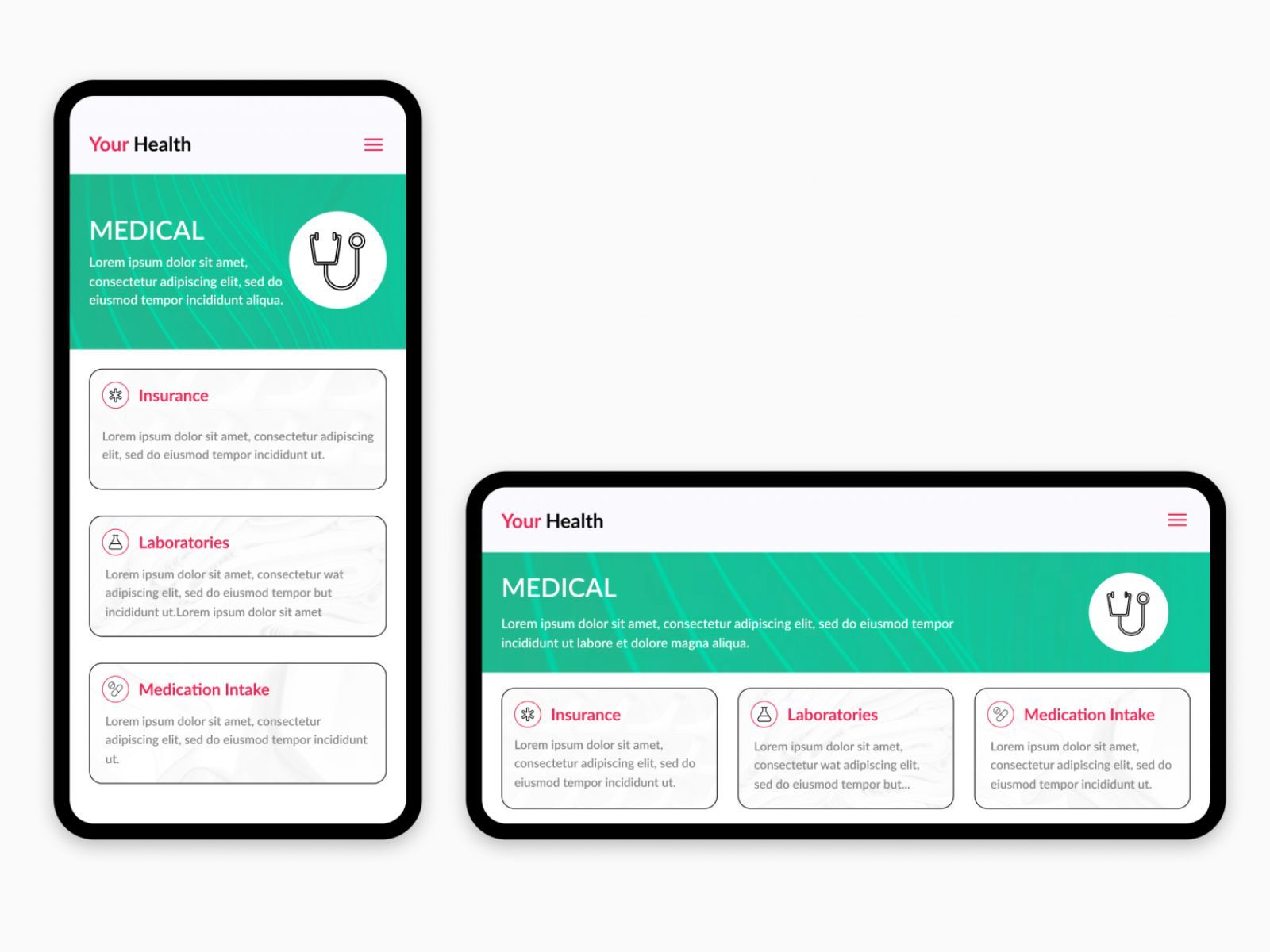
9. Implement Healthcare-Specific Icons
Incorporating icons into the patient experience design is a prevalent trend in various industries, and it holds great value for healthcare applications. Icons make the interface more interactive, visually appealing, and less cluttered by replacing words with smaller, intuitive symbols for navigation. Including healthcare-specific icons enhances the overall UI design for healthcare app development and ensures a consistent visual language.
For instance, you can use icons representing different parts of the body, medical equipment, and services to illustrate navigation options, various types of healthcare services (e.g., scheduling lab tests), and app functionalities such as contacting a doctor via chat or video call.
A crucial aspect to remember when utilizing icons in your telemedicine app is maintaining uniformity in style, color palette, contrast, and size. Diverse appearances of icons can lead to confusion regarding their meanings and functionalities. To avoid this, opt for icons from a single library or create a custom collection that adheres to a consistent design language.
10. Simplify Medical Content
Medical content often contains complex terminology that can overwhelm users and impede comprehension. To ensure users feel informed and supported rather than confused, simplify medical terms in service descriptions and other types of content featured in the app. Present the main information in plain language while allowing access to additional details when needed.
To address complex medical language, you can include a built-in dictionary that allows users to look up terms and definitions with a simple click without leaving the section they are reading.
11. Maintain a Human and Consistent Tone of Voice
Effective communication between users and a healthcare application hinges on the user feeling seen and heard as if they were in contact with a qualified healthcare specialist. Humanizing the app's language is vital to provide users with empathy and support throughout their experience.
Several strategies can achieve this, from integrating an AI chatbot to adjusting the app's user interface and patient experience design. Using a less formal yet professional language, speaking from the first-person perspective, and adopting a friendly tone of voice will eliminate the feeling of loneliness that users may develop when interacting with bluntly toned content in the app.
Moreover, for patient-doctor communication via in-app chatting or video conferencing, healthcare providers must be trained to deliver personalized care using a similar tone of voice as the app's contents. Consistency in the tone of voice used throughout various app sections will enhance predictability and instil a sense of security in users.
12. Clear Section Labeling for Effortless Navigation
In app development, relying solely on current mHealth UI design trends may not be sufficient without a well-structured architecture. A proper app architecture ensures that contents and functionalities are organized effectively.
The application's design should reflect this architecture to facilitate intuitive user perception. When designing the navigation system, it is crucial to provide clear and intuitive labels for users to move swiftly between different sections and features of the app. Therefore, employ concise and direct labels and descriptions.
13. Adding Visual Cues for Guidance
Simplifying navigation through the app can be achieved through effective UI practices in healthcare, such as incorporating visual cues for enhanced clarity in each step of app functionality. Visual elements like progress bars or step-by-step instructions act as virtual assistants, guiding users through all necessary actions, from signing up to booking appointments.
14. Providing Tips and Hints for App Usage
Navigation can prove challenging for less experienced mobile users, especially older individuals who may rely heavily on the app as a healthcare assistant. To support these users, offer tips and hints that educate and guide them through various app features and common actions, such as contacting a doctor online or setting medication reminders.
Moreover, ensure clear and easy-to-understand error messages are in place to troubleshoot issues effectively. Provide notifications and pop-ups with specific instructions on resolving problems, creating a seamless user experience. Consider featuring an in-app help centre with detailed instructions for addressing common issues.
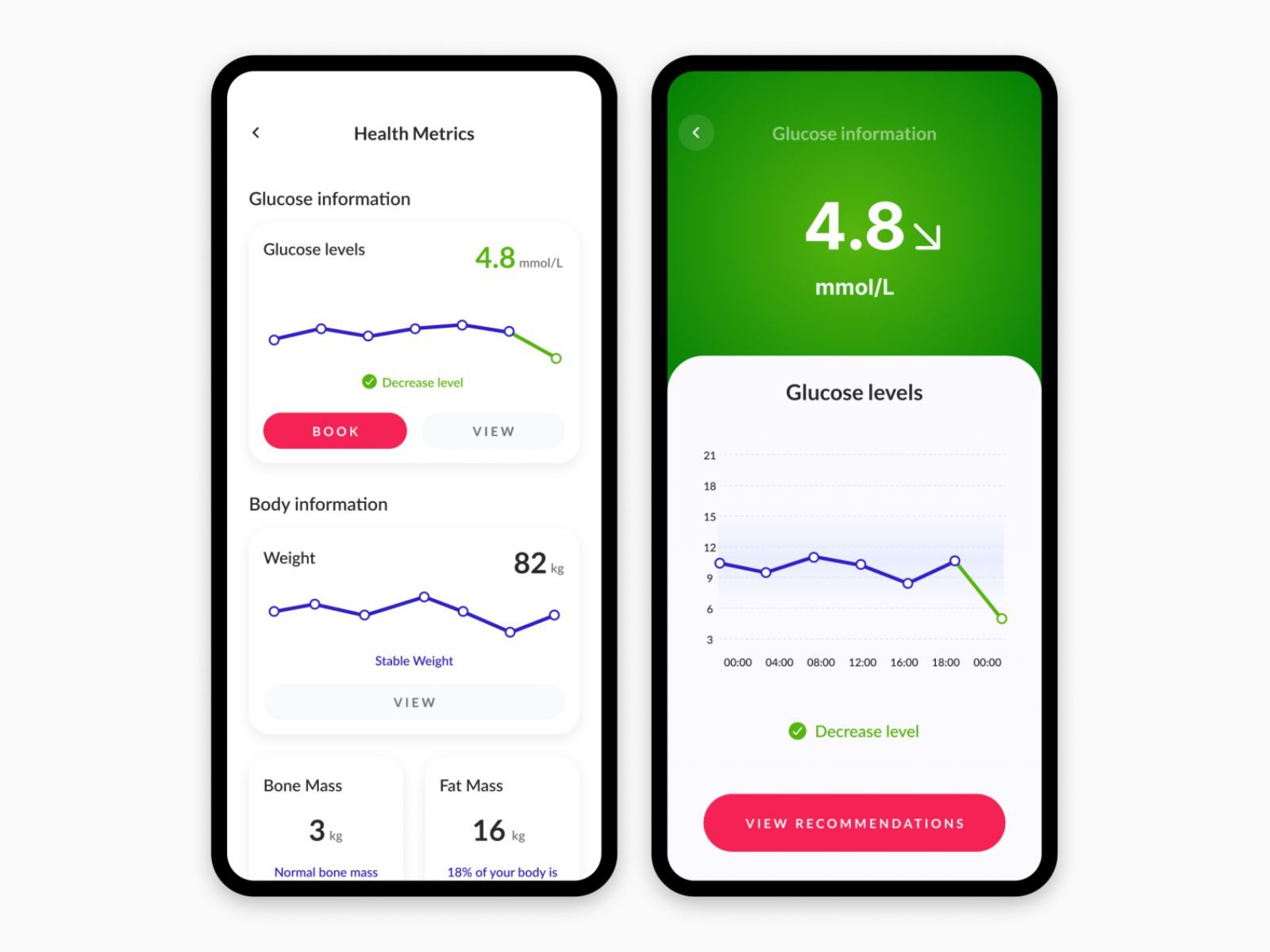
15. Visualizing Data and Analytics
Data visualization and analytics are essential mHealth UI design trends that assist patients and healthcare providers in making informed health decisions. However, interpreting extensive numerical or text data can be challenging. Presenting this data in graphs and charts allows for clear and understandable representation.
To strike a balance in data visualization, avoid overwhelming users with excessive details while ensuring that the presented information is sufficient to draw valuable insights. Visualize most of the data and add context and explanations only where necessary. This approach enables patients better to comprehend their health status with enough relevant details.
16. Ensuring Accessibility
When developing telehealth applications, accessibility is of utmost importance to ensure users feel supported and accommodated. Design the app to include people with different impairments by incorporating high-contrast text and large buttons for easy perception and clicking.
Be mindful of users with colourblindness when selecting the color palette for various UI design elements. Additionally, consider adding voiceover compatibility to the app's functionality to benefit users with vision impairments.
17. Design Responsiveness for Various Devices
Since patients and doctors will access your app from various mobile devices and tablets, ensuring the design's responsiveness is critical. A responsive UI design for healthcare application development seamlessly adapts to different screen sizes and orientations.
Responsiveness allows the app's layout to adjust smoothly for all users, ensuring they can access all content and features without any issues on any mobile device.
Furthermore, besides testing the app's display on various screens, thoroughly evaluate all design aspects, including font and image sizes, colors and contrast, icons, and the navigation section. Ensure that everything appears well-designed regardless of the device used.
18. Keeping Up With Emerging Medical UI Design Trends
While the provided tips are timeless, staying abreast of changing UI design aspects and emerging healthcare UX trends is crucial. Some trends may persist for an extended period, while others may fade quickly. Monitoring these trends helps identify design approaches and decisions that resonate with users.
Be attentive to emerging and current mHealth UI design trends to deliver a healthcare UI design that users will likely appreciate. Consider adapting your existing design to incorporate trending elements that align with user preferences.
>> Read more: How to Choose the Best Web Development Company?
Final Thoughts
In conclusion, the user interface plays a significant role in the usability of a telehealth app, directly influencing how intuitive and convenient it is in addressing users' pain points. The provided comprehensive list of tips can be implemented when designing the interface of your telehealth application. If you require further assistance, feel free to contact us, and together we can work on your project.
>>> Follow and Contact Relia Software for more information!

- Designing an application
- Web application Development