
In the ever-evolving landscape of data visualization, Chart.js stands out as a versatile and powerful tool, especially within React applications. While its ease of use makes it accessible for beginners, its depth and flexibility allow for sophisticated customization and optimization. This article delves into advanced techniques for enhancing Chart.js in React, focusing on customization, interactivity, performance optimization, and handling complex datasets.
Whether you're looking to improve user engagement through interactive features or optimize performance for large datasets, this guide will equip you with the tools needed to push the boundaries of what you can achieve with React Chart.js.
>> Read more:
- Top 6 Best React Component Libraries for Your Projects
- A Comprehensive Guide for React Server Components
- Mastering React Higher-Order Components (HOCs)
Setting Up Chart.js
Recap of the Basic Setup
Before exploring advanced features, it's essential to set up your environment correctly. Start by creating a new React project using Create React App, followed by installing the necessary Chart.js dependencies:
npx create-react-app chartjs-react-app
cd chartjs-react-app
npm install react-chartjs-2 chart.js
Basic Chart Types
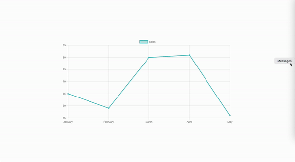
Chart.js offers a wide range of chart types, including Line, Bar, and Pie charts. To get started, let's walk through the setup of a basic Line chart, which is commonly used to display trends over time.
The following example demonstrates how to set up a simple Line chart using React and Chart.js. This chart will visualize monthly sales data:
import React from 'react';
import { Line } from 'react-chartjs-2';
import {
  Chart as ChartJS,
  CategoryScale,
  LinearScale,
  PointElement,
  LineElement,
  Title,
  Tooltip,
  Legend
} from 'chart.js';

// Register the necessary components with Chart.js
ChartJS.register(
  CategoryScale,
  LinearScale,
  PointElement,
  LineElement,
  Title,
  Tooltip,
  Legend
);

const data = {
  labels: ['January', 'February', 'March', 'April', 'May'],  // Labels for the x-axis
  datasets: [
    {
      label: 'Sales',  // Label for the dataset shown in the legend and tooltips
      data: [65, 59, 80, 81, 56],  // Data points corresponding to the labels
      fill: false,  // Disables filling the area under the line
      backgroundColor: 'rgba(75,192,192,0.4)',  // Color of the points
      borderColor: 'rgba(75,192,192,1)',  // Color of the line connecting the points
    },
  ],
};

const options = {
  scales: {
    y: {
      beginAtZero: true,  // Ensures the y-axis starts at zero, providing a clear baseline
    },
  },
};

const LineChart = () => <Line data={data} options={options} />;

export default LineChart;
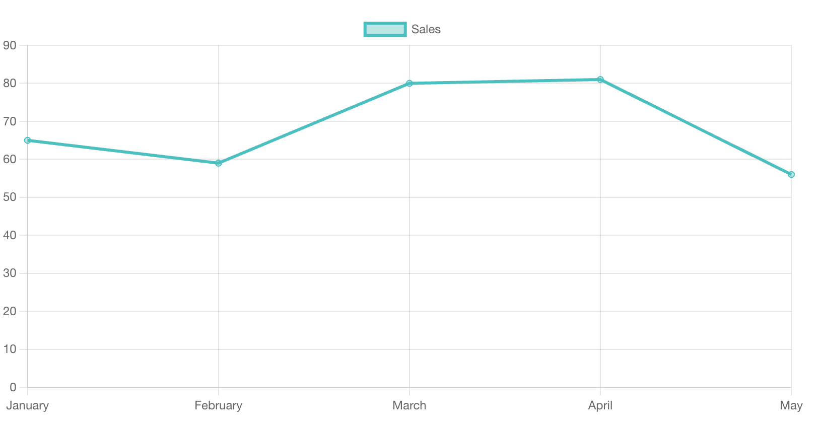
Here is where the rendered chart image will be displayed:
In this example:
- The
dataobject contains thelabelsfor the x-axis and thedatasetsarray that holds the data points, their colors, and other styling options. - The
optionsobject allows for customization of the chart’s behavior and appearance, such as ensuring the y-axis starts at zero, which provides a clear visual baseline.
This Line chart provides a visual representation of monthly sales data, making it easy to observe trends over time. You can further customize the chart by adjusting the data and options objects to fit your specific needs.
Customizing Components with React Chart.js
Appearance Customization
One of the most powerful features of Chart.js is its extensive customization options, which allow you to align your charts with your application's branding and design. This section covers how to adjust the chart's appearance by modifying the color scheme, gridlines, and font settings.
const options = {
plugins: {
legend: {
labels: {
font: {
size: 16,
},
color: '#333',
},
},
},
scales: {
x: {
grid: {
color: 'rgba(200, 200, 200, 0.3)',
},
},
y: {
grid: {
color: 'rgba(200, 200, 200, 0.3)',
},
title: {
display: true,
text: 'Sales ($)',
color: '#333',
font: {
size: 14,
weight: 'bold',
},
},
},
},
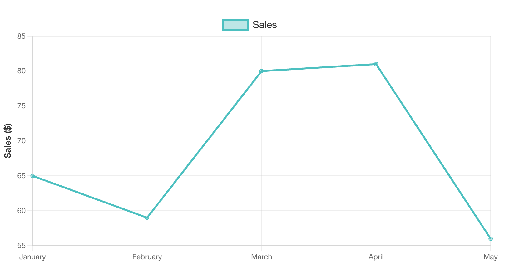
};These adjustments make the chart more polished and professional. By increasing the legend text size and using a darker color, the chart becomes easier to read. The subtle light gray gridlines ensure that the focus remains on the data, while the bold y-axis title provides clarity by indicating the data's context.
Together, these changes create a more polished and professional look compared to the default setup, ensuring that the chart is both visually appealing and informative. Here is the result:
Plugins
Plugins in Chart.js extend its functionality beyond the default capabilities, allowing you to add sophisticated features such as annotations, zooming, and more. For instance, the chartjs-plugin-zoom plugin enables zooming and panning:
import zoomPlugin from 'chartjs-plugin-zoom';
import { ChartJS } from 'chart.js';

// Add zoomPlugin to the register section
ChartJS.register(zoomPlugin);

const options = {
  plugins: {
    zoom: {
      zoom: {
        wheel: {
          enabled: true,  // Enable zooming with the mouse wheel
        },
        pinch: {
          enabled: true,  // Enable zooming on touch devices using pinch gestures
        },
        mode: 'xy',  // Allow zooming on both x and y axes
      },
    },
  },
};
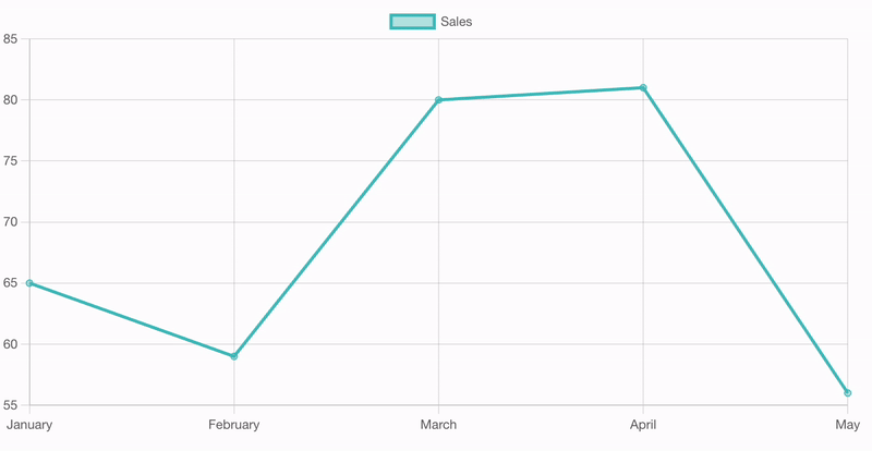
With these settings, the chart now supports zooming via the mouse wheel and pinch gestures, enhancing user interaction. Compared to the default static chart, this interactive functionality provides users with a more dynamic and detailed data exploration experience. Users can focus on specific data points or time frames by zooming in and out, making the chart not just a visual tool but also an interactive one.
By registering and configuring plugins, you can significantly enhance the interactivity and functionality of your charts, making them more responsive to user inputs. Here is the result:
Interactive Features in Chart.js
Tooltips and Legends
Tooltips and legends are essential for enhancing the usability of charts by providing users with additional context and information at a glance. Customizing these elements helps you present data more effectively and tailor the chart's appearance to your application's needs. Below is an example of how to customize tooltips and legends in Chart.js:
const options = {
  plugins: {
    tooltip: {
      callbacks: {
        label: function(context) {
          return `Sales: $${context.raw}`;  // Customize the tooltip text to include a dollar sign
        },
      },
    },
    legend: {
      display: true,  // Ensure the legend is displayed
      position: 'top',  // Position the legend at the top of the chart
    },
  },
};
These customizations enhance the chart by providing more informative tooltips, such as appending a dollar sign to the sales figures. Placing the legend at the top makes it more accessible and visually prominent, improving the overall user experience. Let's see the result below:
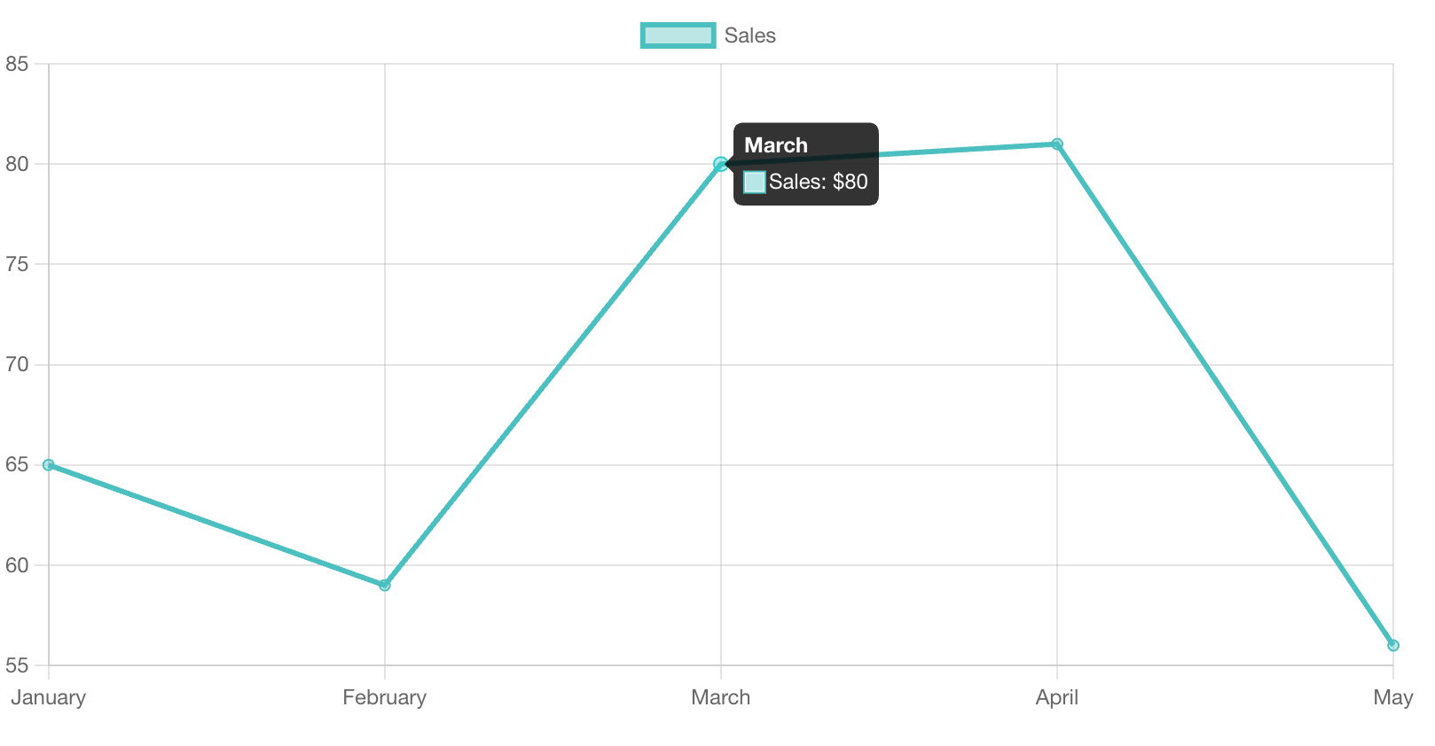
By tailoring the tooltips and legends, you can make your charts more intuitive and aligned with the user's needs compared to the default setup, where these elements might not provide enough context or be optimally positioned.
User Interaction
Advanced user interaction, such as click events, zooming, and panning, can transform static charts into dynamic tools for data exploration. Adding interaction encourages users to engage with the data more deeply. Here's an example of adding a click event to a chart:
const options = {
  onClick: (evt, element) => {
    if (element.length > 0) {
      const index = element[0].index;
      alert(`Clicked on ${data.labels[index]}: $${data.datasets[0].data[index]}`);
    }
  },
};
This simple but effective feature allows users to interact directly with individual data points. By enabling click events, your charts become more engaging and informative, as users can get instant feedback from specific parts of the chart.
Advanced Data Handling
Complex Datasets
As your applications grow in complexity, so do the datasets you need to visualize. Chart.js allows you to handle complex datasets by combining multiple chart types within a single chart. This capability is particularly useful when you need to compare different types of data on the same graph, such as visualizing sales volume with a bar chart and overlaying a line chart for cumulative sales.
To create a mixed chart in Chart.js, you can define different chart types within the same dataset array. Below is an example that combines a Bar chart for monthly sales and a Line chart for cumulative sales:
import React from 'react';
import { Chart as ChartJS, CategoryScale, LinearScale, BarElement, PointElement, LineElement, Title, Tooltip, Legend } from 'chart.js';
import { Bar, Line } from 'react-chartjs-2';

// Register the required components with Chart.js
ChartJS.register(CategoryScale, LinearScale, BarElement, PointElement, LineElement, Title, Tooltip, Legend);

const data = {
  labels: ['January', 'February', 'March', 'April', 'May'],
  datasets: [
    {
      type: 'bar',
      label: 'Monthly Sales',
      data: [65, 59, 80, 81, 56],
      backgroundColor: 'rgba(75,192,192,0.2)',
      borderColor: 'rgba(75,192,192,1)',
    },
    {
      type: 'line',
      label: 'Cumulative Sales',
      data: [65, 124, 204, 285, 341],
      fill: false,
      borderColor: 'rgba(153,102,255,1)',
    },
  ],
};

const options = {
  scales: {
    y: {
      beginAtZero: true,  // Ensures the y-axis starts at zero, providing a clear baseline
    },
  },
};

const MixedChart = () => <Bar data={data} options={options} />;

export default MixedChart;
In this example:
- Mixed Chart Types: We use a Bar chart to visualize monthly sales and overlay it with a Line chart that tracks cumulative sales. Each dataset specifies its chart type using the
typeproperty within the dataset object. - Component Choice: Although we use the
Barcomponent to initialize the chart, the line dataset is still rendered correctly because Chart.js handles the mixed types seamlessly. The key is in specifying the correcttypefor each dataset. - Custom Options: The
optionsobject includes settings such as ensuring the y-axis starts at zero, which is important for accurate data representation.
Check out the result:
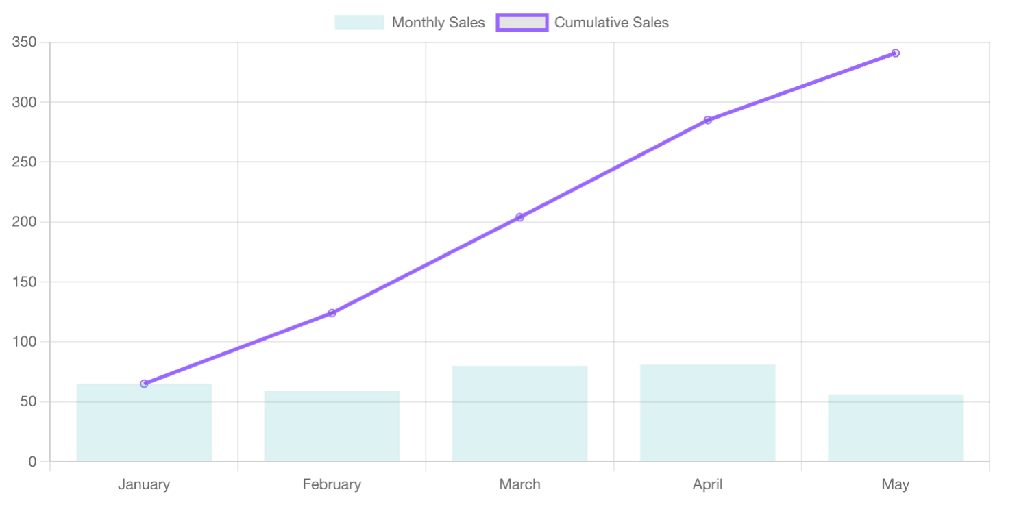
This mixed chart effectively combines two different types of data visualization into one cohesive view, making it easier to compare monthly and cumulative sales at a glance. This approach is particularly useful for dashboards and reports where multiple data trends need to be analyzed simultaneously.
Real-time Updates
In modern web applications, real-time data updates are increasingly important, particularly in scenarios where timely insights are critical. This section explores two approaches to integrating real-time data into your React applications using Chart.js.
We'll start with a basic implementation suitable for moderate update frequencies and then move on to a more advanced technique using chartjs-plugin-streaming for high-frequency data streams.
- Basic Real-time Data Integration with React Hooks
For applications requiring regular, but not extremely high-frequency updates, React Hooks offer a simple yet powerful solution for managing real-time data in your charts. Here's an example that illustrates how to integrate live data into your charts:
import React, { useState, useEffect } from 'react';
import { Line } from 'react-chartjs-2';
import { Chart as ChartJS, CategoryScale, LinearScale, PointElement, LineElement, Title, Tooltip, Legend } from 'chart.js';

// Register the required components with Chart.js
ChartJS.register(CategoryScale, LinearScale, PointElement, LineElement, Title, Tooltip, Legend);

const RealTimeChart = () => {
  const [data, setData] = useState({
    labels: ['January', 'February', 'March', 'April', 'May'],
    datasets: [
      {
        label: 'Sales',
        data: [65, 59, 80, 81, 56],
        fill: false,
        backgroundColor: 'rgba(75,192,192,0.4)',
        borderColor: 'rgba(75,192,192,1)',
      },
    ],
  });

  useEffect(() =>

 {
    const interval = setInterval(() => {
      // Example API call to fetch new data
      fetch('/api/data')
        .then((response) => response.json())
        .then((newData) => {
          setData({
            ...data,
            datasets: [
              {
                ...data.datasets[0],
                data: newData,
              },
            ],
          });
        });
    }, 1000);

    return () => clearInterval(interval);
  }, [data]);

  const options = {
    scales: {
      y: {
        beginAtZero: true,
      },
    },
  };

  return <Line data={data} options={options} />;
};

export default RealTimeChart;
This example demonstrates how to integrate live data into your charts, ensuring that users always see the most up-to-date information. The use of React Hooks (useState and useEffect) makes it easy to manage real-time updates. Remember to register the required components to ensure proper rendering.
- Advanced Real-time Data Handling with
chartjs-plugin-streaming
For applications requiring high-frequency updates—such as stock market tracking, network monitoring, or live sensor data visualization—chartjs-plugin-streaming offers a robust solution. This plugin is designed to handle continuous data streams, maintaining smooth performance even with rapid updates.
import React from 'react';
import { Line } from 'react-chartjs-2';
import 'chartjs-plugin-streaming';
import {
  Chart as ChartJS,
  CategoryScale,
  LinearScale,
  PointElement,
  LineElement,
  Title,
  Tooltip,
  Legend
} from 'chart.js';

// Register the necessary components with Chart.js
ChartJS.register(CategoryScale, LinearScale, PointElement, LineElement, Title, Tooltip, Legend);

const options = {
  scales: {
    x: {
      type: 'realtime', // Set the x-axis to realtime mode
      realtime: {
        duration: 20000,  // Display the last 20 seconds of data
        refresh: 1000,    // Refresh the chart every second
        delay: 1000,      // Delay the display by 1 second
        onRefresh: (chart) => {
          // Append new data to the chart in real time
          chart.data.datasets[0].data.push({
            x: Date.now(),
            y: getNewData(),  // Custom function to fetch or generate new data
          });
        },
      },
    },
    y: {
      beginAtZero: true,  // Ensures the y-axis starts at zero
    },
  },
  plugins: {
    streaming: {
      frameRate: 30  // Control the frame rate for smoother updates
    }
  }
};

const data = {
  datasets: [{
    label: 'Live Data',
    backgroundColor: 'rgba(75,192,192,0.4)',
    borderColor: 'rgba(75,192,192,1)',
    data: []  // Start with an empty dataset
  }]
};

const RealTimeChart = () => (
  <Line data={data} options={options} />
);

export default RealTimeChart;

function getNewData() {
  // Replace with your data fetching or generation logic
  return Math.random() * 100;
}
This real-time chart implementation offers several key advantages:
- Efficient Data Handling: The
onRefreshcallback is central to this implementation, enabling efficient management of high-frequency data streams. This is ideal for applications requiring real-time data visualization. - Performance Optimization: Adjusting the
frameRateandrefreshintervals allows developers to fine-tune performance, ensuring that the chart remains responsive even under heavy data loads. - Advanced Customization: The
getNewDatafunction is a placeholder that can be customized with real-time data sources such as WebSockets or APIs, enabling richer and more dynamic visualizations.
Performance Optimization
Working with Large Datasets
Handling large datasets in Chart.js can be challenging, but with the right techniques, you can maintain performance without compromising the quality of your data visualizations. One effective strategy is data thinning, which reduces the number of data points without losing significant detail. This approach allows your charts to remain responsive even when working with extensive datasets:
const thinnedData = originalData.filter((_, index) => index % 10 === 0);By filtering out unnecessary data points, you create a more manageable dataset, making it easier for Chart.js to render without performance issues. This method is particularly useful for visualizing time series data or large-scale datasets where every data point may not be critical for the overall analysis.
Offscreen Canvas and Web Workers
For performance-intensive operations, such as rendering large charts or handling real-time updates, using an offscreen canvas or web workers can offload heavy computational tasks from the main thread, significantly improving performance:
const offscreenCanvas = document.createElement('canvas').transferControlToOffscreen();
const worker = new Worker('chart-worker.js');
worker.postMessage({ canvas: offscreenCanvas }, [offscreenCanvas]);
These techniques allow complex rendering tasks to be handled in a background thread, freeing up the main thread to manage the user interface and other critical tasks. This can dramatically improve performance in resource-constrained environments, such as mobile devices, or when dealing with complex and large-scale data visualizations.
- Offscreen Canvas: Moves the rendering process to a separate canvas element that operates outside the document’s flow, allowing for smoother and faster drawing operations.
- Web Workers: Offload JavaScript tasks to run in the background, preventing UI blocking and ensuring that the main thread remains responsive to user interactions.
By incorporating these techniques, you can optimize your charts for performance, especially in applications that demand real-time data visualization or handle substantial amounts of data.
Case Study - Custom Chart Example
To illustrate the advanced techniques discussed in this guide, let's consider a real-world scenario involving a financial dashboard. The objective is to display real-time stock prices and trading volumes using a mixed chart, while incorporating live data updates and interactive features like zooming and detailed tooltips.
Implementation:
- Chart Type: A combination of Line and Bar charts is used to display stock prices and trading volumes, respectively. This provides a clear comparison of trends in both price movements and trading activities.
- Real-time Data: Data is fetched from a WebSocket API, ensuring the charts are updated in real-time, allowing users to make decisions based on the most current data.
- Interactivity: Zooming and panning features are enabled using the
chartjs-plugin-zoom, allowing users to focus on specific time periods for detailed analysis.
Code Example:
import React, { useState, useEffect } from 'react';
import { Line, Bar } from 'react-chartjs-2';
import zoomPlugin from 'chartjs-plugin-zoom';
import { Chart as ChartJS, CategoryScale, LinearScale, BarElement, PointElement, LineElement, Title, Tooltip, Legend } from 'chart.js';

ChartJS.register(zoomPlugin, CategoryScale, LinearScale, BarElement, PointElement, LineElement, Title, Tooltip, Legend);

const FinancialDashboard = () => {
  const [data, setData] = useState({
    labels: ['January', 'February', 'March', 'April', 'May'],
    datasets: [
      {
        type: 'bar',
        label: 'Trading Volume',
        data: [1500, 2000, 1800, 2400, 2300],
        backgroundColor: 'rgba(75,192,192,0.2)',
        borderColor: 'rgba(75,192,192,1)',
      },
      {
        type: 'line',
        label: 'Stock Price',
        data: [65, 59, 80, 81, 56],
        fill: false,
        borderColor: 'rgba(153,102,255,1)',
      },
    ],
  });

  useEffect(() => {
	  // Replace with your needed websocket
    const ws = new WebSocket('wss://example.com/stock-prices');
    ws.onmessage = (event) => {
      const newData = JSON.parse(event.data);
      setData((prevData) => ({
        ...prevData,
        datasets: [
          { ...prevData.datasets[0], data: newData.volumes },
          { ...prevData.datasets[1], data: newData.prices },
        ],
      }));
    };

    return () => ws.close();
  }, []);

  const options = {
    plugins: {
      zoom: {
        zoom: {
          wheel: {
            enabled: true,
          },
          mode: 'xy',
        },
      },
    },
  };

  return (
    <div>
      <Bar data={data} options={options} />
      <Line data={data} options={options} />
    </div>
  );
};

export default FinancialDashboard;
This case study demonstrates how to combine advanced features like real-time updates and interactivity to create a dynamic and responsive financial dashboard. These techniques can be applied across various industries where live data visualization is critical for decision-making.
>> You may consider:
- Demystifying React Redux for Centralized State Management
- Mastering React Context API for Streamlined Data Sharing
- 7 Best React State Management Libraries for Any Project Size
Conclusion
In this article, we've delved into the advanced capabilities of Chart.js within React applications, covering everything from customizing chart appearances and adding interactive features to handling complex datasets and optimizing performance. By mastering these techniques, you can transform your data visualizations, making them not only visually appealing but also highly functional and responsive.
As you continue to experiment with Chart.js, remember that the key to effective data visualization lies in balancing complexity with clarity. The goal is to create charts that deliver meaningful insights without overwhelming the user.
By thoughtfully applying the customization, interactivity, and performance optimization techniques discussed here, you'll be well-equipped to build powerful, user-friendly visualizations that can handle even the most complex datasets.
>>> Follow and Contact Relia Software for more information!

- coding
- web development
- Web application Development