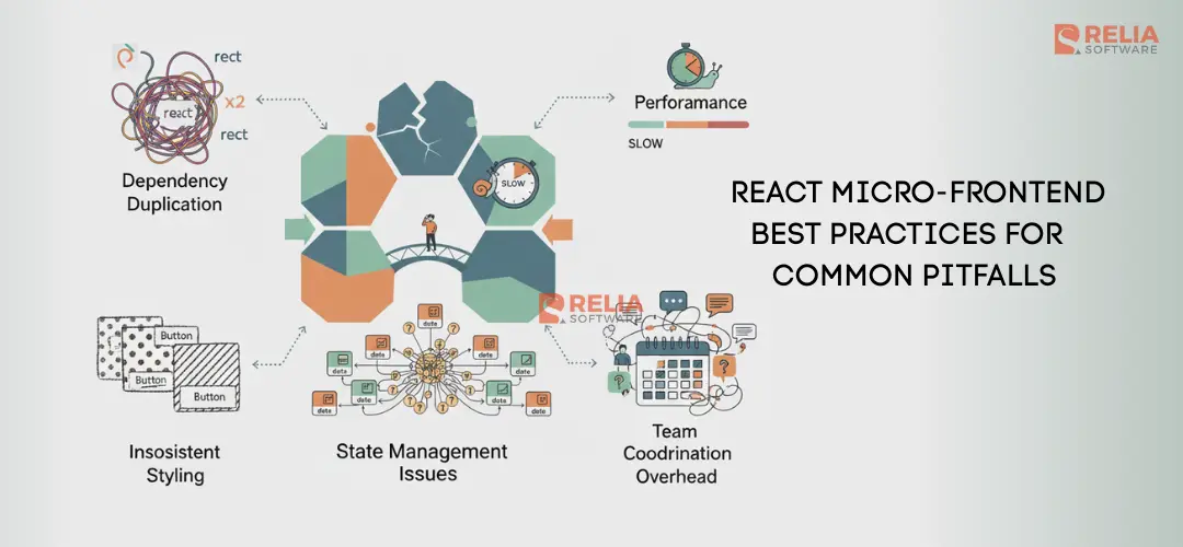
React micro-frontends promise team autonomy, independent deployments, and technology diversity. But many teams discover these benefits create hidden costs: bloated bundles, inconsistent UIs, broken state management, and slow performance.
Without proper planning, micro-frontends create worse problems than monoliths. The solution? Understanding common pitfalls before you build. This guide covers five critical pitfalls in React micro-frontends with proven solutions you can implement today. You'll learn why these issues occur, how to recognize them early, and fixes that scale to production.
What Are Micro-Frontends?
Micro-frontends are self-contained frontend applications that integrate at runtime to form a complete user experience. Each micro-frontend is independently developed, deployed, and maintained by different teams.
Think of micro-frontends like microservices for the frontend. Instead of one large React app, you have multiple smaller apps that communicate and integrate together.
Micro-frontends architecture offers compelling benefits:
- Team autonomy: Teams work independently without waiting on others
- Technology diversity: Different teams can use different React versions or frameworks
- Independent deployments: Deploy features without coordinating with other teams
- Faster iteration: Smaller codebases mean faster builds and deployments
However, these benefits create new challenges. Independent teams mean less coordination. Different technologies mean potential conflicts. Separate deployments mean integration risks.
⚠️ Warning: Micro-frontends aren't always the right choice. They add complexity and overhead. Use them when team size (5+ teams) or release cadence (daily deployments) justifies the added complexity.
Pitfall 1: Dependency Duplication
Problem: Multiple micro-frontends bundle the same dependencies, causing massive bundle bloat and slower load times.
When teams work independently, each micro-frontend includes its own dependencies. React, ReactDOM, and shared libraries get bundled separately in each app. If you have three micro-frontends, React might be downloaded three times.
The impact is significant. Typical React applications include React (~45KB gzipped), ReactDOM (~140KB gzipped), and common utilities. With three micro-frontends duplicating these, you're sending 400-500KB of redundant JavaScript before any business logic.
Here's what happens without dependency sharing:
// Micro-frontend A (Dashboard)
import React from 'react';
import ReactDOM from 'react-dom';
import { format } from 'date-fns'; // 50KB

// Micro-frontend B (Admin Panel)
import React from 'react';
import ReactDOM from 'react-dom';
import { format } from 'date-fns'; // Same 50KB duplicated

// Micro-frontend C (User Settings)
import React from 'react';
import ReactDOM from 'react-dom';
import { format } from 'date-fns'; // Same 50KB duplicated again
Result: Users download React three times, ReactDOM three times, and date-fns three times. That's 500+ KB of duplicated dependencies.
Solution 1: Module Federation
Module Federation is a Webpack 5 feature that enables runtime sharing of modules across separate builds. It allows micro-frontends to consume shared dependencies from a host application without bundling them again.
The host application exposes shared dependencies, and micro-frontends consume them at runtime:
// Host application (webpack.config.js)
const ModuleFederationPlugin =
  require('@module-federation/webpack');

module.exports = {
  plugins: [
    new ModuleFederationPlugin({
      name: 'host',
      remotes: {
        dashboard:
          'dashboard@<http://localhost:3001/remoteEntry.js>',
        admin:
          'admin@<http://localhost:3002/remoteEntry.js>',
      },
      shared: {
        react: {
          singleton: true,
          requiredVersion: '^18.0.0'
        },
        'react-dom': {
          singleton: true,
          requiredVersion: '^18.0.0'
        },
        'date-fns': {
          singleton: true,
          requiredVersion: '^2.0.0'
        },
      },
    }),
  ],
};
// Micro-frontend (dashboard) webpack.config.js
const ModuleFederationPlugin =
require('@module-federation/webpack');
module.exports = {
plugins: [
new ModuleFederationPlugin({
name: 'dashboard',
filename: 'remoteEntry.js',
exposes: {
'./Dashboard': './src/Dashboard',
},
shared: {
react: {
singleton: true,
requiredVersion: '^18.0.0'
},
'react-dom': {
singleton: true,
requiredVersion: '^18.0.0'
},
'date-fns': {
singleton: true,
requiredVersion: '^2.0.0'
},
},
}),
],
};This configuration ensures:
- Single instance: React loads once, shared by all micro-frontends
- Version control:
singleton: trueprevents multiple versions - Runtime resolution: Dependencies resolve at runtime, not build time
The result? Instead of 500KB of duplicated dependencies, you get 150KB shared once. That's a 70% reduction in bundle size.
Solution 2: Peer Dependencies
If Module Federation isn't an option, use peer dependencies to ensure shared libraries aren't bundled:
// package.json in each micro-frontend
{
  "name": "@company/dashboard",
  "dependencies": {
    "date-fns": "^2.29.0"
  },
  "peerDependencies": {
    "react": "^18.0.0",
    "react-dom": "^18.0.0"
  }
}
The host application provides React and ReactDOM. Micro-frontends declare them as peer dependencies, preventing bundling. You still need Module Federation or similar for runtime integration, but peer dependencies enforce the constraint.
💡 Pro Tip: Use Module Federation for Webpack 5 projects. For Vite or other bundlers, consider single-spa or import maps for dependency sharing.
Comparing Approaches:
Approach | Bundle Reduction | Complexity | When to Use |
|---|---|---|---|
Module Federation | 60-70% | Medium | Webpack 5 projects |
Peer Dependencies | 40-50% | Low | Simple setups, fewer dependencies |
Shared CDN | 70-80% | Low | Public dependencies (React, lodash) |
Single Bundle | 80-90% | High | Requires build coordination |
Module Federation provides the best balance of bundle reduction and flexibility. It works at runtime, so micro-frontends can deploy independently while sharing dependencies.
Pitfall 2: Inconsistent Styling
Problem: CSS conflicts across micro-frontends create visual inconsistencies, style leaks, and maintenance nightmares.
Global CSS namespaces collide when micro-frontends load. Component styles from one app affect components in another. Button styles clash, colors differ, and spacing becomes inconsistent.
Consider this scenario:
// Micro-frontend A (Dashboard) - styles.css
.button {
  background: blue;
  padding: 10px;
  border-radius: 4px;
}

// Micro-frontend B (Admin Panel) - styles.css
.button {
  background: red;
  padding: 15px;
  border-radius: 8px;
}
When both micro-frontends load, the last CSS wins globally. Buttons appear inconsistent, and changing one app's styles breaks the other.
Solution 1: CSS-in-JS with Scoped Styles
CSS-in-JS libraries like styled-components or Emotion generate unique class names, preventing conflicts:
// Dashboard micro-frontend
import styled from 'styled-components';

const DashboardButton = styled.button`
  background: ${props => props.theme.colors.primary};
  padding: 10px;
  border-radius: 4px;

  &:hover {
    background: ${props =>
      props.theme.colors.primaryDark};
  }
`;

// Admin Panel micro-frontend
const AdminButton = styled.button`
  background: ${props =>
    props.theme.colors.danger};
  padding: 15px;
  border-radius: 8px;
`;
Each styled component generates unique class names like sc-dashboardButton-abc123 and sc-adminButton-xyz789. Styles remain isolated.
Solution 2: CSS Modules
CSS Modules scope classes to components, preventing global conflicts:
// Dashboard - Button.module.css
.button {
  background: blue;
  padding: 10px;
}

// Dashboard - Button.tsx
import styles from './Button.module.css';

function Button() {
  return (
    <button className={styles.button}>
      Click me
    </button>
  );
}
CSS Modules transform class names during build. The .button
class becomes .Button_button__abc123 in the output. Classes are unique per component, preventing conflicts.
Solution 3: Design Tokens
Shared design tokens ensure visual consistency while allowing per-app customization:
// Shared design tokens package
export const tokens = {
  colors: {
    primary: '#007bff',
    secondary: '#6c757d',
    danger: '#dc3545',
  },
  spacing: {
    xs: '4px',
    sm: '8px',
    md: '16px',
    lg: '24px',
  },
  borderRadius: {
    small: '4px',
    medium: '8px',
    large: '16px',
  },
};

// Dashboard uses tokens
import { tokens } from '@company/design-tokens';

const buttonStyle = {
  background: tokens.colors.primary,
  padding: tokens.spacing.md,
  borderRadius: tokens.borderRadius.medium,
};
All micro-frontends import the same tokens. Colors, spacing, and typography stay consistent. Teams can customize within token constraints.
Solution 4: Shadow DOM Isolation
Shadow DOM creates complete style isolation:
// Dashboard component with Shadow DOM
class DashboardRoot extends HTMLElement {
  connectedCallback() {
    const shadow = this.attachShadow({
      mode: 'closed'
    });

    shadow.innerHTML = `
      <style>
        .button {
          background: blue;
          padding: 10px;
        }
      </style>
      <button class="button">
        Dashboard Button
      </button>
    `;
  }
}

customElements.define('dashboard-root',
  DashboardRoot);
Styles inside Shadow DOM can't leak out. External styles can't affect Shadow DOM content. Complete isolation, but requires custom elements instead of React components.
Comparing Styling approaches:
Approach | Isolation Level | Consistency | Bundle Impact |
|---|---|---|---|
CSS-in-JS | High | Medium (needs tokens) | +5-10KB runtime |
CSS Modules | High | Medium (needs tokens) | No runtime cost |
Design Tokens | Medium | High | Minimal |
Shadow DOM | Complete | Medium (needs tokens) | Native browser API |
For React micro-frontends, combine CSS-in-JS or CSS Modules with design tokens. You get style isolation plus visual consistency.
Best Practice: Use design tokens for shared values (colors, spacing) and CSS-in-JS for component-specific styles. This balances consistency with flexibility.
Pitfall 3: State Management Issues
Problem: Global state doesn't sync across micro-frontends, causing data inconsistencies and broken features.
Micro-frontends operate independently. When one app updates user data, other apps don't know. Users see stale information. Actions fail because state is out of sync.
Imagine a shopping cart micro-frontend and a checkout micro-frontend:
// Shopping Cart micro-frontend
function Cart() {
  const [items, setItems] = useState([]);

  const addItem = (product) => {
    setItems([...items, product]);
  };

  return <div>{items.length} items</div>;
}

// Checkout micro-frontend
function Checkout() {
  const [items, setItems] = useState([]);

  // Problem: Checkout doesn't know about cart items
  // Items array is always empty
  return <div>Total: ${calculateTotal(items)}</div>;
}
Cart state lives in the cart app. Checkout state lives in the checkout app. They're separate React apps with separate state, no synchronization. One app updates the cart, another app shows the old total. The user sees inconsistent data.
Solution 1: Event Bus Pattern
An event bus enables communication between micro-frontends without tight coupling:
// Shared event bus (loaded by host)
class MicroFrontendEventBus {
  private listeners: Map<string, Function[]> =
    new Map();

  on(event: string, callback: Function) {
    if (!this.listeners.has(event)) {
      this.listeners.set(event, []);
    }
    this.listeners.get(event)!.push(callback);
  }

  emit(event: string, data: any) {
    const callbacks =
      this.listeners.get(event) || [];
    callbacks.forEach(cb => cb(data));
  }

  off(event: string, callback: Function) {
    const callbacks =
      this.listeners.get(event) || [];
    const filtered = callbacks.filter(
      cb => cb !== callback
    );
    this.listeners.set(event, filtered);
  }
}

// Make it globally available
(window as any).eventBus =
  new MicroFrontendEventBus();
// Shopping Cart micro-frontend
function Cart() {
  const [items, setItems] = useState([]);

  useEffect(() => {
    const handleCartUpdate =
      (newItems: CartItem[]) => {
      setItems(newItems);
    };

    window.eventBus.on(
      'cart:updated',
      handleCartUpdate
    );

    return () => {
      window.eventBus.off(
        'cart:updated',
        handleCartUpdate
      );
    };
  }, []);

  const addItem = (product: Product) => {
    const newItems = [...items, product];
    setItems(newItems);
    window.eventBus.emit('cart:updated', newItems);
  };

  return <div>{items.length} items</div>;
}
// Checkout micro-frontend
function Checkout() {
const [items, setItems] = useState<CartItem[]>([]);
useEffect(() => {
const handleCartUpdate =
(newItems: CartItem[]) => {
setItems(newItems);
};
window.eventBus.on(
'cart:updated',
handleCartUpdate
);
// Request current cart state
window.eventBus.emit('cart:request-state');
return () => {
window.eventBus.off(
'cart:updated',
handleCartUpdate
);
};
}, []);
return <div>Total: ${calculateTotal(items)}</div>;
}The event bus decouples micro-frontends. Cart emits events, checkout listens without direct dependencies between apps.
Solution 2: Context Bridge
A context bridge shares React context across micro-frontend boundaries:
// Shared state store (host application)
import {
  createContext,
  useContext,
  useState
} from 'react';

interface AppState {
  cart: CartItem[];
  user: User | null;
}

const AppStateContext = createContext<{
  state: AppState;
  updateCart: (items: CartItem[]) => void;
  updateUser: (user: User) => void;
} | null>(null);

export function AppStateProvider({
  children
}: {
  children: React.ReactNode
}) {
  const [state, setState] = useState<AppState>({
    cart: [],
    user: null,
  });

  const updateCart = (items: CartItem[]) => {
    setState(prev => ({ ...prev, cart: items }));
  };

  const updateUser = (user: User) => {
    setState(prev => ({ ...prev, user }));
  };

  return (
    <AppStateContext.Provider
      value={{ state, updateCart, updateUser }}
    >
      {children}
    </AppStateContext.Provider>
  );
}

export function useAppState() {
  const context = useContext(AppStateContext);
  if (!context) {
    throw new Error(
      'useAppState must be used within AppStateProvider'
    );
  }
  return context;
}
Host app:
// Host application wraps all micro-frontends
function App() {
  return (
    <AppStateProvider>
      <Dashboard />
      <Cart />
      <Checkout />
    </AppStateProvider>
  );
}
Cart:
// Cart micro-frontend uses shared context
function Cart() {
  const { state, updateCart } = useAppState();

  const addItem = (product: Product) => {
    const newItems = [...state.cart, product];
    updateCart(newItems);
  };

  return <div>{state.cart.length} items</div>;
}
Context bridge provides React-native state sharing. All micro-frontends access the same context and update propagate automatically.
Solution 3: Cross-App State Store
For complex state, use a dedicated state store accessible to all micro-frontends:
// Shared Redux store (host application)
import { createStore } from 'redux';
import { cartReducer } from './reducers/cart';

const store = createStore(cartReducer);

// Make store globally available
(window as any).reduxStore = store;
// Cart micro-frontend
import { useSelector, useDispatch } from 'react-redux';
function Cart() {
const items = useSelector(
(state: AppState) => state.cart.items
);
const dispatch = useDispatch();
const addItem = (product: Product) => {
dispatch({
type: 'cart/addItem',
payload: product
});
};
return <div>{items.length} items</div>;
}Redux, Zustand, or Jotai work well for cross-app state. The store lives in the host app. Micro-frontends connect to it.
Comparing State Management Approaches:
Approach | Coupling | Complexity | Best For |
|---|---|---|---|
Event Bus | Low | Medium | Simple events, notifications |
Context Bridge | Medium | Low | Shared user data, theme |
State Store | Medium | High | Complex state, large apps |
Event bus works for simple communication. Context bridge fits React-native patterns. State store handles complex applications.
💡 Pro Tip: Start with an event bus for simple communication. Add a state store when you need complex shared state. Keep micro-frontends loosely coupled.
Pitfall 4: Performance Bottlenecks
Problem: Too many JavaScript bundles cause slow initial loads, poor Core Web Vitals, and frustrated users.
Each micro-frontend ships as a separate bundle. Loading five micro-frontends means downloading five JavaScript files, executing five initialization scripts, and rendering five React trees. Initial load time balloons to 3-5 seconds on 3G connections.
Here's what happens without optimization:
// Host application loads all micro-frontends eagerly
import('./dashboard')
  .then(module => renderDashboard(module.default));
import('./admin')
  .then(module => renderAdmin(module.default));
import('./cart')
  .then(module => renderCart(module.default));
import('./checkout')
  .then(module => renderCheckout(module.default));
import('./settings')
  .then(module => renderSettings(module.default));
All bundles download immediately. Users wait for everything to load before seeing content.
Solution 1: Route-Based Lazy Loading
Load micro-frontends only when routes are accessed:
// Host application with lazy loading
import { lazy, Suspense } from 'react';
import {
  BrowserRouter,
  Routes,
  Route
} from 'react-router-dom';

// Lazy load micro-frontends
const Dashboard = lazy(() =>
  import('./micro-frontends/Dashboard')
);
const Admin = lazy(() =>
  import('./micro-frontends/Admin')
);
const Cart = lazy(() =>
  import('./micro-frontends/Cart')
);

function App() {
  return (
    <BrowserRouter>
      <Suspense fallback={<div>Loading...</div>}>
        <Routes>
          <Route path="/dashboard"
            element={<Dashboard />} />
          <Route path="/admin"
            element={<Admin />} />
          <Route path="/cart"
            element={<Cart />} />
        </Routes>
      </Suspense>
    </BrowserRouter>
  );
}
Users download only the micro-frontend they need. Dashboard users don't load admin code. Load time drops from 5 seconds to 1-2 seconds.
Solution 2: Prefetching Strategy
Prefetch micro-frontends users are likely to visit:
// Prefetch on hover or idle time
function useMicroFrontendPrefetch() {
  useEffect(() => {
    // Prefetch on link hover
    const links =
      document.querySelectorAll('a[data-prefetch]');

    links.forEach(link => {
      link.addEventListener('mouseenter', () => {
        const moduleName =
          link.getAttribute('data-prefetch');
        if (moduleName) {
          import(`./micro-frontends/${moduleName}`);
        }
      });
    });

    // Prefetch during idle time
    if ('requestIdleCallback' in window) {
      requestIdleCallback(() => {
        import('./micro-frontends/Cart');
      });
    }
  }, []);
}
// Navigation component with prefetch hints
function Navigation() {
return (
<nav>
<a href="/dashboard" data-prefetch="Dashboard">
Dashboard
</a>
<a href="/cart" data-prefetch="Cart">
Cart
</a>
</nav>
);
}Prefetching loads bundles in the background. When users click, the bundle is already cached. Perceived performance improves.
Solution 3: Code Splitting Within Micro-Frontends
Split large micro-frontends into smaller chunks:
// Dashboard micro-frontend with code splitting
const DashboardChart = lazy(() =>
  import('./components/Chart')
);
const DashboardTable = lazy(() =>
  import('./components/Table')
);
const DashboardFilters = lazy(() =>
  import('./components/Filters')
);

function Dashboard() {
  return (
    <div>
      <Suspense fallback={
        <div>Loading chart...</div>
      }>
        <DashboardChart />
      </Suspense>
      <Suspense fallback={
        <div>Loading table...</div>
      }>
        <DashboardTable />
      </Suspense>
    </div>
  );
}
Micro-frontends load incrementally. Critical content appears first. Non-critical features load afterward.
Solution 4: Bundle Analysis and Optimization
Analyze bundle sizes and optimize large dependencies:
// Use webpack-bundle-analyzer to identify large dependencies
// Then optimize with dynamic imports

// Before: Import entire library
import * as dateFns from 'date-fns';

// After: Import only needed functions
import format from 'date-fns/format';
import parseISO from 'date-fns/parseISO';
Tree-shaking eliminates unused code. Dynamic imports load features on demand. Bundle sizes shrink.
Performance Comparison of 4 Approaches:
Strategy | Initial Load | Time to Interactive | Bundle Size |
|---|---|---|---|
Eager Loading | 3-5s | 5-8s | All bundles (2MB+) |
Lazy Loading | 1-2s | 2-3s | Route bundle only (400KB) |
Prefetching | 1-2s | <1s | Smart preloading |
Code Splitting | 1-1.5s | 1.5-2s | Incremental loading |
Route-based lazy loading provides the biggest performance gain. Combine with prefetching for optimal user experience.
✅ Best Practice: Measure Core Web Vitals (LCP, FID, CLS) before and after optimization. Target LCP < 2.5s, FID < 100ms, CLS < 0.1.
Pitfall 5: Team Coordination Overhead
Problem: Fragmented ownership creates merge conflicts, deployment blockers, and unclear responsibilities.
Multiple teams working independently means shared components live in different repositories. Changes to shared UI require coordination across teams. Deployment order matters. Breaking changes cascade through dependent micro-frontends.
Consider a shared button component:
// Team A owns the button component
// Button.tsx in @company/ui-components

export function Button({
  onClick,
  children
}: ButtonProps) {
  return (
    <button onClick={onClick}>
      {children}
    </button>
  );
}

// Team B's micro-frontend uses it
import { Button } from '@company/ui-components';

// Team A changes Button API without notice
// Team B's app breaks on next deployment
Team A updates the button. Team B doesn't know. Team B deploys. The app breaks. Coordination failure.
Solution 1: Governance Model
Establish clear ownership and change management:
// Shared component contract
interface ButtonContract {
  version: '2.0.0';
  props: {
    onClick: (event: MouseEvent) => void;
    children: React.ReactNode;
    variant?: 'primary' | 'secondary';
  };
  breakingChanges: string[];
  migrationGuide: string;
}

// Component registry tracks usage
const componentRegistry = {
  '@company/ui-components/Button': {
    owner: 'team-ui',
    consumers: ['dashboard', 'admin', 'cart'],
    version: '2.0.0',
    deprecationPolicy: 'major-version-only',
  },
};
Governance model defines:
- Ownership: Which team maintains each component
- Change policy: Breaking changes require major version bumps
- Communication: Notify consumers before changes
- Deprecation: Timeline for removing old versions
Solution 2: Contract Testing
Automated tests verify component contracts:
// Contract test ensures Button API stability
describe('Button Component Contract', () => {
  it('must accept onClick and children props', () => {
    const onClick = jest.fn();
    const { getByRole } = render(
      <Button onClick={onClick}>
        Click me
      </Button>
    );

    fireEvent.click(getByRole('button'));
    expect(onClick).toHaveBeenCalled();
  });

  it('must support variant prop', () => {
    const { container } = render(
      <Button variant="primary">
        Button
      </Button>
    );
    expect(container.firstChild)
      .toHaveClass('primary');
  });
});

// CI/CD fails if contract breaks
Contract tests run in CI/CD. If someone breaks the contract, the build fails before the change reaches consumers.
Solution 3: Shared Component Library
Centralized component library with versioning:
// @company/ui-components package.json
{
  "name": "@company/ui-components",
  "version": "2.0.0",
  "exports": {
    "./Button": "./src/Button.tsx",
    "./Input": "./src/Input.tsx"
  }
}

// Micro-frontends pin versions
{
  "dependencies": {
    "@company/ui-components": "^2.0.0"
  }
}
Semantic versioning communicates breaking changes. Major versions (2.0.0) indicate breaking changes. Minor versions (2.1.0) add features. Patches (2.0.1) fix bugs.
Teams upgrade on their schedule. Breaking changes require explicit version bumps.
Solution 4: Communication Channels
Structured communication prevents surprises:
// Change notification system
interface ChangeNotification {
  component: string;
  version: string;
  type: 'breaking' | 'feature' | 'bugfix';
  description: string;
  migrationGuide?: string;
  deadline?: string;
}

// Notify all consumers before breaking changes
function notifyConsumers(
  change: ChangeNotification
) {
  const consumers =
    componentRegistry[change.component].consumers;

  consumers.forEach(team => {
    sendNotification({
      to: team,
      subject: `Breaking change: ${change.component} ${change.version}`,
      body: change.migrationGuide,
    });
  });
}
Automated notifications alert teams to changes. Migration guides explain upgrades. Deadlines communicate urgency.
Coordination Strategy Comparison:
Approach | Coordination Effort | Deployment Risk | Flexibility |
|---|---|---|---|
No Governance | Low initially, high later | Very High | High |
Governance Model | Medium | Medium | Medium |
Contract Testing | Medium-High | Low | Medium |
Shared Library | Low | Low | Low-Medium |
Combining governance, contract testing, and shared libraries minimizes coordination overhead while maintaining team autonomy.
🎯 Key Takeaway: Micro-frontends require more coordination than monoliths. Invest in governance, testing, and communication channels from day one.
Conclusion
The five pitfalls we've covered—dependency duplication, styling conflicts, state management issues, performance bottlenecks, and coordination overhead—are common because they're natural consequences of distributed development.
Solutions exist for each pitfall:
- Dependency Duplication: Module Federation shares dependencies at runtime.
- Inconsistent Styling: CSS-in-JS with design tokens ensures consistency.
- State Management: Event bus or context bridge synchronizes state.
- Performance: Route-based lazy loading reduces initial bundle size.
- Coordination: Governance model with contract testing prevents conflicts.
Success in micro-frontends requires planning. Understand these pitfalls before you build and implement solutions early, which can help you prevent and overcome these challenges.
Hope the insights above can help you in your coding journey.
>>> Follow and Contact Relia Software for more information!

- coding